The previous two chapters have dealt with the topic of identifying issues with a linear regression model. In Chapter 9, we assessed whether the assumptions underlying our inferential techniques are satisfied, while in Chapter 10 we checked whether or not there were any influential observations that had an undue effect on the conclusions we could draw from the linear regression.
What we did not discuss was what to do about the failures of any of these assumptions. For example, let’s say that we find that the linearity assumption is violated (so that the dependent and independent variables are not described well by a line/plane). After identifying, this we have two options:
Give up 😢.
Try to make some modification to the linear regression that make whatever issues we found go away.
Usually people don’t like giving up, so in this chapter we will discuss how to go about trying to fix things.
11.1 Running Example: Medical Expenditure Panel Survey
The following data comes from the Medical Expenditure Panel Survey (MEPS), which is an ongoing survey that collects information on use of the healthcare system by patients, hospitals, and insurance companies. This data comes from the 2011 round of the survey:
meps_file <-paste0("https://raw.githubusercontent.com/theodds/", "2023-ENAR-BNPCI/master/meps2011.csv")meps_2011 <-read.csv(meps_file)# To make life easy, we will only look at individuals with positive medical expendituresmeps_2011 <-subset(meps_2011, totexp >0)head(meps_2011)
  age  bmi edu income povlev    region    sex   marital            race
1  30 39.1  14  78400 343.69 Northeast   Male   Married           White
3  53 20.2  17 180932 999.30      West   Male   Married           Multi
4  81 21.0  14  27999 205.94      West   Male   Married           White
5  77 25.7  12  27999 205.94      West Female   Married           White
7  31 23.0  12  14800  95.46     South Female  Divorced           White
8  28 23.4   9  45220 171.07      West Female Separated PacificIslander
  seatbelt smoke   phealth totexp
1   Always    No      Fair     40
3   Always    No Very Good    429
4   Always    No Very Good  14285
5   Always    No      Fair   7959
7   Always    No Excellent   5017
8   Always   Yes Excellent     13
We will look at the following variables:
totexp: the total medical expenditures for an individual as captured in the 2011 survey.
age: the age of an individual participating in the survey
Our question is: What is the relationship between age and medical expenditures? Intuitively, we expect that increasing age should be associated with higher medical expenditures, since health usually gets worse as one gets older. One possible model is the following:
meps_age_lm <-lm(totexp ~ age, data = meps_2011)
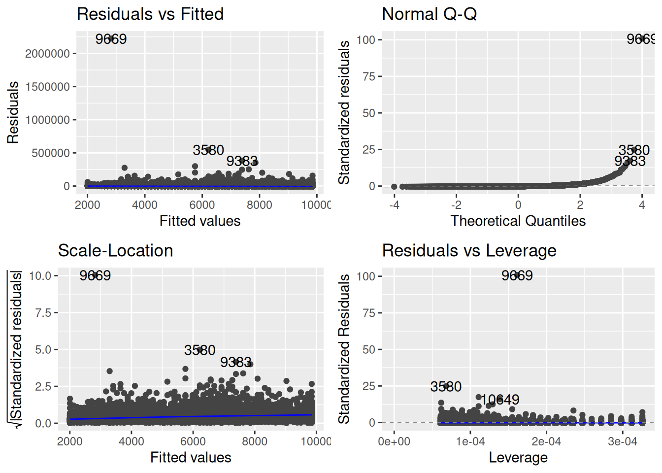
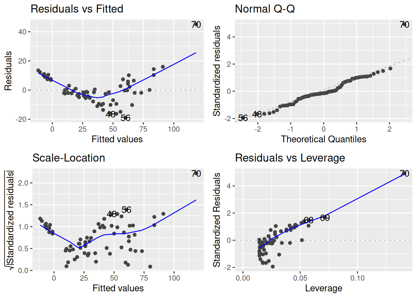
Before doing any analysis, let’s perform some diagnostic checks to see if there are any issues with the usual assumptions of the linear regression model:
library(ggfortify)autoplot(meps_age_lm)
A few things immediately jump out:
From the residuals-vs-fitted and leverage plots, we see that there are a lot of big outliers. One individual, for example, has a standardized residual of over 90.
It’s hard to tell whether there might be an issue with the linearity assumption because the outliers are so extreme that they dominate the residual-vs-fitted plot.
From the scale-location plot, we see an increasing trend in the size of the standardized residuals and the fitted values (i.e., the blue line is increasing). So there is evidence that the variance is not constant.
From the QQ-plot, if it happened to be the case that the linearity and homoscedasticity assumptions were OK, the normality assumption would clearly be violated.
So, basically, things are a mess, and we can’t expect the inferences we get from the linear regression model to be correct.
My Overall Strategy
Personally, I generally proceed as follows.
When the residuals are highly skewed, have extreme outliers, or things are non-linear, consider transforming the dependent variable.
When the linearity assumption fails, consider transforming some of the predictors.
If there is no easy way to fix everything all at once, I prioritize fixing linearity, do what I can for the other assumptions, then I might use robust standard errors to do inference. We may or may not talk robust standard errors in this class.
Expect to do some experimentation; a lot of the time fixing one issue introduces others, and it is hard to make everything OK all at once.
11.2 Strategy 1: Transform the Dependent Variable
One approach, that is especially useful when there are outliers, or when the dependent variable is highly skewed, is to transform the dependent variable. In simple terms, a transformation just refers to treating something like \(\sqrt Y_i\) or \(\ln(Y_i)\) as the dependent variable instead of the original \(Y_i\).
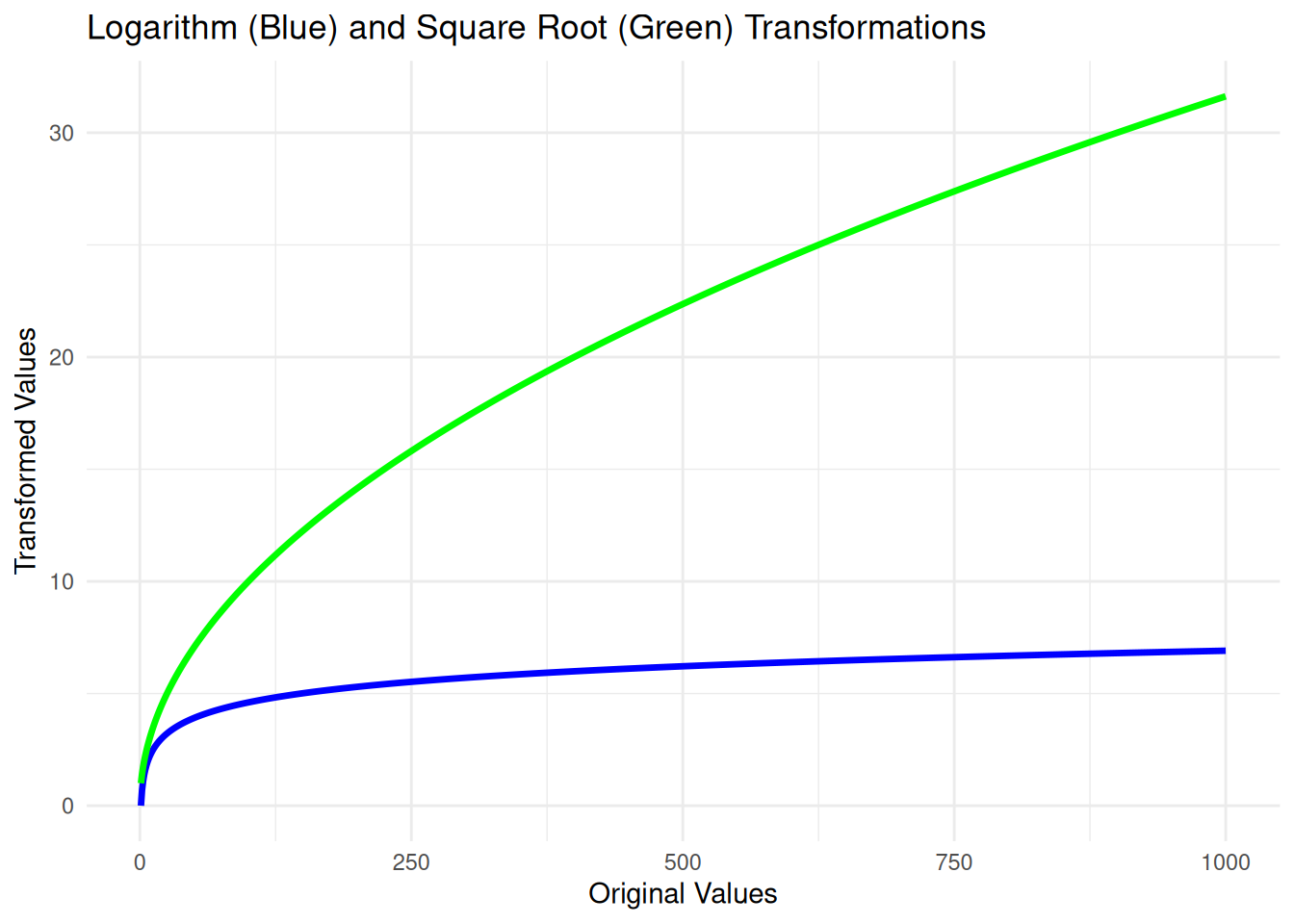
Transforming the dependent variable can stabilize variance, reduce skewness, and make the data more closely meet the assumptions of linear regression, leading to more reliable and valid inferences. To see why this might be useful for handling outliers, consider the plots of these functions:
Both of these functions take big values (up to 1000 in plot) and make them substantially smaller (around 30 for the square root and around 7 for the natural logarithm) while leaving smaller values less changed; this will therefore tend to pull positive outliers closer to the bulk of the data.
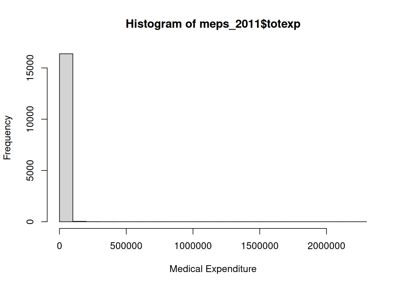
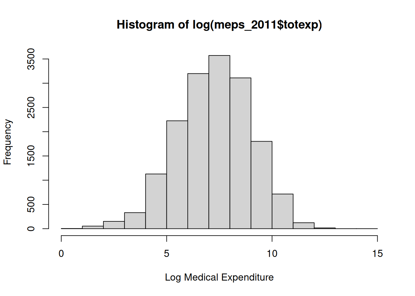
In the case of the MEPS dataset, the dependent variable is medical expenditures, which has a histogram that looks like this:
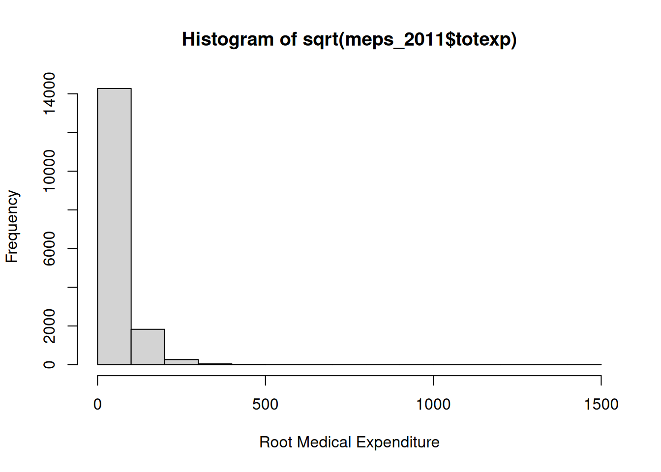
There are some huge outliers there! Let’s see what happens if we apply a square root instead:
hist(sqrt(meps_2011$totexp), xlab ="Root Medical Expenditure")
This seems a little better, but things still seem a bit skewed. Let’s try a log instead:
hist(log(meps_2011$totexp), xlab ="Log Medical Expenditure")
It looks like the logarithm removes the skewness and outliers!
11.2.1 How Does Transforming the Dependent Variable Affect the Diagnostics?
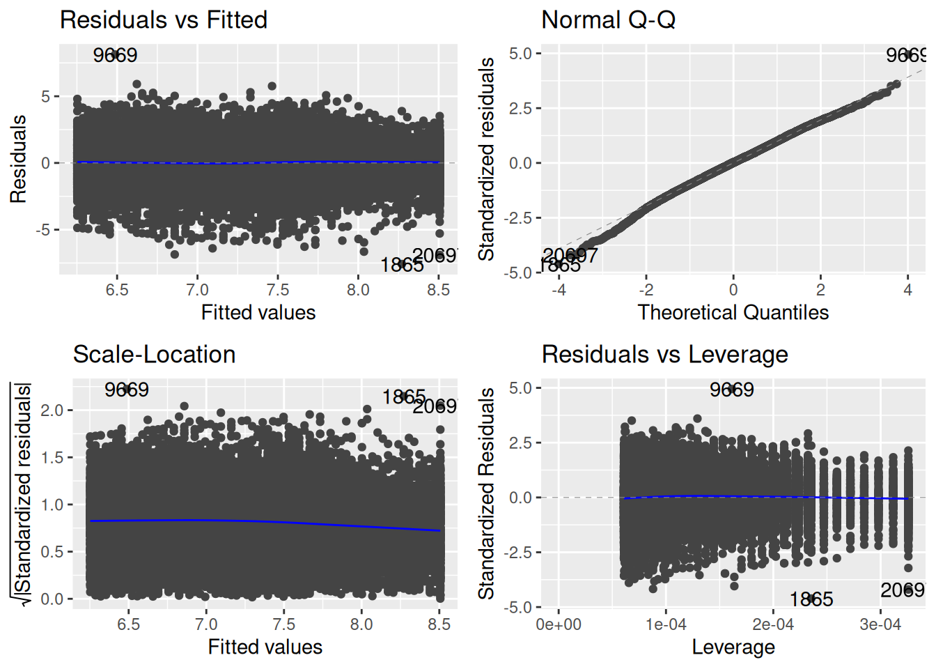
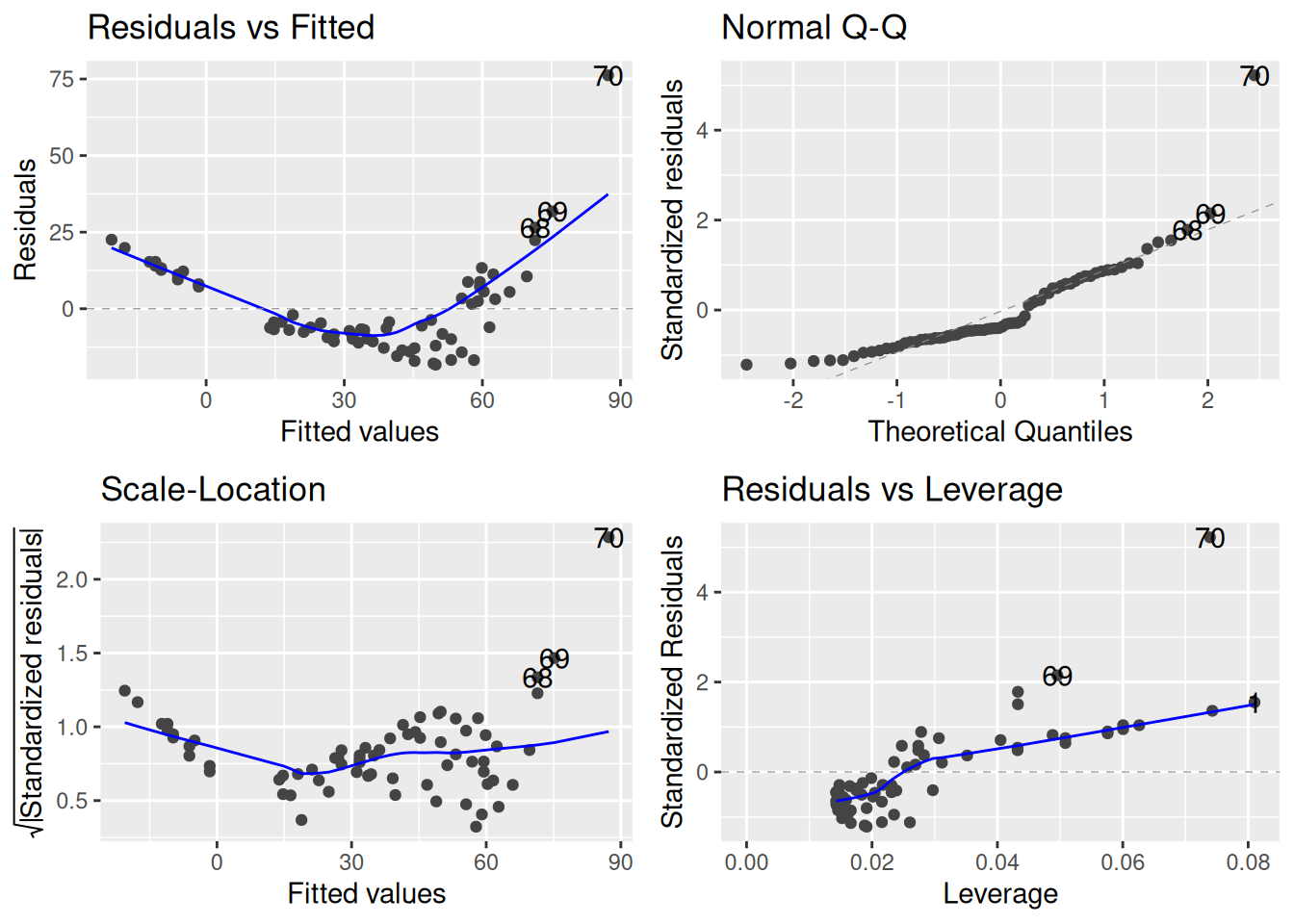
At least in terms of histograms of the dependent variable, things look good with the logarithm. But the important thing is whether it makes our diagnostic plots look better. Let’s fit a model that now uses log medical expenditure as the outcome:
## Make log medical expendituremeps_2011$logexp <-log(meps_2011$totexp)meps_age_log_lm <-lm(logexp ~ age, data = meps_2011)autoplot(meps_age_log_lm)
This looks much better to me! There is still some slight issue with the QQ plot, but by and large we should be able to proceed with statistical inference guilt-free.
11.2.2 Choice of Transformation
How do we know which transformation to choose? I mentioned the square root and the logarithm as options; are there others?
The most common choices are:
I think the log transform is the most commonly used in practice for dealing with skewness, outliers, and heteroscedasticity. It is very useful when dealing with variables that span multiple orders of magnitudes, like medical expenditures, incomes, and so forth.
The square-root transformation is useful in certain situations. The most common situation where the square-root will tend to be useful is when the \(Y_i\)’s represent counts, e.g., the number of earthquakes in a region, number of individuals who develop an illness, and so forth.
If you don’t want to guess-and-check which transformation is best, you can use a Box-Cox Transform.
The Box-Cox approach basically tries to find the “best” transformation of the form
At a high-level, this is effectively just raising \(Y_i\) to the \(\lambda^{\text{th}}\) power, so \(\lambda = 1/2\) corresponds to the square root.
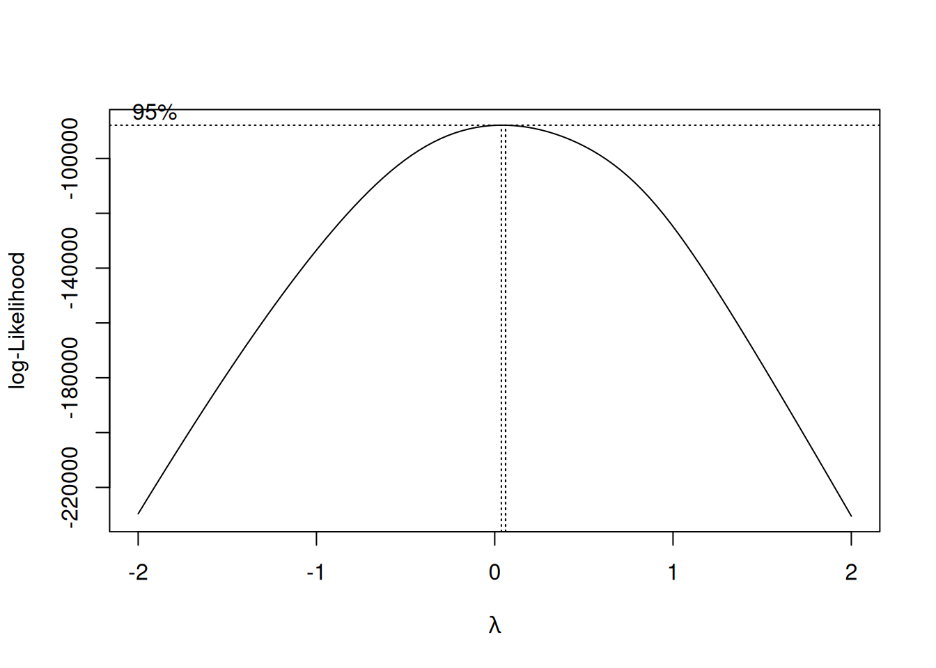
An estimate of the best \(\lambda\) to use can be obtained from the boxcox function in the MASS package:
bc <- MASS::boxcox(meps_age_lm)
So it looks like the data prefers something very close to \(\lambda = 0\), so the natural log is a good choice.
11.2.3 Interpreting the Regression After Transformations
Once we’ve applied a transformation to our dependent variable, interpreting the results of the regression model requires some care. In the case of the logarithm transform, for example, the model we are effectively using is
So the \(\beta_j\)’s now represent the effect of the independent variables on the logarithm of the dependent variable. This is a very different thing than we are used to! If we want to interpret things in terms of the original variable, we would need to “undo” the logarithm transform. Using the properties of logarithms, this gives:
Inspecting this model, we are led to the following interpretation:
Given a one-unit increase in \(X_{ij}\), and holding all other quantities fixed, we multiply the predicted value of \(Y_i\) by \(e^{\beta_j}\).
For the MEPS dataset, the summary gives:
summary(meps_age_log_lm)
Call:
lm(formula = logexp ~ age, data = meps_2011)

Residuals:
    Min      1Q  Median      3Q     Max
-7.5779 -1.0721  0.0357  1.0943  8.1279

Coefficients:
             Estimate Std. Error t value Pr(>|t|)
(Intercept) 5.6472978  0.0367981  153.47   <2e-16 ***
age         0.0336380  0.0007205   46.69   <2e-16 ***
---
Signif. codes:  0 '***' 0.001 '**' 0.01 '*' 0.05 '.' 0.1 ' ' 1

Residual standard error: 1.644 on 16428 degrees of freedom
Multiple R-squared:  0.1171,    Adjusted R-squared:  0.1171
F-statistic:  2180 on 1 and 16428 DF,  p-value: < 2.2e-16
Interpreting this in terms of the effect of age on medical expenditures we have:
Increasing age by one year multiplies the predicted medical expenditure by \(e^{0.0336380} \approx 1.034\), which corresponds to a 3.4% increasing.
Interpreting Other Transformations
The logarithm is nice to work with because it leads to a good interpretation on the original scale of the data. For the Box-Cox and square-root transformations, things aren’t so simple: if we used a square-root transformation instead, we would be limited to the interpretation that “the predicted value of \(\sqrt{Y_i}\) increases by \(\beta_j\) units if I increase \(X_{ij}\) by one unit.” But usually we care about predicting \(Y_i\), not \(\sqrt{Y_i}\), and there is no straightforward way to interpret the coefficients back on the original scale of \(Y_i\).
11.3 Strategy 2: Also Transforming Independent Variables
Sometimes, especially when the relationship between \(Y_i\)’s and the \(X_{ij}\)’s is itself non-linear, you might decide to also transform some of the \(X_{ij}\)’s as well. An example of this comes from the Applied Regression course at Penn State:
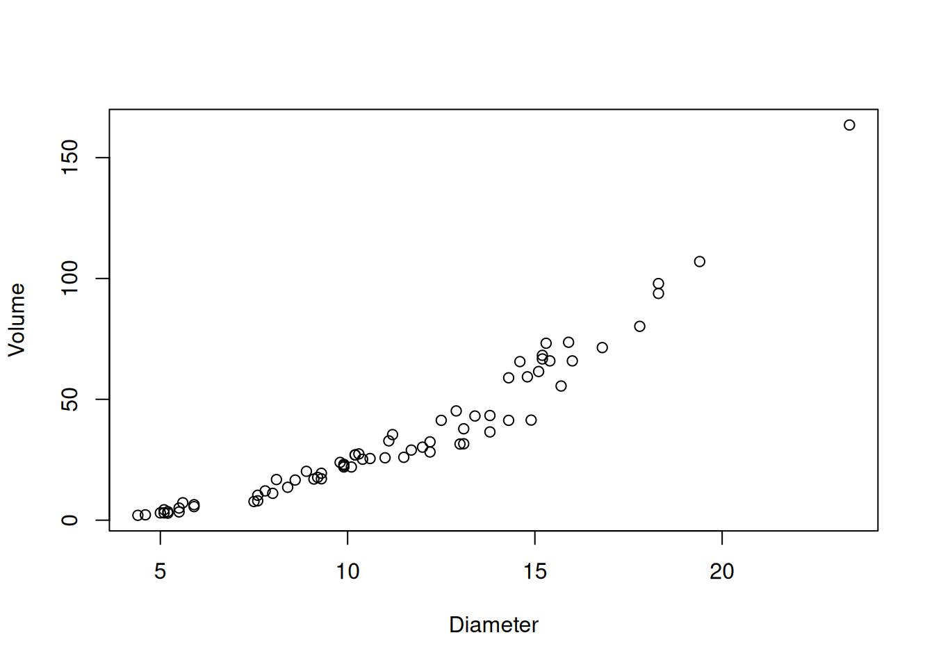
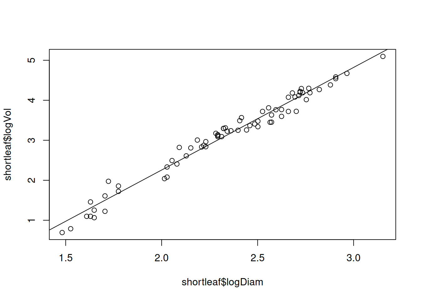
Many different interest groups — such as the lumber industry, ecologists, and foresters — benefit from being able to predict the volume of a tree just by knowing its diameter. One classic data set reported by C. Bruce and F. X. Schumacher in 1935 concerns the diameter (x, in inches) and volume (y, in cubic feet) of n = 70 shortleaf pines.
This looks pretty good to me, although not perfect.
11.3.1 Why Log Both? Sometimes It’s a Power Law
An issue with trying to “improve” a model is that the steps that lead to the best results are often shrouded in mystery. Sure, we can see that using \(\ln(X_i)\) and \(\ln(Y_i)\) in place of \(X_i\) and \(Y_i\) in the above example makes the results better. But what is the logic here? Did we just guess that this is the right thing to do?
Well, the logic used by the PSU example is basically just what we did here: they tried transforming \(X_i\) (because that is usually what you do to correct for non-linearity), and it didn’t help, so they tried doing both, and it happened to work. They don’t really state “why” it works, just that it does.
That’s not very satisfying. I at least would like to know why. One possible reason that logging both would be useful is if the relationship between \(X_i\) and \(Y_i\) is if the true relationship was something like
\[
Y_i = a \times X_i^b \times \text{error}_i,
\]
where \(E(\ln \text{error}_i) = 0\); after taking a log we get
\[
\ln Y_i = \ln a + b \, \log (X_i) + \epsilon_i,
\]
which is our linear model.
This is referred to as a power law relating \(X_i\) and \(Y_i\). Why might this be good for relating the volume of trees to their diameter? One idea is that trees are (basically) cylinders, and the volume of a cylinder is
Since we don’t know the height, we can view the term \(\text{error}_i\) as accounting for the fact that we don’t know the height. This suggests that, if we do a regression of \(\ln Y_i\) (log Volume) on \(\ln X_i\) (log Diameter), that the slope for \(\ln X_i\) should be about \(2\). Let’s check:
summary(shortleaf_logboth_lm)
Call:
lm(formula = logVol ~ logDiam, data = shortleaf)

Residuals:
    Min      1Q  Median      3Q     Max
-0.3323 -0.1131  0.0267  0.1177  0.4280

Coefficients:
            Estimate Std. Error t value Pr(>|t|)
(Intercept)  -2.8718     0.1216  -23.63   <2e-16 ***
logDiam       2.5644     0.0512   50.09   <2e-16 ***
---
Signif. codes:  0 '***' 0.001 '**' 0.01 '*' 0.05 '.' 0.1 ' ' 1

Residual standard error: 0.1703 on 68 degrees of freedom
Multiple R-squared:  0.9736,    Adjusted R-squared:  0.9732
F-statistic:  2509 on 1 and 68 DF,  p-value: < 2.2e-16
The slope we get isn’t 2, and if we tested the null that it was 2 we would reject. But it’s around 2, and it might be just a tad off because of either (i) the fact that trees aren’t actually cylinders and (ii) the fact that height itself might depend on the diameter (trees with bigger trunks are probably taller).
Anyway, power laws are pretty common in practice, and so it is often the case that logging both works well when looking at the relationship between two positive quantities.
11.3.2 Sometimes, Logging is the Default
Even before doing any diagnostics, I usually log variables before doing a linear regression if:
They are positive
They span many orders of magnitude
Regardless of whether they are independent of dependent variables
For example, if I’m looking at incomes, I usually log it whether I’m using it as a dependent variable or independent variable. It’s not universally true that this is a good idea, but I find it helpful more often than not.
11.4 Other Ways to Deal With Nonlinearity: Polynomials
If your problem is non-linearity, a good starting place is to consider transforming some/all of the \(X_{ij}\)’s. Your options for doing this are pretty broad. If you have one predictor, a flexible approach is to use a polynomial relationship between \(X_i\) and \(Y_i\) with the following model::
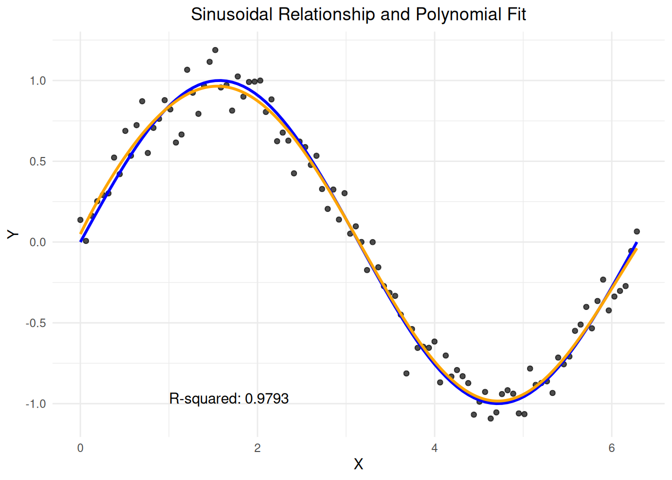
This lets us model non-linear relationships. For example, suppose your data looks like this:
In orange we have the fit of a 7th degree polynomial, while the blue line represents the true relationship of \(Y_i = \sin(X_i) + \epsilon_i\). The 7th degree polynomial is more than up to the task of dealing with this type of nonlinearity.
11.4.1 Nonlinear Regression Using Linear Regression?
You might be wondering: if we’re dealing with nonlinear relationships, why are we still using linear regression? The key insight is that while the relationship between the original variables might be nonlinear, we can often transform the problem into a linear one. Consider our polynomial regression model:
This is now in the form of a multiple linear regression model, where our predictors are the various powers of \(X_i\). We can estimate this using ordinary least squares, just as we would with any linear regression model.
11.4.2 Polynomials in Action
We mentioned that we might expect a relationship between \(Y_i\) and \(X_i\) on the PSU data of the form
\[
Y_i \approx a \, X_i^b,
\]
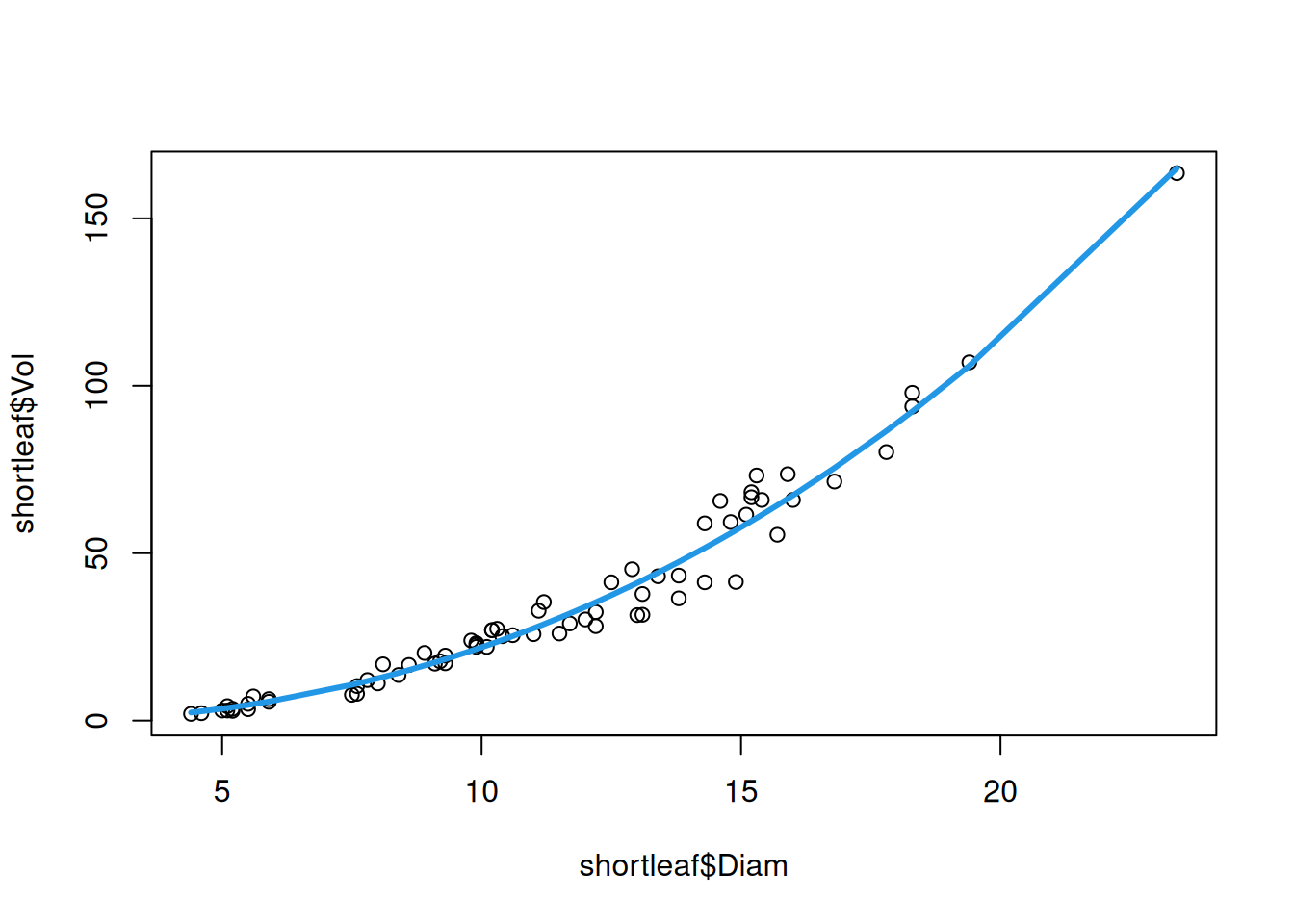
with \(b \approx 2\), but possibly some other relationship. This suggests that we might be able to get away with a polynomial relationship, rather than transforming \(X_i\) and \(Y_i\). We can fit a polynomial regression of Volume on Diameter using the poly() function as follows:
## The poly(Diam, 3) part means "do a polynomial regression of degree 3"shortleaf_poly <-lm(Vol ~poly(Diam, 3), data = shortleaf)
plot(shortleaf$Diam, shortleaf$Vol)lines(shortleaf$Diam, predict(shortleaf_poly), col =4, lwd =3)
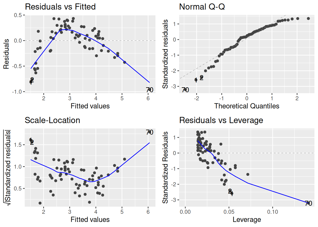
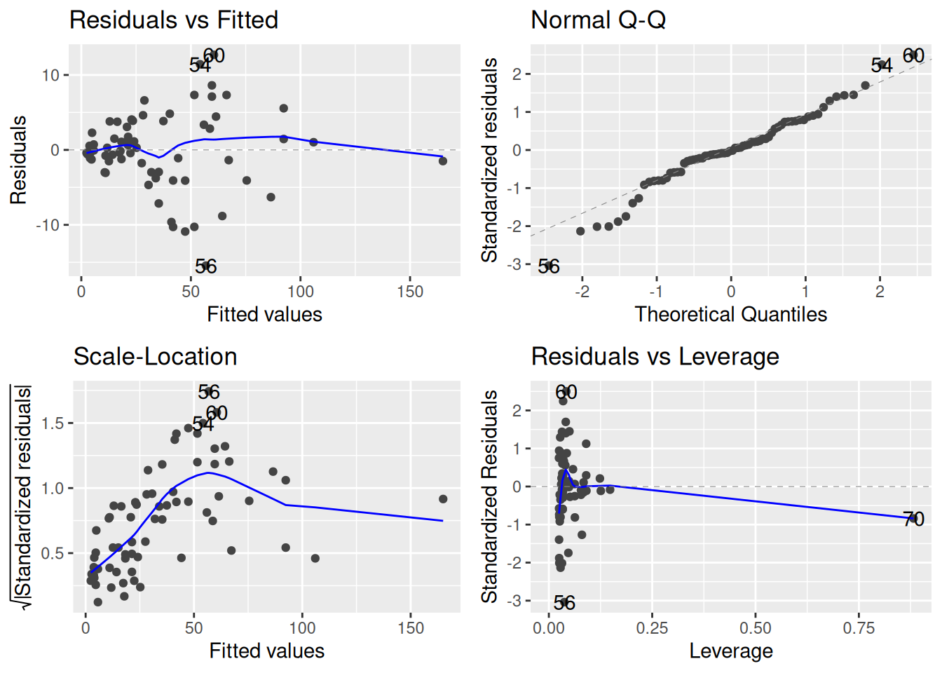
This looks pretty good! Let’s now take a look at the diagnostics:
autoplot(shortleaf_poly)
It seems like taking logs might have been better: while we have fixed the non-linearity, it seems like there is still quite a bit of heteroscedasticity.
11.4.3 Other Options: Splines and Binning
While polynomials are a popular choice for modeling nonlinear relationships, they’re not the only option. Two other approaches that are commonly used are splines and binning.
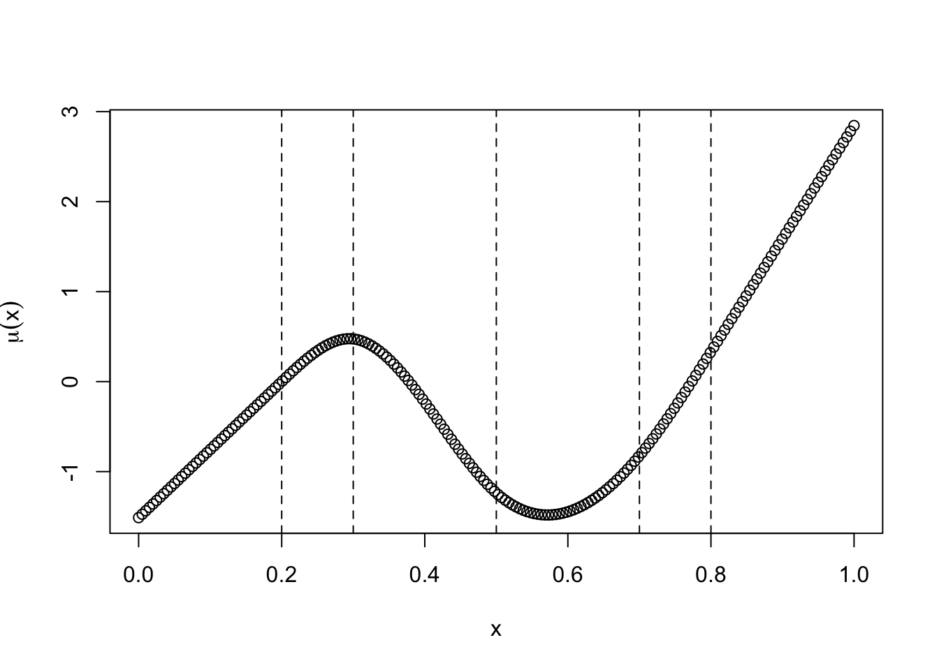
The basic idea of a spline is probably best described in pictures. Here is an example of a (cubic) spline:
The spline above is essentially six different third degree polynomials glued together. They are glued together in a special way that makes them nice and smooth. The vertical lines are the places where the cubics are being glued; these places are referred to as knots and specifying the number of knots you want to use is an important part of creating a spline model.
People usually like splines better than polynomials. If you want to use a spline, rather than a polynomial, you can use the bs() function in the splines package in place of poly():
library(splines)shortleaf_spline <-lm(Vol ~bs(Diam, 3), data = shortleaf)plot(shortleaf$Diam, shortleaf$Vol)lines(shortleaf$Diam, predict(shortleaf_spline), col =4, lwd =3)
Again, looks pretty good!
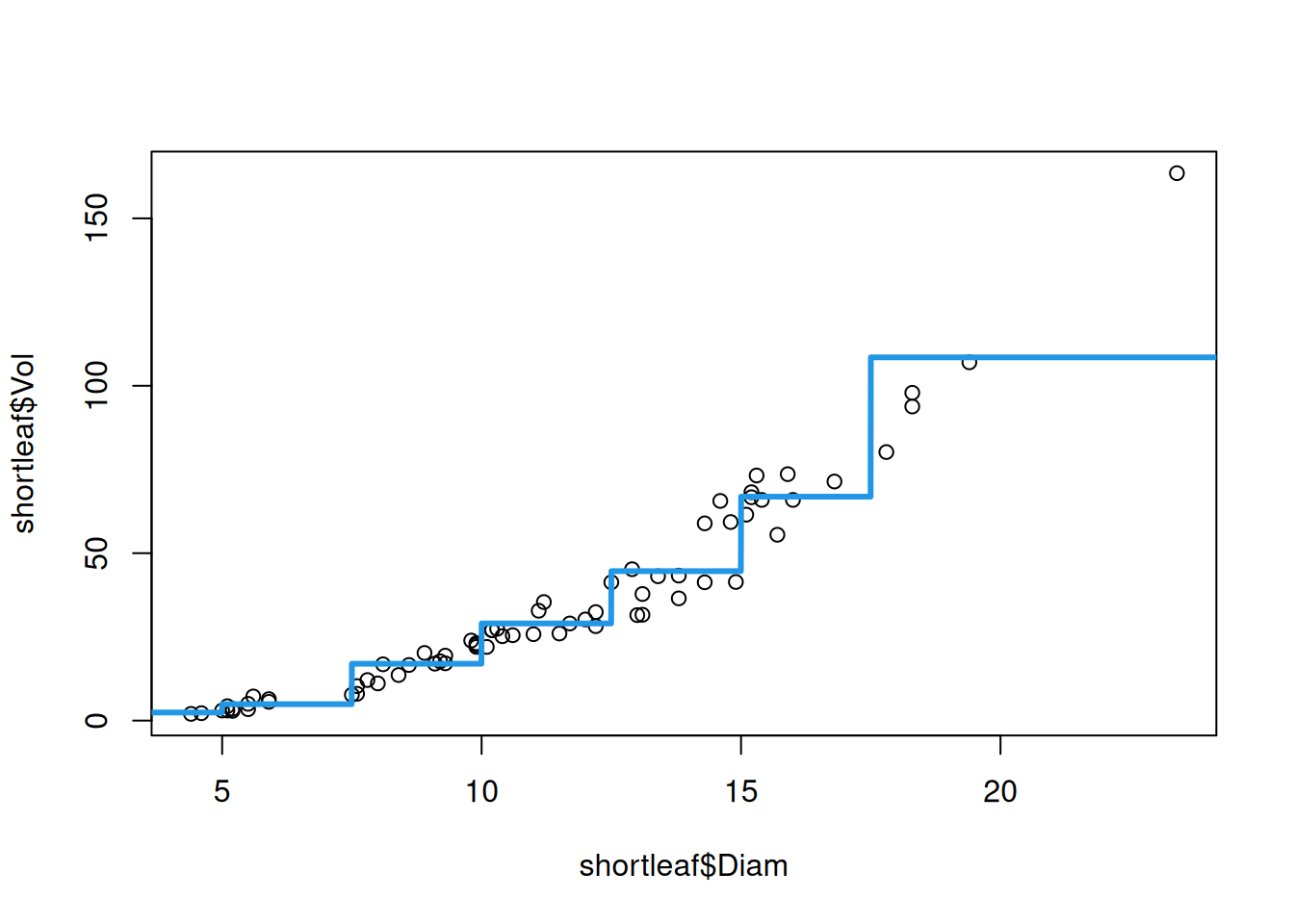
A simpler approach, that is extremely popular in the health and social sciences, is to use binning (also called discretization). Basically what you do is just take \(X_i\) and create a categorical variable out of it. To illustrate the concept, we can use the cut() function to discretize the diameter:
## Create the discretizationshortleaf$binnedDiam <-cut(shortleaf$Diam, breaks =c(-Inf, 5, 7.5, 10, 12.5, 15, 17.5, Inf))## See how it lookshead(shortleaf$binnedDiam)
We see that, instead of storing the value of the diameter, the new column binnedDiam just provides whether the diameter is less than 5 OR between 5 and 7.5 OR between 7.5 and 10, and so forth. We can then use this new categorical predictor in the linear regression as
Rather than being a nice smooth function, discretization produces a step function as an estimate of the relationship between diameter and volume.
Advantages and disadvantages of each approach:
Discretization/binning is often used because it is easy to understand for stakeholders. People who are not technically minded may not even really understand polynomials, whereas discretization is easy to understand. Moreover, the coefficients of the regression are also interpretable as representing comparisons between subpopulations.
A problem with discretization is that the choice of subpopulations is sort of arbitrary, and predictions often depend critically on where exactly you choose for the function to jump.
Polynomials are easier to understand than splines, and also may perform better than discretization, so they are a good compromise between the two.
In most cases, splines are probably the best option. Their main limitation is that they are harder to understand and less interpretable than binning, at least in my opinion.
11.5 Exercises
11.5.1 Exercise: Memory
The following data is taken from this website, and is described as follows:
Let’s consider the data from a memory retention experiment in which 13 subjects were asked to memorize a list of disconnected items. The subjects were then asked to recall the items at various times up to a week later. The proportion of items (y = prop) correctly recalled at various times (x = time, in minutes) since the list was memorized were recorded (wordrecall.txt) and plotted.
Plot prop on the y axis against time on the x axis. Does the relationship between prop and time look linear? Explain.
Fit a linear regression predicting prop from time, then use autoplot to look at the diagnostic plots. Based on these results, again, does the relationship seem linear? Explain.
Repeat part (b), but considering the models prop ~ log(time), log(prop) ~ time, and log(prop) ~ log(time). For which of the models does the assumption of linearity appear to be most reasonable?
For the model you identified in part (c), plot the predictor variable on the x axis against the outcome on the y axis. Using the lines and predict functions, add a line connecting the predictions from the model to visualize the model fit. Does this seem to improve upon the plot from part (a)?
11.5.2 Exercise: LIDAR
The following data is taken from the lidar dataset in the aspline package. The data consists of 221 observations from a light detection and ranging (LIDAR) system, which is used to measure the distance to a target by illuminating the target with a laser and measuring the reflected light with a sensor. The data consists of two variables:
range: the distance to the target, in meters; and
logratio: the logarithm of the ratio of the amount of light reflected by the target to the amount of light reflected by a white card.
In this exercise, we will consider the relationship between range and logratio, in particular focusing on whether the relationship is linear. More details on the data can be found by running ?SemiPar::lidar in the console or referencing the book Semi-Parametric Regression by Ruppert, Wand, and Carroll referenced therein.
We load the data by running the following command:
## Make sure to run install.packages("aspline") if you don't have the packagelibrary(aspline)data(lidar)
Plot range (x-axis) against logratio (y-axis). On the basis of this plot, which of the usual assumptions (linearity, independence, constant variance, and normality) do you think are likely to be violated?
Before proceeding, imagine what line you would draw through the data to summarize the relationship between range and logratio. Then, explain how you would describe this relationship visually to someone who is not familiar with the data.
Fit a linear model predicting logratio from range. Use autoplot to look at the diagnostic plots. Which of the usual assumptions appear to be violated? Explain.
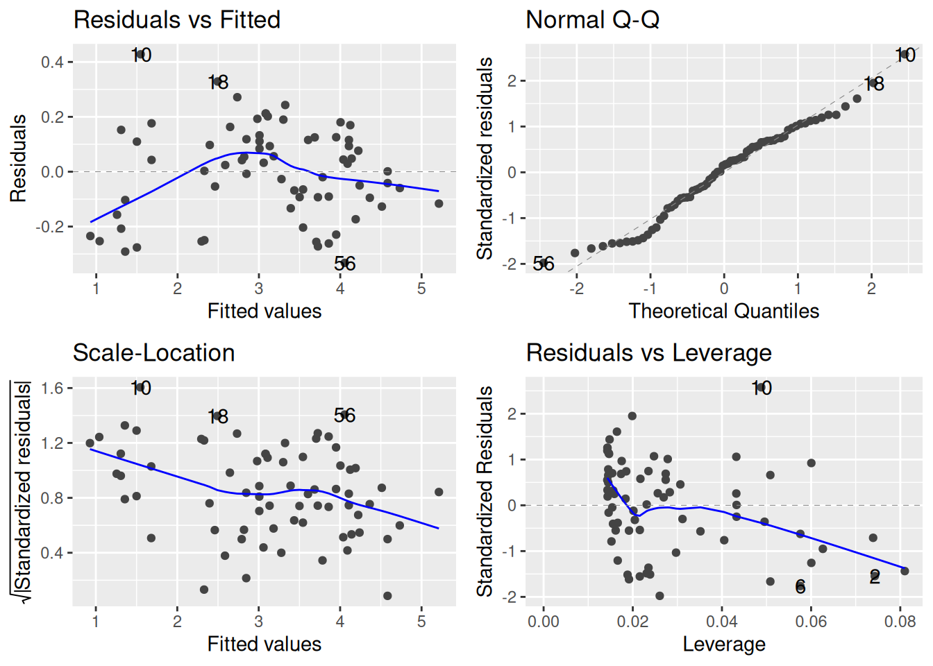
Consider using a polynomial regression to predict logratio from range. Do this by fitting a linear model of the form logratio ~ poly(range, k) for \(k = 2, 3, 4, 5, 6\). Then, for each of these models, (i) use the predict to obtain the predictions from the model, (ii) plot the predictor variable on the x axis against the outcome on the y axis, and (iii) add a line connecting the predictions from the model to visualize the model fit. Explain how the predictions change as\(k\) increases. Do any of these fits match the line you imagined in part (b)?
Repeat the previous exercise, but using a spline instead of a polynomial. Do this by fitting a linear model of the form logratio ~ ns(range, df = k) for \(k = 2, 3, 4, 5, 6\). Do the results look more, or less, like what you imagined in part (b)?
For the best fitting model of the ones you considered above, look at the diagnostic plots. Do any of the usual assumptions still appear to be violated? Explain.
11.5.3 Exercise: Boston
The following problem revisits the Boston housing dataset, where our interest is in understanding the relationship between the concentration of nitrous oxide in a census tract (nox) and the median home value in that tract. First, we load the data:
If necessary, familiarize yourself with the data by running ?MASS::Boston in the console. In addition to nox and medv, we will consider a number of additional factors that are relevant for predicting medv: lstat (the proportion of “lower-status” individuals in a tract) and dis (the distance to industry centers).
Fit linear models defined by the following formulas:
medv ~ nox + dis + lstat
log(medv) ~ nox + dis + lstat
Using the autoplot function applied to these fits, which of the models seems to do the best job at satisfying the standard assumptions of the linear regression model? Explain your answer.
For the model that you selected in part (a), plot the residuals of the model fit (y-axis) against dis (x-axis). What do you notice about the plot? Does this seem problematic for any of the usual assumptions?
Repeat part (b), but with lstat. Does the relationship between medv and lstat appear linear?
Use either a polynomial or a spline to treat lstat non-linearly and repeat part (c). How does this change your conclusions?
For the model log(medv) ~ nox + dis + lstat, compute the slope estimate associated to lstat. Then, interpret this coefficient in terms of the effect of a unit increase in lstat on medv.