When performing statistical inference with the linear regression model, our statistical inference procedures were justified under a bunch of working assumptions (linearity, constant error variance, normality of residuals, and independence of errors); we do not expect that these assumptions will be exactly true, but statistical inference usually works well provided that the working assumptions are not violated too wildly.
In this chapter we develop diagnostics, which play a crucial role in verifying these assumptions and ensuring that they are sufficiently met so that our conclusions are reliable.
9.1 Motivation: Utilities Dataset
We will look at the utilities dataset to illustrate concepts in this chapter. This dataset can be loaded by running the following code:
## Load the datafilename <-"https://raw.githubusercontent.com/theodds/2023-Statistical-Modelling-II/master/data/utilities.csv"utilities <-read.csv(filename)## Look at the top of the datasethead(utilities)
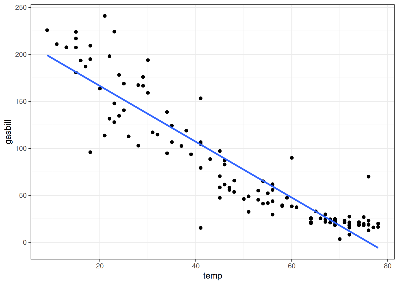
This dataset contains records of the temperature on a given day and the total gas bill charged to a particular individual1 on that day. Below we plot the relationship between gas bill and temperature, along with the fitted least squares line:
As is evident from the figure, the linearity assumption does not appear to be satisfied as the relationship is curved. But what about the other assumptions? Is the error variance constant? Are the errors normally distributed? In this chapter we will develop tools to help answer these questions.
9.2 Residual Plots
One way to assess whether the model assumptions are close to being satisfied is via a residual plot. Recall that the residuals and predicted values are given by
Residual plots are figures that plot the residuals \(e_i\) on the \(y\)-axis, and a variety of other quantities (usually the fitted values, but sometimes the individual independent variables as well) on the \(x\)-axis. An example of a residual plot, with the residual plotted against the daily temperature, is given below:
When the model fits well, there should be no discernible pattern with the residuals and any of the predictors. In the above figure, there is a relationship between the residual and daily temperature: for both small and large temperatures, the residuals start positive (indicating that the model systematically has predictions that are too small) while in the middle the residuals are systematically negative (indicating that the model systematically has predictions that are too large).
9.3 Other Types of Residuals
In addition to the residuals \(e_i = Y_i - \widehat Y_i\), there are a few other related quantities that are sometimes useful to look at. The standardized residuals are the residuals divided by an estimate of their standard deviation. Rather than representing how many units the prediction is off by, it instead represents the number of standard deviations the prediction is off by; for example, standardized residuals of \(3\) or more should be quite rare if the underlying errors are normal. The standardized residuals are given by
\[
r_i = \frac{e_i}{s_{\widehat e_i}}
\]
where \(s_{\widehat e_i}\) is the standard error of \(e_i\). Standardized residuals can be extracted from a model fit using the rstandard() function.
Optional: More Details on the Formula
The quantity \(s_{\widehat e_i}\) is given by
\[
s_{\widehat e_i} = s \times \sqrt{1 - h_{ii}}
\]
where \(h_{ii}\) is the \((i,i)\)th diagonal entry of the hat matrix \(\boldsymbol{H} = \boldsymbol{X} (\boldsymbol{X}^\top \boldsymbol{X})^{-1} \boldsymbol{X}^\top\).
To understand what is going on here, note that we could standardize the error\(\epsilon_i\) by dividing by \(\sigma\); since we do not know either of these quantities, we instead need to work with \(e_i\) and \(s\) as approximations. A direct approximation to standardizing would therefore take \(r_i = e_i / s\), but this is not quite correct due to the fact that we are using approximations. The additional term \(\sqrt{1 - h_{ii}}\) adjusts for approximating \(\epsilon_i\) and \(\sigma\), ensuring that the formula accounts for the these approximations.
Another type of residual, that slightly modifies the standardized residual, is the studentized residual. These are obtained by dividing \(e_i\) by an estimate of its standard deviation, excluding the \(i\)th observation in the computation of \(s\) in the formula:
where \(s^{(-i)}\) is the residual standard error that we would have computed if observation \(i\) were excluded from the linear model. In practice, the standardized and studentized residuals are usually very similar to each other, and your conclusions will not depend on which one you use. I generally recommend using the studentized residuals rather than the standardized residuals, as in some rare cases the standardized residuals can be misleading in ways that studentized residuals are not. Studentized residuals can be extracted from a linear model using the rstudent() function:
## Fit the linear regressionutilities_lm <-lm(gasbill ~ temp, data = utilities)## Look at just the first few studentized residualshead(rstudent(utilities_lm))
Raw Residuals: Simple difference between actual and predicted values, denoted by \(e_i\).
Standardized Residuals: Adjust raw residuals by their estimated standard deviation, denoted by \(r_i\).
Studentized Residuals: Further adjust raw residuals by excluding the effect of each observation on itself, denoted by \(t_i\).
9.4 Checking the Linearity Assumption
The linearity assumption can be assessed by looking for any systematic deviations of the residual plot away from being centered at zero. The most common approach is to plot the residuals \(e_i\) on the \(y\)-axis and the fitted values \(\widehat Y_i\) on the \(x\)-axis, although it can also be advisable to replace the fitted values with the individual predictors when looking at a multiple linear regression. If there is a systematic deviation of the residuals from a horizontal line at\(0\)then this indicates that the linearity assumption is violated.
9.4.1 What the Plot Should Look Like
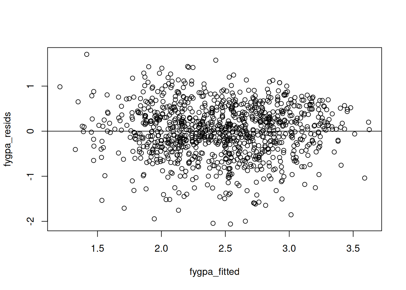
An example of a residual plot that does not have any systematic deviations from \(0\) is the residual plot we get on the first year GPA dataset:
## Load the datafygpa <-read.csv("https://raw.githubusercontent.com/theodds/SDS-348/master/satgpa.csv")fygpa$sex <-ifelse(fygpa$sex ==1, "Male", "Female")## Fit a linear modelfygpa_lm <-lm(fy_gpa ~ hs_gpa + sex + sat_m + sat_v, data = fygpa)## Extract the residuals and fitted valuesfygpa_fitted <-fitted(fygpa_lm)fygpa_resids <-residuals(fygpa_lm)## Plot the fitted values against the residualsplot(fygpa_fitted, fygpa_resids)abline(h =0)
We see in this plot that the points seem to be randomly spread out above and below the horizontal line around \(0\). On the basis of this plot, one would not flag any potential issues with the linearity assumption.
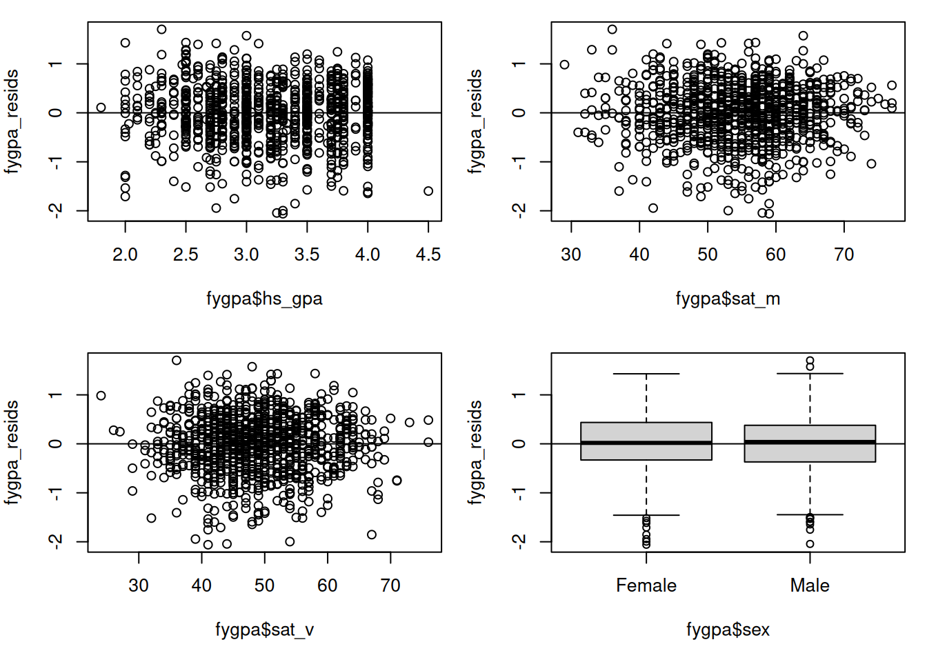
In addition to plotting against \(\widehat Y_i\), plotting against the individual predictors can be useful to see which of the variables might be the source of the non-linearity. In the case of the GPA dataset, we can also plot the residuals against first year GPA, the SAT scores, and sex:
## This puts the figures in a 2 by 2 gridspar(mfrow =c(2,2), mar =c(5,4,1,1))## Making residual plots, with abline(h = 0) making the horizontal lineplot(fygpa$hs_gpa, fygpa_resids)abline(h =0)plot(fygpa$sat_m, fygpa_resids)abline(h =0)plot(fygpa$sat_v, fygpa_resids)abline(h =0)boxplot(fygpa_resids ~ fygpa$sex)abline(h =0)
In each of these plots there does not seem to be any systematic deviation of the residuals away from \(0\); the residuals appear to be equally above and below the horizontal line at each value of the different variables.
9.4.2 What the Plot Looks Like When Linearity is Violated
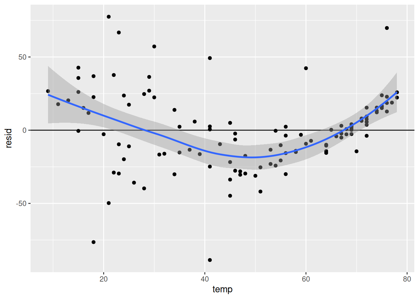
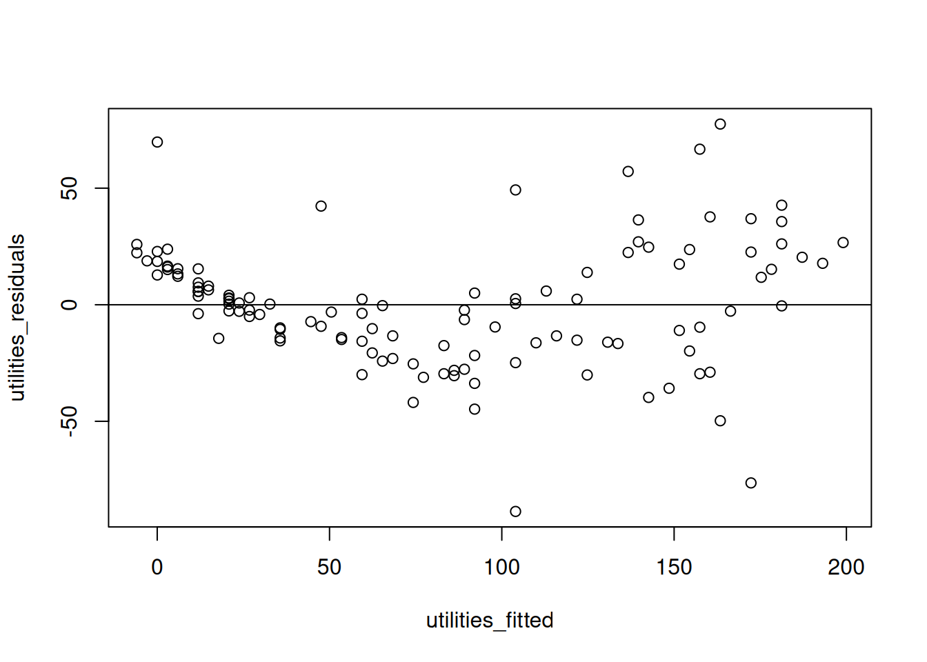
Next, we will look at what the residual plot looks like when the linearity assumption is violated using the utilities data. First, we’ll create a linear model for this data and extract the fitted values and the residuals:
## Fit a linear modelutilities_lm <-lm(gasbill ~ temp, data = utilities)## Extract the residuals and fitted valuesutilities_fitted <-fitted(utilities_lm)utilities_residuals <-residuals(utilities_lm)
Next, we plot the residuals and fitted values against each other:
Here we see a systematic deviation of the residuals from \(0\): in some places, most of the residuals are either above the horizontal line or below the horizontal line. This indicates a failure of the linearity assumption.
9.4.3 Creating Residual Plots by Working Directly with a Linear Model
To state more explicitly the steps used in constructing the residual plots above, we have been doing the following:
Fit the Linear Model: First, fit the linear regression model to your data.
Create the Plot: Plot the residuals against the fitted values or the independent variables, then add a horizontal line at 0 to aide visualization:
## Comparing with fitted valuesplot(fitted_values, residuals)abline(h =0)## Comparing with sat_mplot(fygpa$sat_m, residuals)abline(h =0)
Warning
In practice, you would not really carry these steps out yourself; instead, there are functions that can be used to directly create these residual plots, which we will learn about below. You should use these functions instead, but I think internalizing the steps above is a good idea so that you know precisely what is being displayed in the residual plot.
9.4.4 Residual Plots Against Individual Predictors
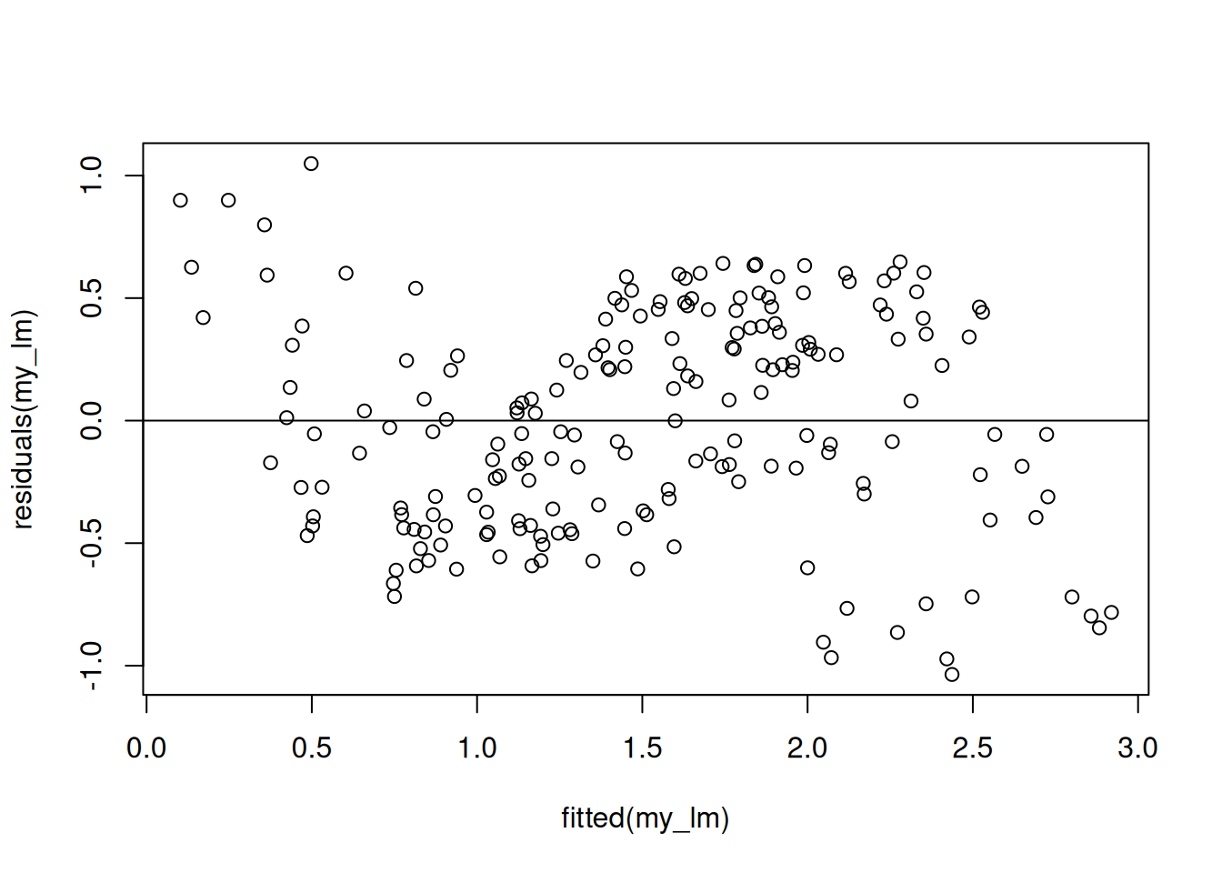
Below we give a simple illustration of how using residual plots against the individual predictors can provide more fine-grained information about how the linearity assumption can fail. We consider data that is created so that it satisfies the following relationship:
where the \(\epsilon_i\)’s have a constant standard deviation of 0.1 and are normally distributed. I created \(N = 200\) observations according to this relationship and fit a linear regression like so:
N <-200X1 <-runif(N)X2 <-runif(N)epsilon <-rnorm(N, 0, 0.1)Y <-1+ X1 +sin(2* pi * X2) + epsilonmy_lm <-lm(Y ~ X1 + X2)
This linear model is incorrect, as it does not account for the non-linear sinusoidal relationship between \(X_{i2}\) and \(Y_i\). When we look at the plot of the residuals against the fitted values we can see a clear systematic deviation from \(0\), indicating a failure of the linearity assumption:
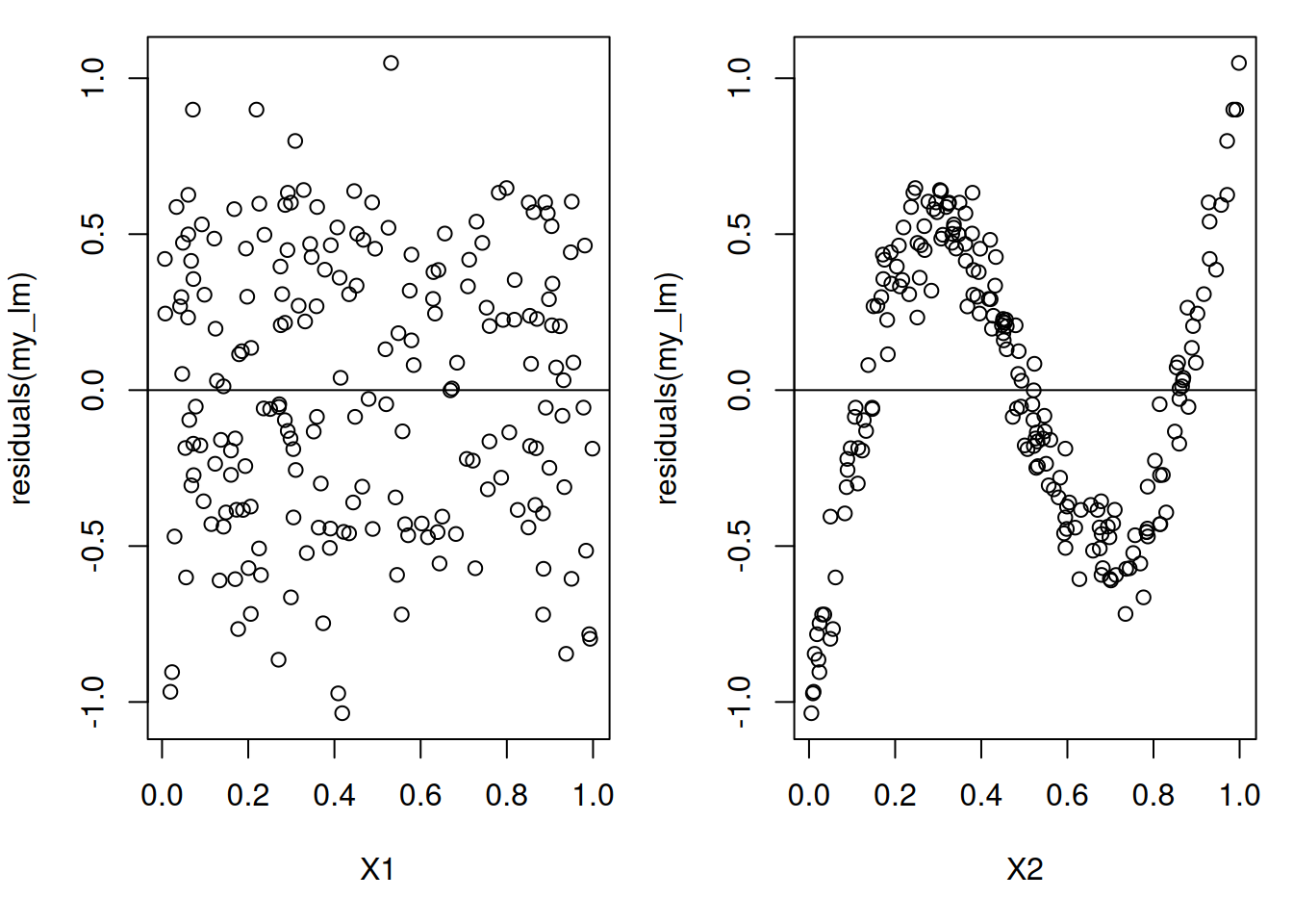
This tells us that the linearity assumption most likely violated. But it doesn’t give us any information about which of the variables are the problem. To get a handle on this we can look at residual plots for the individual predictors:
We can now see very clearly that there is a systematic deviation from \(0\) in the residuals when plotted against \(X_{i2}\)! This is exactly the variable where we have a non-linearity!
9.5 Checking the Constant Variance Assumption
The constant variance assumption states that the variance of the outcome \(\text{Var}(\epsilon_i)\) does not depend on the value of \(X_i\); it is a single number \(\sigma^2\). In this section we will look at two visualizations for assessing this assumption: the residual plots we’ve looked at before, and a new plot called a scale-location plot.
9.5.1 Checking Constant Variance With Residual Plots
Violations of the constant variance assumption can usually be assessed by looking at a residual plot against the fitted values. What we are looking for is a “funnel shape” that looks like this:
Notice that there are not any systematic deviations of the residuals from zero in the above plot; for each of the fitted values, things are basically centered around \(0\). What is different here, however, is that the variability seems to change as the fitted values change. In particular, we see a funnel shape:
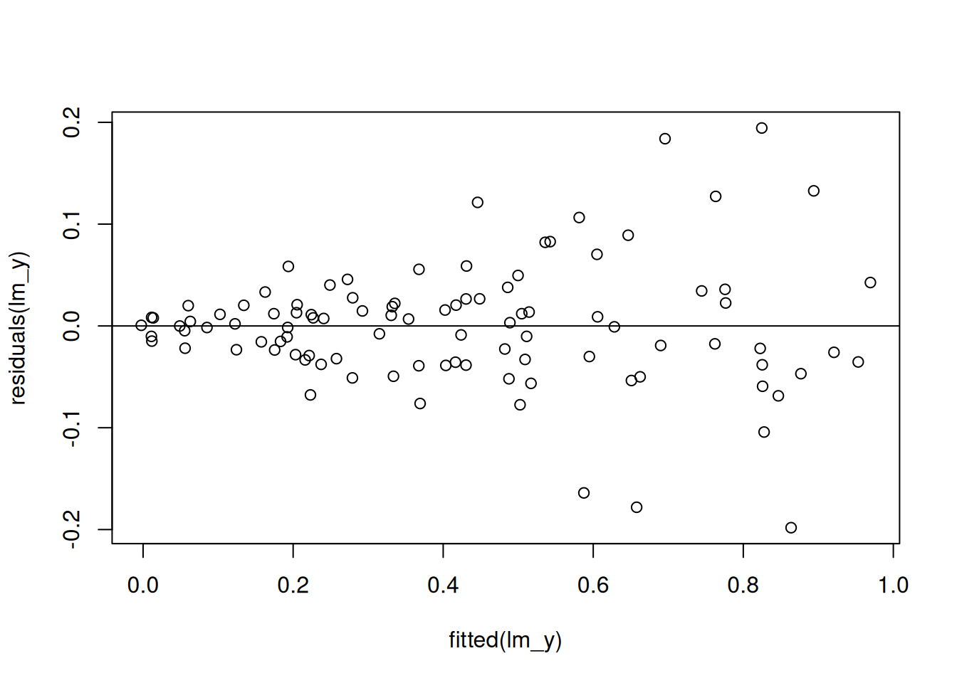
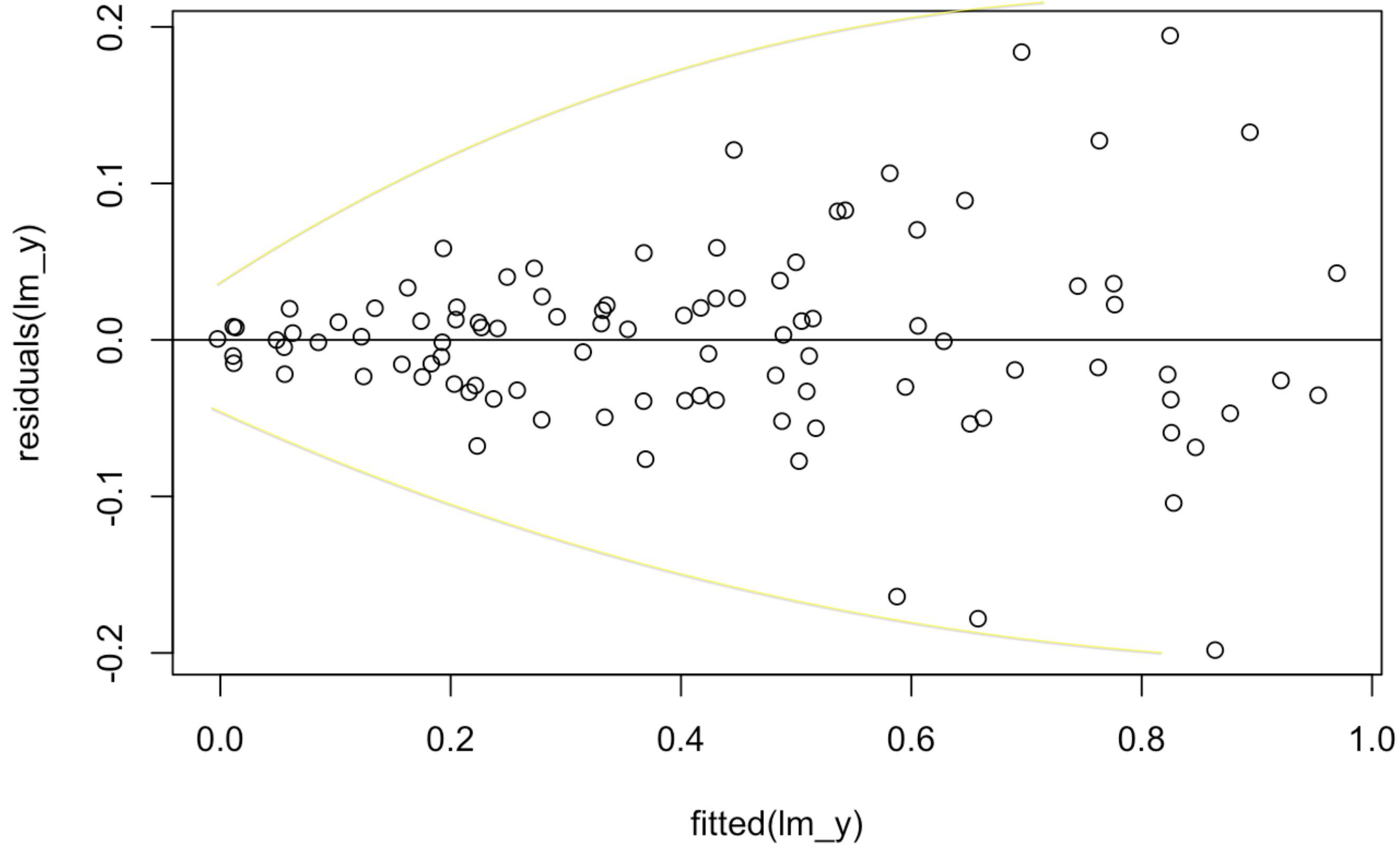
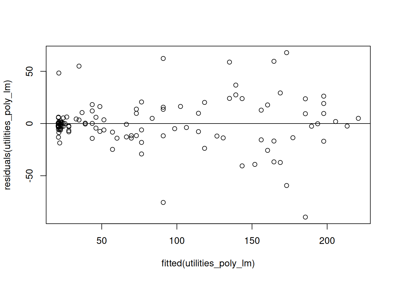
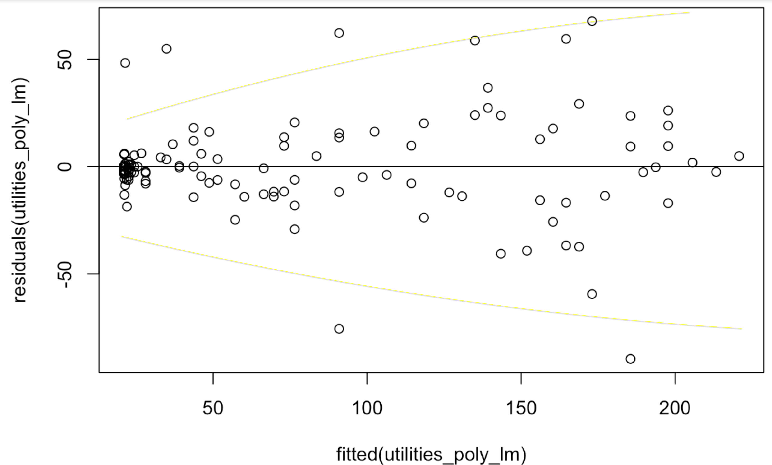
This is evidence that the constant variance assumption is violated! Let’s see how this works in the context of the utilities dataset. The initial problem with the utilities dataset was that the relationship was not linear; to correct this, we can replace the temp with a more complicated relationship (we will learn how to do this in ?sec-curve-fitting). After doing this, however, we can get a new residual plot against the fitted values that looks like this:
While it is somewhat more subtle in the above picture, we do see the characteristic funnel shape in this figure as shown below: when the predicted gasbill is very small, the errors the model makes are very close to zero, while when the gasbill is predicted to be high the residuals deviate much further from \(0\):
From the above plot we can conclude that there is evidence that the constant variance assumption is violated.
9.5.2 Checking Constant Variance With Scale-Location Plots
The scale-location plot displays the fitted values on the \(x\)-axis and against the square root of the absolute value of the standardized residual
\[
\sqrt{|r_i|}
\]
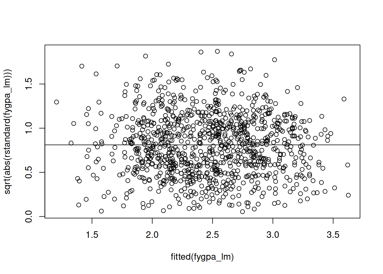
on the \(y\)-axis. For the GPA data, for example, we can get the scale-location plot by running the following commands:
## Make the scale-location plotplot(fitted(fygpa_lm), sqrt(abs(rstandard(fygpa_lm))))abline(h =mean(sqrt(abs(rstandard(fygpa_lm)))))
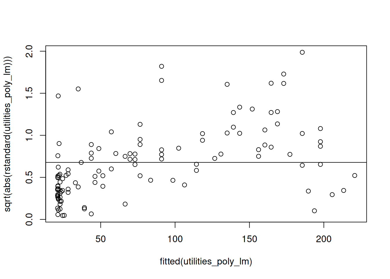
What we are looking for in this visualization is for any systematic deviations away from the flat line in the above figure. Typically what you will see when the constant variance assumption is violated is for there to be an increasing or decreasing trend in the plot. For example, this is what we see with the utilities data instead:
We see in this figure that the residuals are systematically below the line for small fitted values and systematically above the line for larger fitted values. This indicates a failure of the constant variance assumption.
9.6 Checking the Normality Assumption
Lastly, we consider checking the assumption that the errors in the linear model
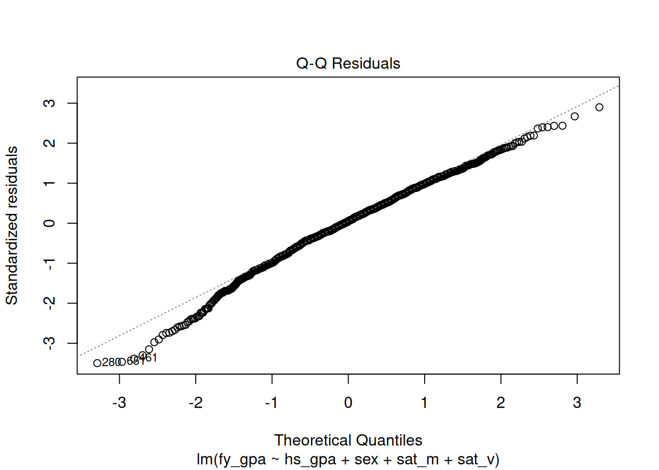
are actually normally distributed. This is usually done by making a QQ-plot, which is displayed for the GPA data below:
plot(fygpa_lm, which =2)
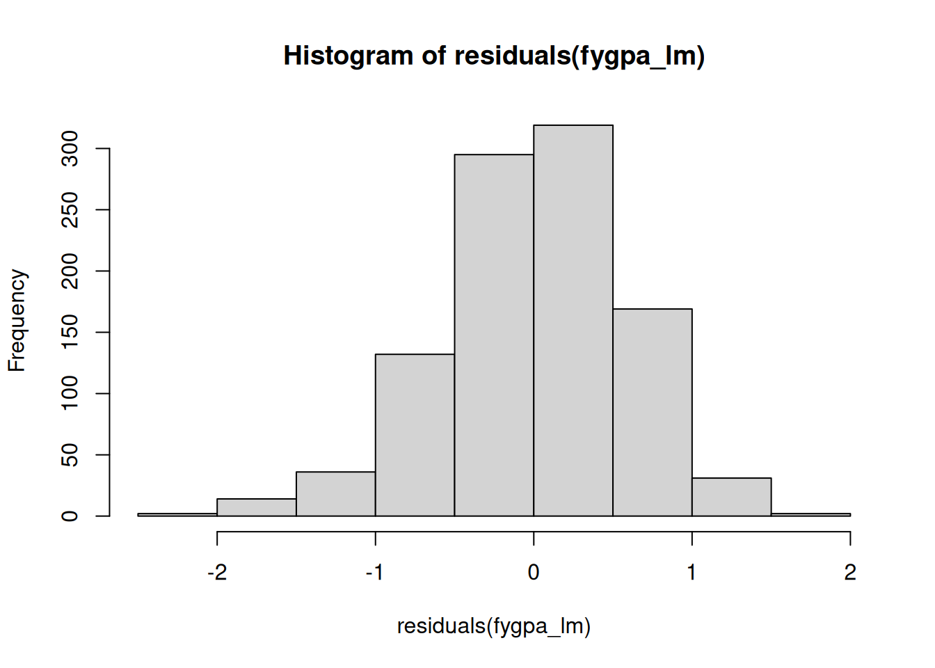
What we are looking for here are systematic deviations away from the dashed line in the above plot. In this case, it looks like there is a systematic deviation away from the line on the left. This indicates that the residuals have a longer “left tail” than would be expected if the residuals really were normal; we can see this by looking directly at a histogram of the residuals as well:
While it is much less obvious here than with the QQ-plot, we can see that the distribution of the residuals is slightly skewed to the left. The deviation of the residuals from the dashed line in the QQ-plot indicates that the normality assumption is likely violated for the GPA dataset.
9.6.1 What the QQ-Plot Represents
The QQ-plot (or quantile-quantile plot) can be used to determine if some data comes from a particular distribution; for us, we will use it to check if the residuals are close to a normal distribution in particular.
Each point on the QQ-plot corresponds to a quantile of the standardized residuals on the y-axis plotted against the same quantile of a standard normal distribution; so, for example, the median of the standardized residuals (which happens to be 0.05 for the GPA dataset) is plotted against the median of a standard normal distribution (which we know is 0). Similarly, the 97.5th percentile of the standardized residuals happens to be 1.8, while we know that a standard normal distribution has a 97.5th percentile of 1.96; consequently, the point 1.96 is plotted against 1.8.
The QQ-plot is particularly useful for detecting:
Skewness: If the points form a curve that deviates from the straight line at one of the ends, it suggests that the residuals are skewed.
Outliers: If the points at the ends of the plot (the tails) seem to diverge from the line, it indicates that the residuals have heavier tails than a normal distribution. This is associated with data that possess a lot of outliers, i.e., extreme residuals.
9.7 Autoplot
While it is possible to make these plots by hand (which I have been doing to this point), it can be helpful to use the autoplot function in the ggfortify package to make these plots for you automatically. It can be used as follows:
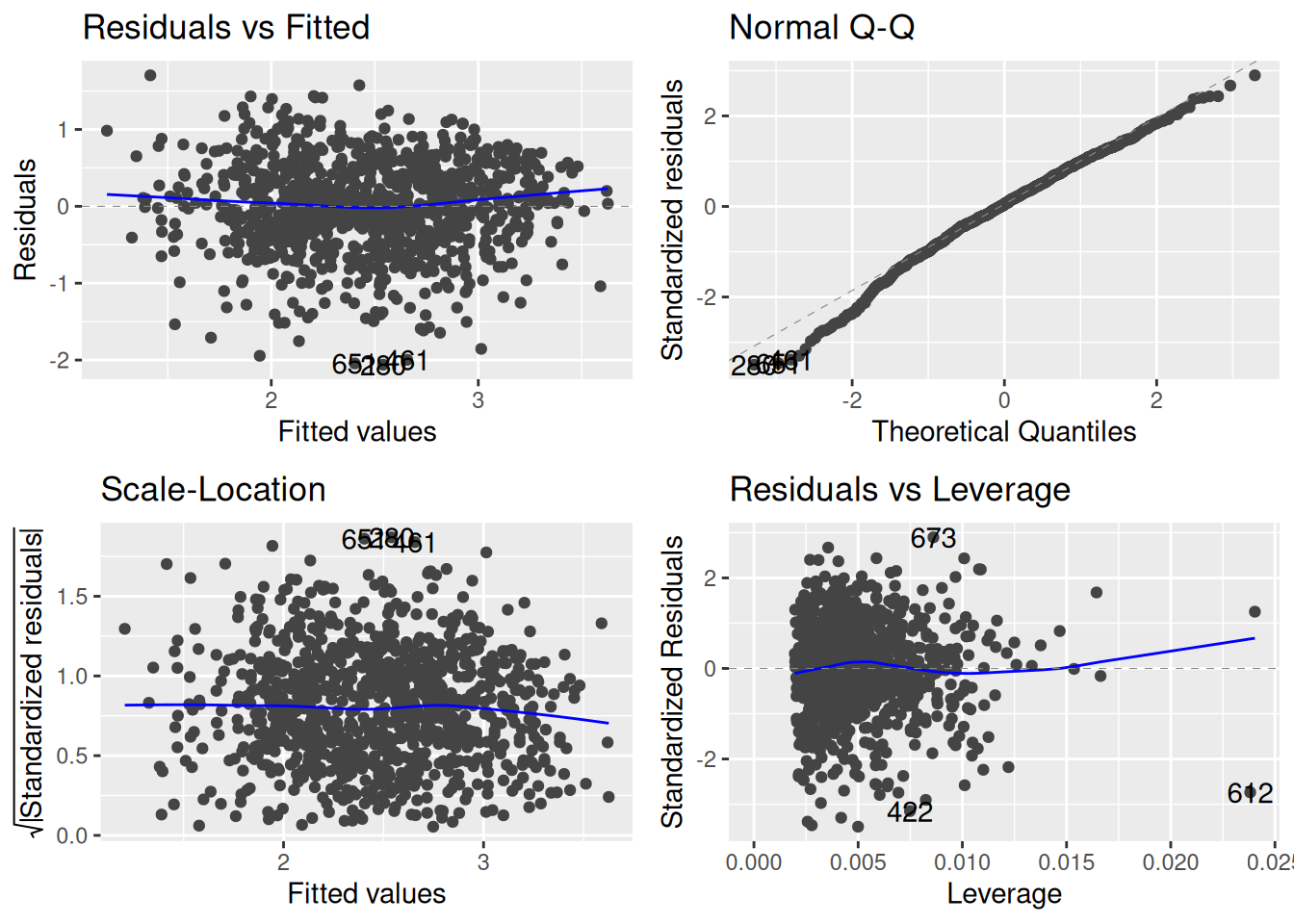
## Load ggfortify, which is where the autoplot function is definedlibrary(ggfortify)## Use autoplot to make the residual plotsautoplot(fygpa_lm)
This provides:
a residual plot against the fitted values (top-left);
a QQ-plot (top-right);
a scale-location plot (bottom-left);
and a leverage plot (bottom-right).
We have not learned about the leverage plot yet, but we will discuss them in Chapter 10. Some of these plots have also had smooth blue lines added to them to make any trends a little easier to see.
It is also possible to pick-and-choose the plots you want to look at using the which = argument:
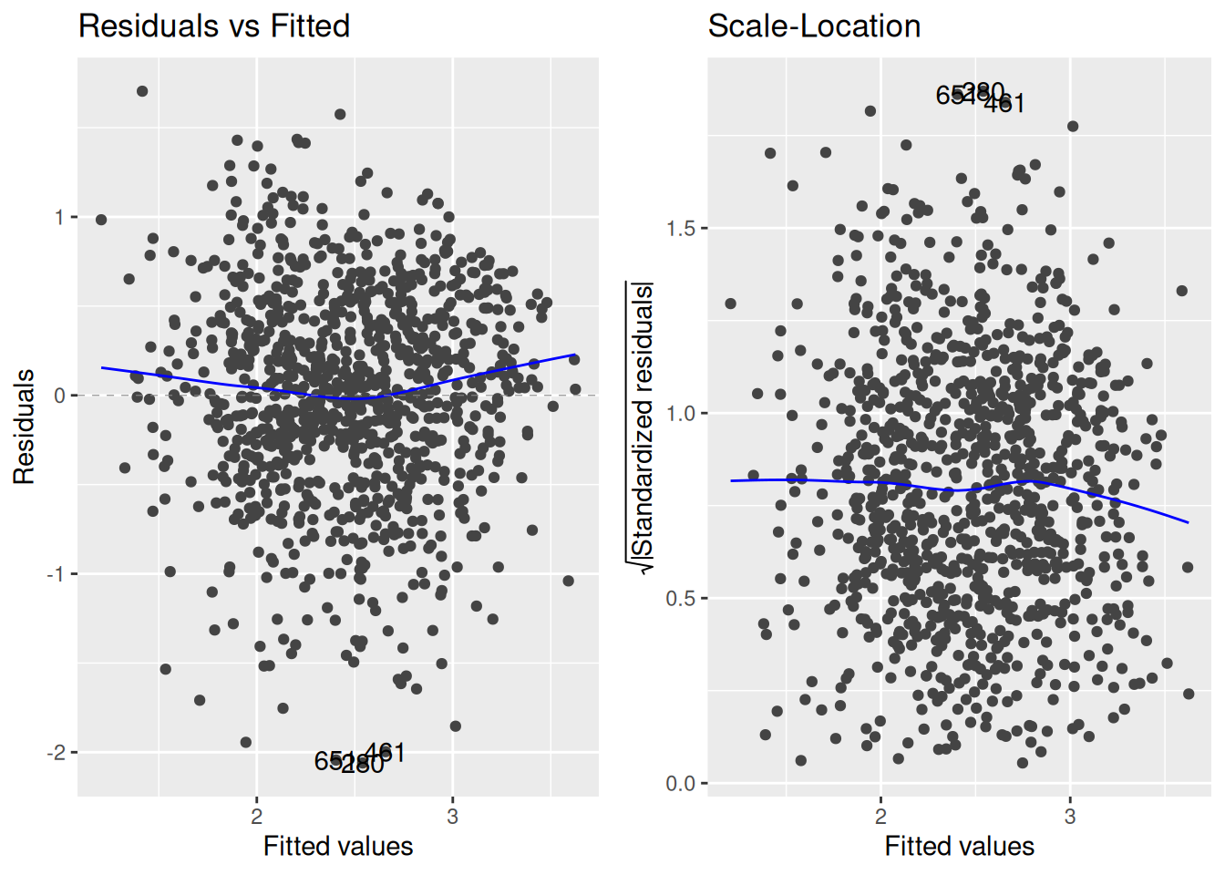
autoplot(fygpa_lm, which =c(1,3))
The above code grabs the residual and scale-location plots, which are the top-left and bottom-left of the figures produced by autoplot(). In total, there are six plots you can get from autoplot():
which = 1: the plot of the residuals against the fitted values.
which = 2: the QQ-plot of the residuals.
which = 3: the scale-location plot of the residuals.
which = 4: a plot of the Cook’s distance across the observation numbers; we will discuss Cook’s distance in Chapter 10.
which = 5: the plot of the leverage against the standardized residuals, which we will discuss in Chapter 10.
which = 6: the plot of the Cook’s distance against the leverage. Again, we will discuss this in Chapter 10.
9.8 The Independence Assumption
The final working assumption that we made to justify inference in the linear model is that the errors \(\epsilon_i\) are uncorrelated with each other. Rather than this assumption being something that we are usually interested in testing, it is often the case that we know that this assumption is violated from subject-matter considerations:
Suppose that the observations are ordered according to time. This is common in the setting of time series analysis; for example, \(Y_i\) might be the average price of a stock measured on day \(i\), and \(X_i\) might be some measures of market activity; a common goal in such a setting is to predict the price of a stock in the future. In this case, the price of a stock on day is usually correlated with the price of the stock on the following day, and because of this we usually think of \(\epsilon_i\) as being positively correlated with \(\epsilon_{i+1}\).
Similarly, observations might be related spatially. Maybe, for example, we are measuring the size of territory that male lions have access to; then, if two lions live close to each other we might expect that one having a large territory might mean that the others territory must be small, and vice-versa.
On the topic of lions, we might be measuring some basic statistics of lion cubs (e.g., size, weight, and so forth). If two lion cubs are from the same pride then we might expect for them to be correlated (if a lion cub is particularly big, we might expect that the other cubs in their pride are also big). This particular type of dependence is sometimes called clustering, and it occurs in many other settings (e.g., students might attend the same or different schools, people might go to the same or different clinics for health issues).
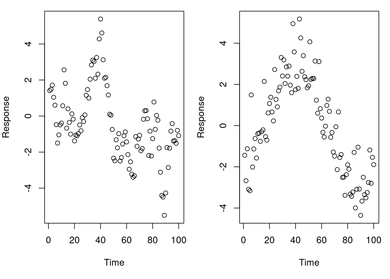
A challenge with checking for correlation is that failures of the independence assumption also tend to look like failures of other assumptions. For example, consider the following data that is measured over time:
One of these figures represents a linear relationship with correlation in the errors; the other represents a non-linear relationship. Can you tell which is which?
Because of this, violations of the independence assumption are often determined from the context of the problem rather than any formal tests. If you are analyzing time series or spatial data, for example, it is just a given that the errors will be correlated, and that special techniques will be required to address them. It is beyond the scope of this course to cover the specialized techniques you would use for analyzing time series or spatial data.
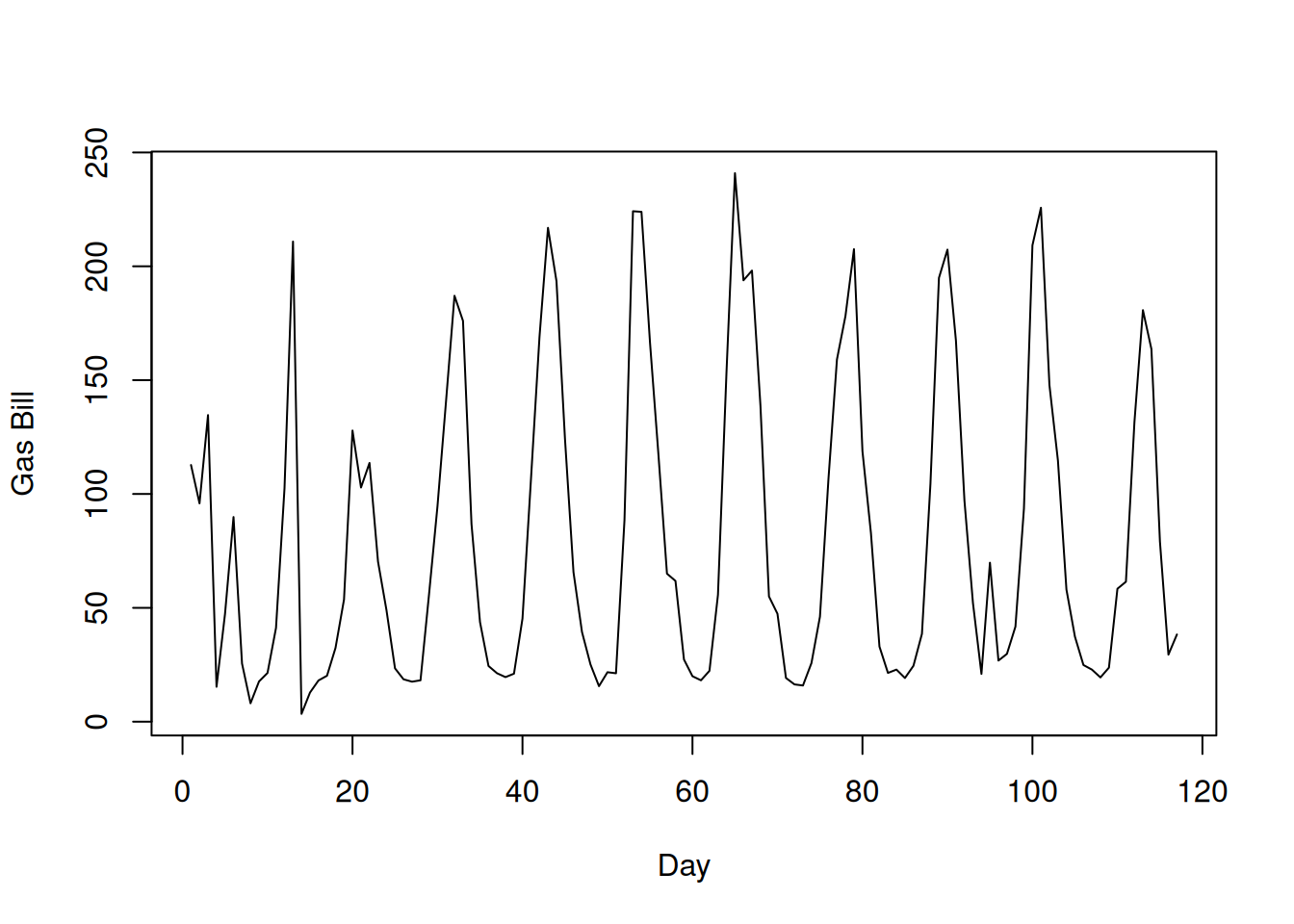
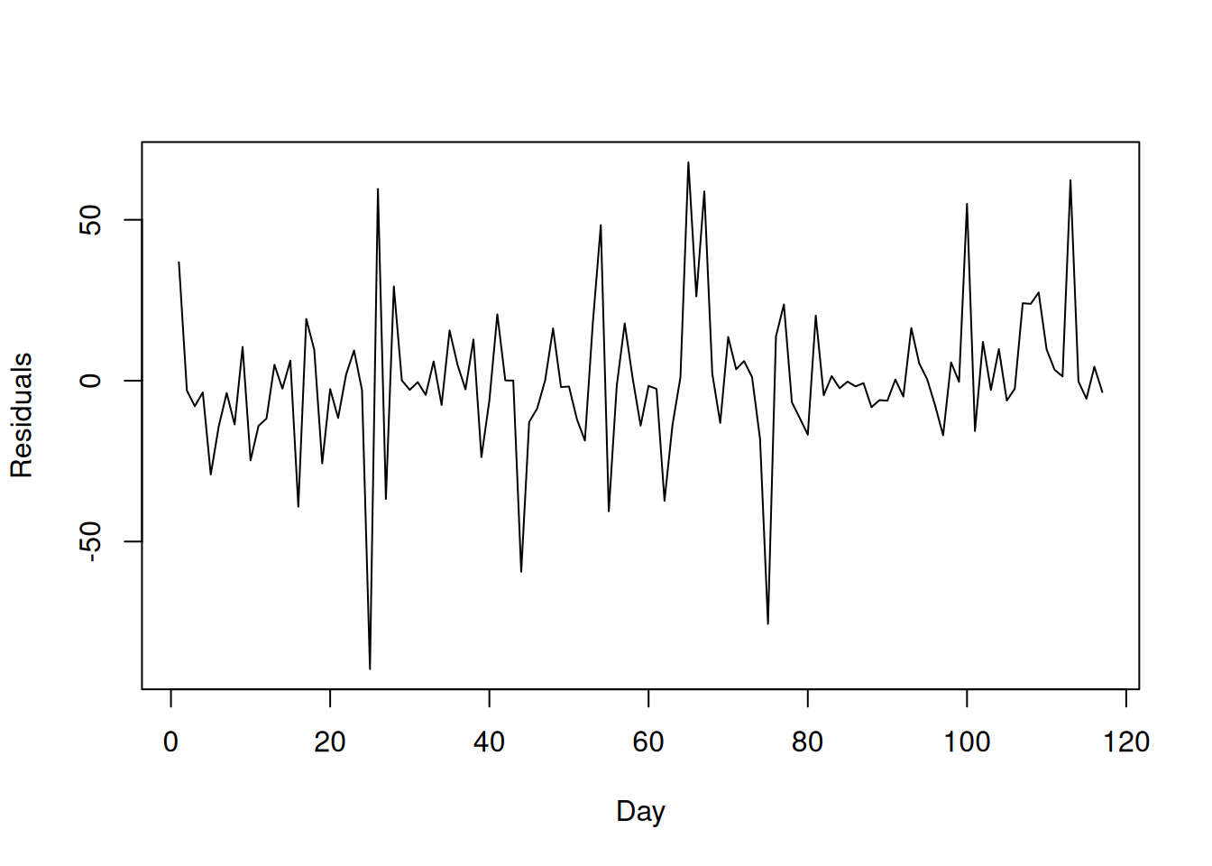
One way to check the independence assumption when observations are potentially correlated in time is to plot the residuals against time. For the utilities data, for example, the rows are actually ordered in time, and you can actually see a clear oscillatory behavior in the daily gas bill over time:
plot(utilities$gasbill, type ='l', xlab ="Day", ylab ="Gas Bill")
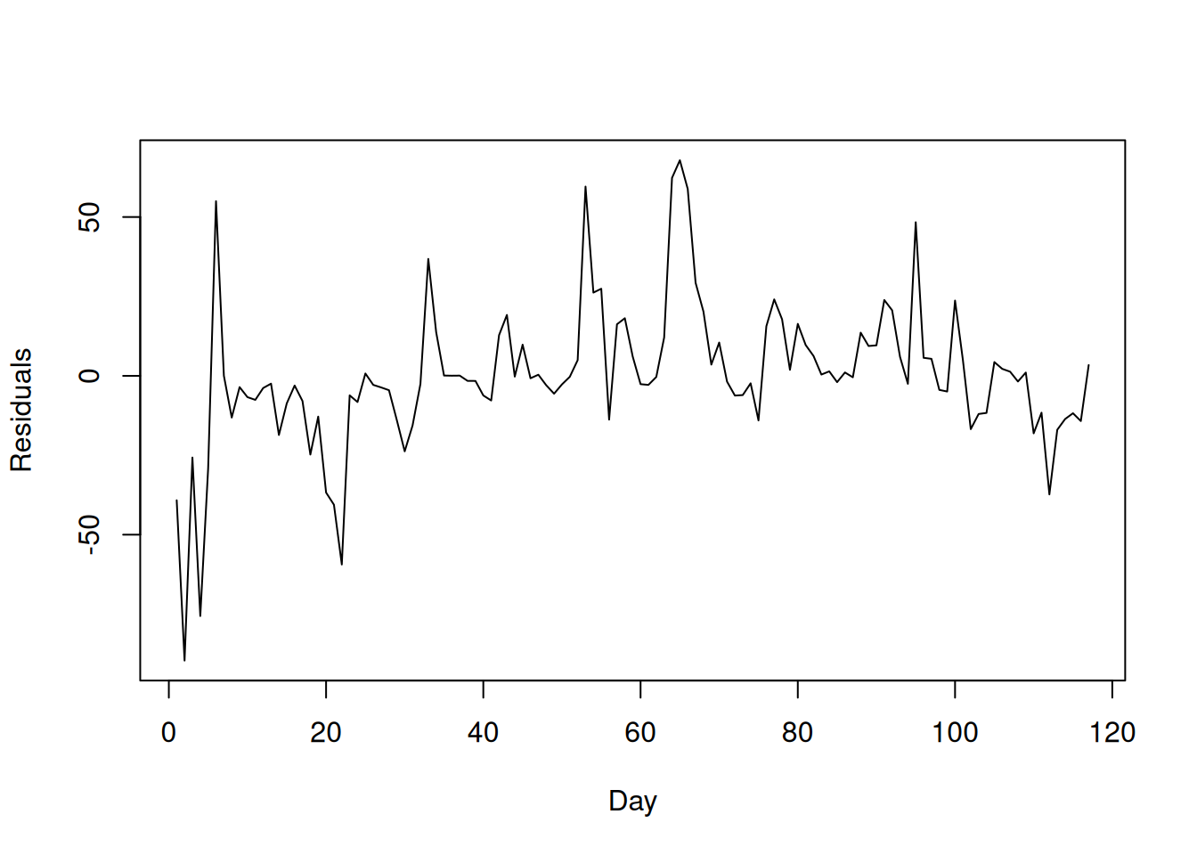
On its own, this isn’t a problem: what we can’t have is for the errors to be correlated over time, but it is OK if the independent variable is correlated over time. To see whether the independence assumption on the errors is violated, we can make a similar plot that plots the residuals against time:
What we would expect to see if the residuals are uncorrelated is that yesterday’s residual should not tell you anything about today’s residual; this does not appear to be the case here. For comparison, this is what an ideal plot would look like:
Towards the end of these notes, we will see how to account for potential correlation in the model building process by using mixed effects models. We also note that, for time series data in particular, the Durbin-Watson test is sometimes used to test for autocorrelation in the residuals, but this test is beyond the scope of this course.
9.9 The Overall Workflow
Let’s now quickly summarize how you might use the diagnostic plots in practice, as part of your linear regression workflow. The steps for actually fixing violations of the assumptions are given in Chapter 11.
Check the Linearity Assumption: plot the residuals against the fitted values and the individual predictors and see if there are any systematic deviations from the horizontal line at zero. If there is, this should be fixed before proceeding, which will be covered in Chapter 11. Otherwise, continue to the next step.
Check the Constant Variance Assumption: Plot the residuals against the fitted values to see if there is a “funnel” relationship, or look for any increasing/decreasing trend in the scale-location plot. If these exist, consider fixing the constant variance assumption as described in Chapter 11 as long as doing so does not mess up linearity.
Check the Normality Assumption: Consider making a QQ-plot if the linearity and constant variance assumption checks are passed. Residuals should lie on or close to the diagonal line; deviations suggest non-normality. If this is violated, consider fixing this if you want to make prediction intervals, provided that you can do so without messing up the linearity or constant variance assumptions.
Check the Independence Assumption: Usually, violations of independence are apparent from subject-matter considerations. In the case of time-series, you can sometimes check this by plotting the residuals against time; patterns in these plots indicate a violation of the independence assumption. If the independence assumption is violated, I would generally recommend using methods specific to time series or spatial analysis, or use a mixed effects model (mixed effects models will be covered towards the end of this course.)
9.10 Exercises
9.10.1 Exercise: Simplicity Data
The following dataset contains data on 82 psychiatric patients hospitalized for depression:
We will focus on the relationship between simplicity (which is a measure of a “subject’s need to see the world in black and white”) and depression (a self-reported measure of depression). That is, we are interested in whether a patient’s need to see the world in binary (right-or-wrong) terms is related to the severity of their depression.
Fit a linear regression model using depression as the outcome and simplicity as the predictor. Is there a statistically significant relationship between these variables? If so, interpret the relationship using the regression coefficient estimates.
Extract the residuals and fitted values from the model using residuals and fitted functions and use these to make a residual plot of the residuals against simplicity. Does there appear to be any obvious violation of the linearity assumption?
Make a scale-location plot. Does there appear to be any obvious violation of the constant variance assumption on the basis of this?
Make a QQ-plot for the residuals. Does there appear to be any evidence that the errors are not normally distributed? If so, how should this affect your conclusions?
9.10.2 Exercise: Advertising Data
Load the advertising data by running the following commands:
Fit a linear regression model that predicts sales from TV and newspaper advertising. Which independent variables, if any, have a statistically significant relationship with sales?
Use autoplot() to generate diagnostic plots. Which of the assumptions seem to be OK? Which not? Explain.
Plot the residuals against the variables TV and newspaper separately. What conclusions can you draw from these plots?
9.10.3 Exercise: Boston Data
This exercise again revisits the Boston Housing data. Load the data by running
Boston <- MASS::Boston
and re-familiarize yourself with the contents of the dataset by running ?MASS::Boston.
Create a multiple linear regression model to predict medv (median house value) using rm (the average number of rooms), lstat (proportion of “lower status” individuals in the tract), crim (per capita crime rate) and nox (nitric oxide concentration). Which variables have a statistically significant association with medv?
Use autoplot() to generate diagnostic plots. Which of the assumptions seem to be OK? Which not? Explain.
Plot the residuals against each of the individual predictors. Which variables may be contributing to a violation of the linearity assumption?
9.10.4 Exercise: Lidar Data
The following dataset comes from a light detection and ranging (LIDAR) experiment. It can be loaded by running the following commands:
## Install the aspline package if you need itlibrary(aspline)## Load the datadata("lidar")## Print the first few rowshead(lidar)
The outcome in this dataset is the log of the ratio of the light received from two laser sources (logratio), while the independent variable is the range the light traveled (range).
Plot the variable logratio on the \(y\)-axis against range on the \(x\)-axis. Before even doing any diagnostics, which of the assumptions seem most dubious? Explain your reasoning.
Fit a linear model using logratio as the dependent variable and range as the independent variable. Then make diagnostic plots using autoplot().
Interpret the residual plot, scale-location plot, and QQ-plot. Which assumptions seem to be unlikely to hold?