This chapter provides an overview of descriptive statistics. Statistics courses often differentiate descriptive statistics, which focuses on describing the data that we have collected, from inferential statistics, which focuses on trying to draw conclusions about the broader population from which the data was sampled. In this chapter, we will focus primarily on descriptive statistics, with an emphasis on computing basic summary statistics and creating some simple visualizations. In Chapter 5 we will also review inferential statistics.
3.1 Example: Grade Point Averages
As a running example, we will consider the following dataset consisting of the first year grade point average of a sample of college students among other things. This dataset was discussed in Chapter 2 and can be loaded by running the following commands:
The above code downloads the data from the internet, so it will not work if you do not have a working internet connection. If this is a concern, you can download the dataset directly to your SDS 324E project folder (clicking on the link and then using Ctrl + s works for me, while Command + s should work on a Mac).
Tip
I recommend running all of the commands in this chapter to follow along with the various things I will be doing.
At the moment, our goal is to understand in a broad sense how students tend to perform during their first year, and what types of students do well.
3.2 The Histogram
Before summarizing a variable, it is usually a good idea to look at all of the data. One way to do this is just look at all of the numbers directly:
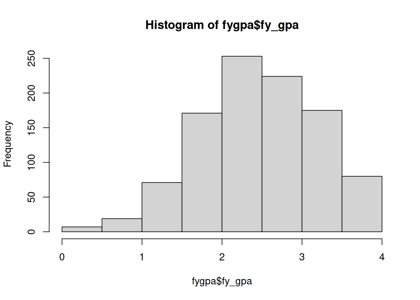
This is not very useful, however; there is just too much information displayed if we look at the raw data. A simple way to visualize this data is to instead use a histogram:
hist(fygpa$fy_gpa)
The histogram works by
dividing up numeric data into bins (in the above case, 0 to 0.5, 0.5 to 1, 1 to 1.5, etc.), then
making a barplot where the height of each bar is equal to the number of individuals in that bin.
From this, we can see that typical GPAs fall between 2 and 3. There is also a left skew in the data: there is more variability to the left of the typical GPA than to the right.
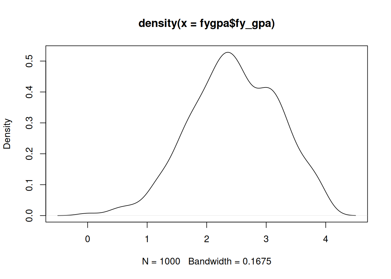
A fancier version of the histogram is the density estimator, which can be created using the plot() function with the density() function:
plot(density(fygpa$fy_gpa))
The density plot is a “smoothed” version of the histogram, and the height of the curve represents the relative likelihood of a variable taking on a given value. The area under the density curve between any two points gives the probability of observing a value in that range; for example, the area between 1.98 and 3.02 under the above curve is 0.5, indicating that about half of the students scored in this range.
In the density plot of the fy_gpa variable, we can clearly see the left skew that was identified in the histogram. The peak of the density curve, which represents the most common GPA values, lies between 2 and 3, consistent with our observations from the histogram.
3.3 The Sample Mean
The sample mean (or sample average) is a measure of the overall center of a set of data. Given numbers \(X_1, \ldots, X_N\), the sample mean is traditionally written as \(\bar X\) and is given by
The sample mean quantifies our intuition from our histogram that GPAs of around 2.5 are typical in this dataset:
mean(fygpa$fy_gpa)
[1] 2.46795
The mean is often referred to as a measure of central tendency, and is in some sense a “best guess” for what a single \(X_i\) is going to be if you were to select one of the data points randomly, i.e., if you told me you were going to select a student at random and ask me to guess their GPA, then I would guess 2.47.
3.4 The Sample Variance and Standard Deviation
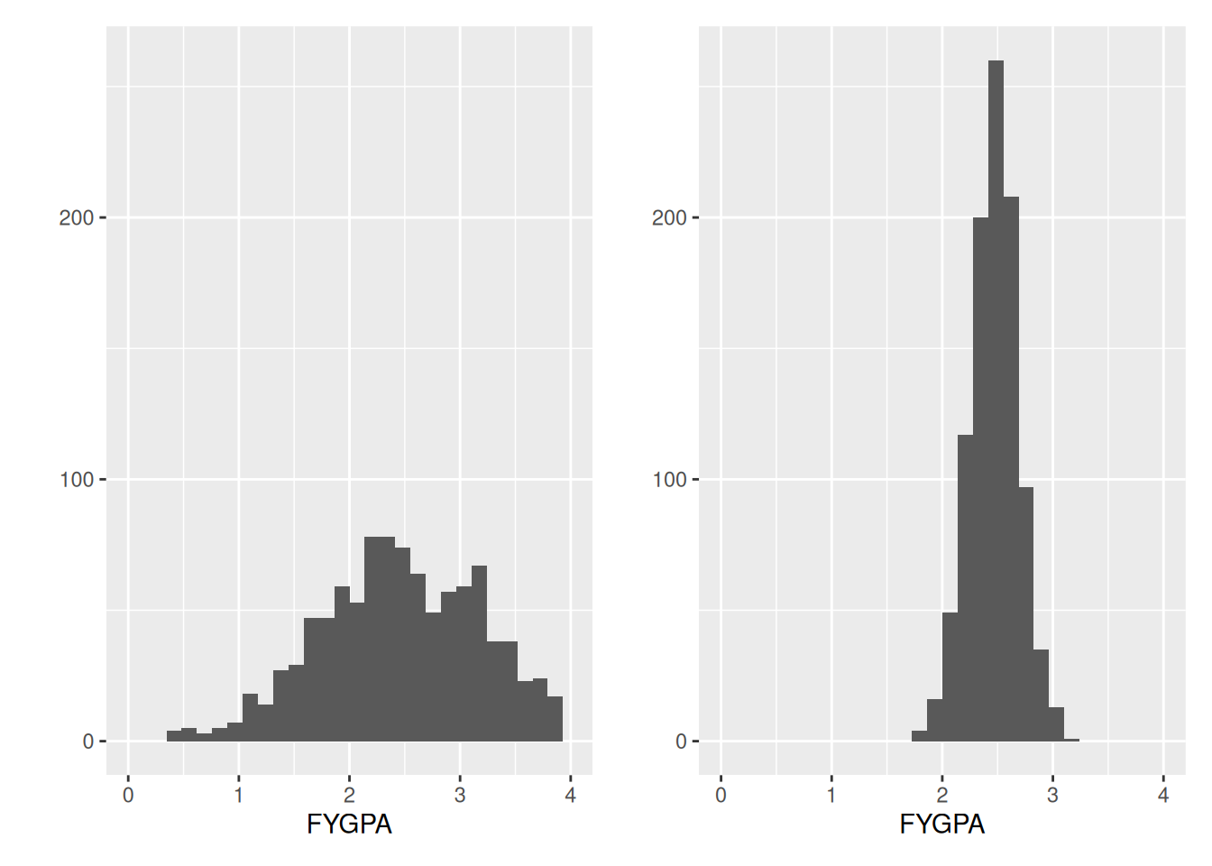
While the sample mean captures the overall center of the data on first year GPA, it does not tell us anything about how variable first year GPA is. Consider, for example, the following two datasets:
These datasets both have the same overall mean, but in some sense the dataset on the right has less variability: individuals tend to have first year GPAs that are closer to the overall average of 2.47, but there are no individuals with very low or very high GPAs.
This can be quantified in terms of the variance and standard deviation of the data. The sample variance measures the average squared distance between and observation and its mean:
Intuitively, if \(s_X^2\) is large it means that individuals tend to be far away from the average (i.e., \(|X_i - \bar X|\) is typically big) whereas if \(s_X^2\) is small it means the opposite.
Note
The denominator is \(N - 1\) rather than \(N\). The denominator is called the degrees of freedom of the numerator, and it counts the number of \(X_i\)’s you need to know, in addition to \(\bar X\), in order to compute the variance: for example, \(X_N = N \bar X - X_1 - \cdots - X_{N-1}\), so if I give you \(X_1,
\ldots, X_{N-1}\) and \(\bar X\) you will be able to compute the variance. Dividing by \(N - 1\) rather than \(N\) is required in order for this to be an unbiased estimator of the population variance \(\sigma^2_X\), which we will define later. We will also consider other similar terms in this course that involve differing numbers of degrees of freedom.
The variance has a lot of nice mathematical properties, but it is not very intuitive. One problem with it is that the units are a bit strange: the variance of the first year GPA is on the scale of grade points squared, which is unnatural. We would instead like something on the original scale. The standard deviation
\[
s_X = \sqrt{s_X^2}
\]
does this. The variance and standard deviation for the GPA data are
A common interpretation of the standard deviation that is given in some statistics classes, and that I might use from time to time, is that it is the “average distance between \(X_i\) and its average.” This isn’t quite right; it’s really the square-root-of-the-average-squared-distance, which doesn’t roll off the tongue as nicely. But these two things are almost the same thing conceptually, so we might heuristically say something like
On average, students GPAs are about 0.74 grade points away from the overall average of 2.47
even though it isn’t quite right.
3.4.1 Sums of Squares
The notion of variability comes up a lot when applying linear regression. Just to get a head start on this, we can define the total amount of variability in \(X_1, \ldots, X_N\) as \(SS_{XX} = \sum_{i = 1}^n (X_i - \bar X)^2\), in which case the sample variance can be written as
\[
s^2_X = \frac{SS_{XX}}{N - 1}.
\]
The term \(SS_{XX}\) is also called the sum of squares for\(X\) (the “SS” stands for “sum-of-squares”). At the moment, it is not obvious what this buys us, but we will see later that things become more convenient when we think in terms of sums of squares.
Exercises
Answer the following questions about the GPA dataset:
What is the average SAT verbal score of students in the fygpa dataset?
What is the variance of SAT verbal scores of students in the fygpa dataset? What about the standard deviation?
Compute both of the above by hand for the first 5 students in the dataset (i.e., pretend that the first five rows are the entire dataset, and do not use R when computing the mean/variance/standard deviation).
3.5 Visualization Workflow for Smaller Datasets
When there are not many columns of your dataset (or there are only a few variables of interest) an easy way to get a sense of what is going on is to look at visualizations of the individual variables and their relationships. I find this preferable as a descriptive tool to looking at single number summaries like the measures of central tendency or spread.
3.5.1 Plot all the pairwise relationships
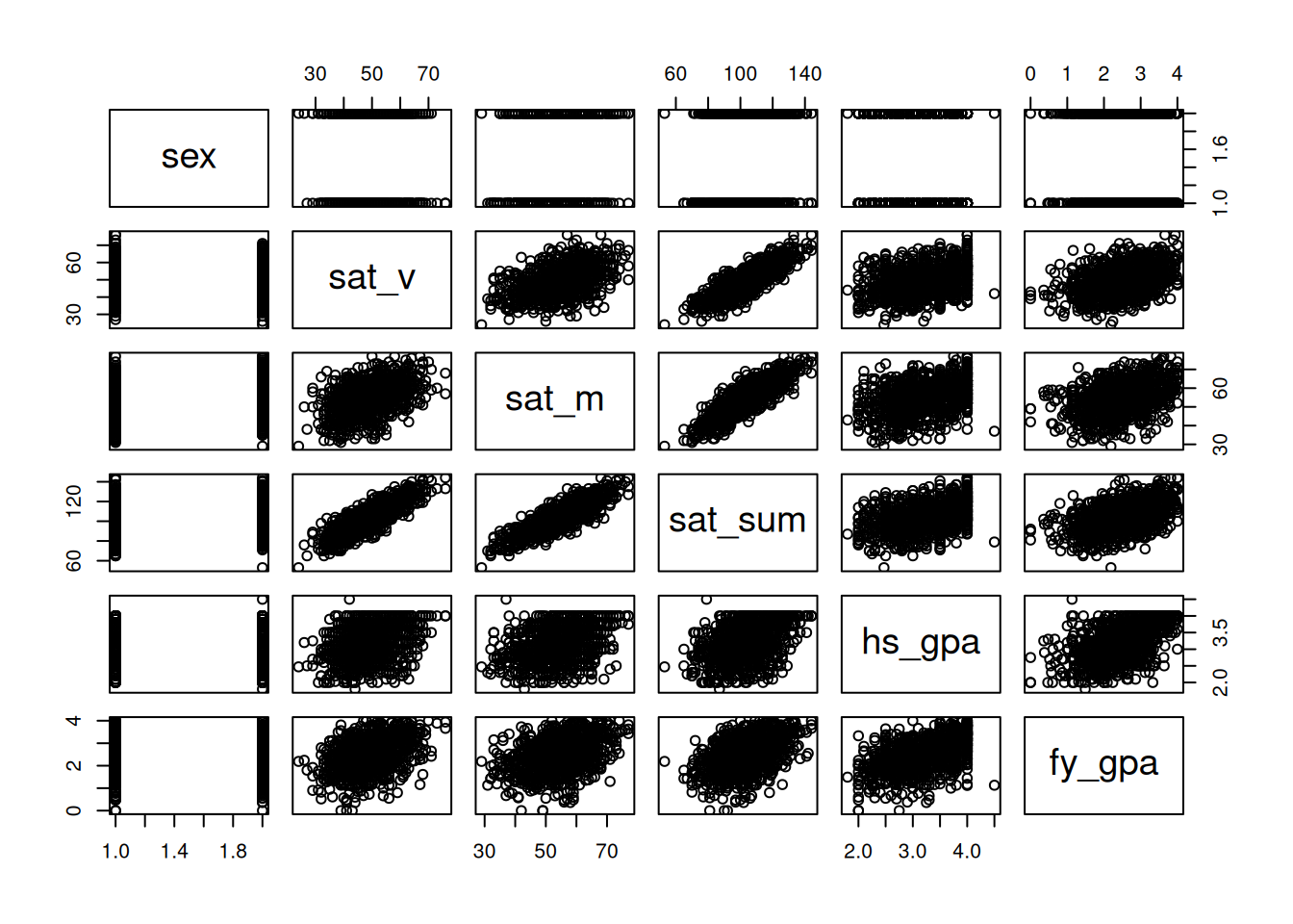
We can create a plot of each column in the dataset against each other column by just plugging a data frame into the plot() function. This creates a scatterplot matrix:
plot(fygpa)
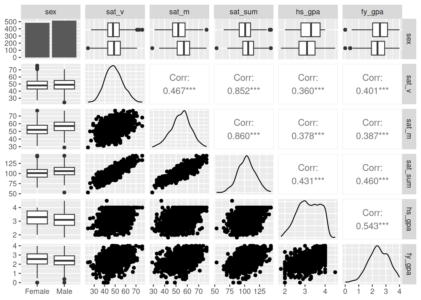
An improved version of this plot can be created using the ggpairs() function in the GGally package. Install this package now! Then run the following commands:
I used the optional argument lower = list(combo = "box_no_facet") to make boxplots appear below the diagonal as well as above. Try removing this statement and see what happens. I find this to be much easier to read, but your preference might be different! When plotting discrete variables against each other I also like the option lower = list(discrete = "colbar", combo = "box_no_facet") and upper = list(discrete = "colbar"). You can see more examples of how to use ggpairs at https://ggobi.github.io/ggally/reference/ggpairs.html.
Obviously there is a bit more going on here, but this figure has some benefits over the scatterplot matrix:
The names of the variables run along the top and the right side of the plot; to get a plot that looks at some pair, just go to the associated row/column of the matrix; for example, both (row 2, column 3) and (row 3 column 2) look at the relationship between SAT verbal and math scores.
Along the diagonal, rather than just printing the name of the variable, it gives density plots for each variable (if numeric) or a barplot (if non-numeric).
For example, we can see that the sexes are roughly evenly distributed by looking at the (sex, sex) entry of the matrix, and we can see that sat_sum is centered around 1000 points by looking at the (sat_sum, sat_sum) entry.
Below the diagonal, we see (i) a scatterplot if both variables are numeric, (ii) a collection of boxplots if one variable is numeric and the other is not, and (iii) a collection of barplots if both are discrete (not shown because we only have one non-numeric variable).
Above the diagonal, we see (i) the correlation between the variables (see the following chapter for a definition) if both variables are numeric, (ii) boxplots if one variable is discrete and the other is numeric, and (iii) another collection of barplots if both are discrete.
We see for example that the correlation between SAT math score and SAT verbal score is 0.47, and we also see that men score somewhat higher than women on the SAT math score but have somewhat lower high-school GPAs, on average.
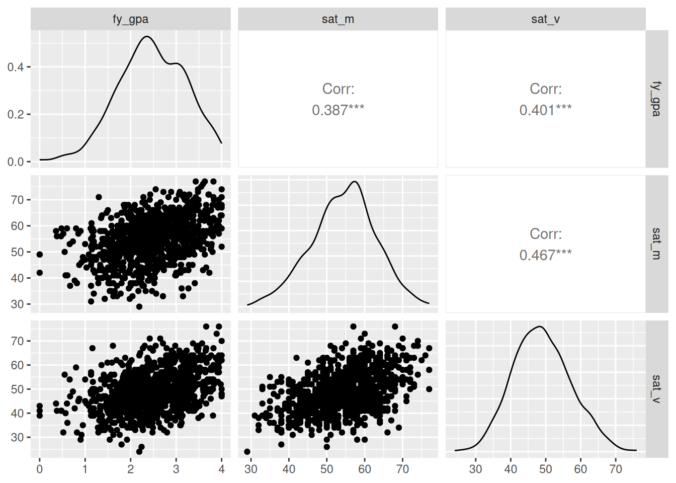
For larger datasets, you might need to look at some subsets of the columns rather than all of them together. You can do this using the subset() function as described in Chapter 2. So, for example, we might do
which makes it easier to see the relationships between these specific variables.
3.6 Other Measures
3.6.1 Quantiles and Percentiles
Other commonly used measures of central tendency or spread make use of the quantiles or percentiles of the data.
A given quantile of the data tells you the proportion of the data that lies below that value, while the percentile tells you the percent of the data that lies below that value. For example, if I tell you that the 95th percentile (or 0.95th quantiles) of SAT scores is a 1450 then this means that 95% of people scored at or below a 1450 on the SAT. A couple of important special cases include:
The 25th percentile (0.25th quantile) is called the first quartile of the data.
The 50th percentile (0.5th quantile) is called the median of the data.
The 75th percentile (0.75th quantile) is called the third quartile.
These percentiles can be extracted using the quantile() function:
quantile(fygpa$fy_gpa)
   0%   25%   50%   75%  100%
0.000 1.980 2.465 3.020 4.000
So, the 25th percentile of first year GPA is a 1.98, for example. We can also give an optional second argument to get specific percentiles:
## Get the 95th percentilequantile(fygpa$fy_gpa, 0.95)
 95%
3.67
## Get the 20th and 80th percentilesquantile(fygpa$fy_gpa, c(0.2, 0.8))
  20%   80%
1.830 3.142
3.6.2 Other Measures of Central Tendency
In addition to the mean, there are other commonly used measures of central tendency; the most commonly used alternative to the mean is the median, which is the 50th percentile.
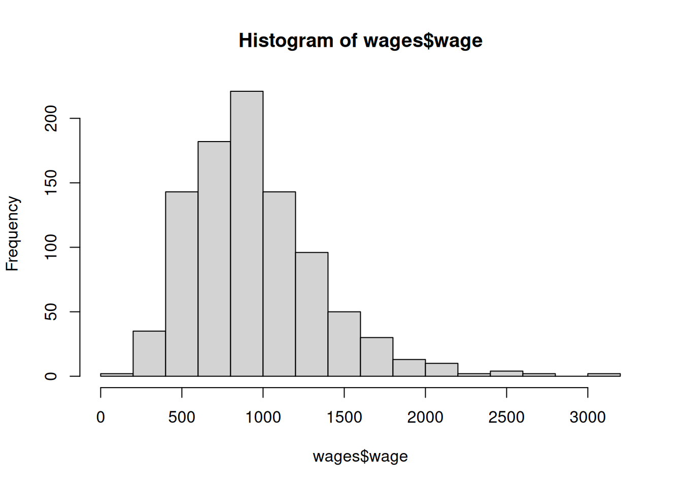
One advantage of the median over the mean is that it is less sensitive to extreme values than the mean. This is especially important, for example, with income data where extremely wealthy individuals cause the mean to be highly inflated. This is illustrated in the wages dataset:
We see that the average wage is somewhat larger (although not much larger) than the median wage in this dataset; one could imagine, however, that if we happened to include a single billionaire in this dataset that the mean would increase drastically while the median would basically be unchanged.
For the GPA data, the median outcome is
median(fygpa$fy_gpa)
[1] 2.465
which is slightly smaller than the mean.
3.6.3 Other Measures of Spread
Just like the mean (average) can be sensitive to extreme values, the same is true of the variance and standard deviation. A more robust measure of spread is the inter-quartile range (IQR), which is given by
Because of the way it is constructed, exactly 50% of the data is contained between the 75th and 25th percentiles. So the IQR is the length of an interval capable of covering 50% of the data!
The IQR() function computes the IQR as below:
IQR(fygpa$fy_gpa)
[1] 1.04
We can also get the 75th and 25th percentiles directly using either summary() or quantile():
summary(fygpa$fy_gpa)
   Min. 1st Qu.  Median    Mean 3rd Qu.    Max.
  0.000   1.980   2.465   2.468   3.020   4.000
Another name for the 25th and 75th percentiles are the “First Quartile” and “Third Quartile”. So, 50% of the students in the same have a GPA between roughly 3.0 and 2.0.
3.6.4 Boxplots Use Medians and IQRs, and Display Outliers Directly
The median and IQR are important to understand not just because they are alternatives to the mean and standard deviation, but because they appear on the boxplot and are part of the “five-number summary” (minimum, 25th percentile, median, 75th percentile, maximum) that you get with the summary() function.
Recall that the box in a box plot extends from the 25th to 75th percentile, with the median marked inside the box. The whiskers extend to the most extreme data points with 1.5 times the IQR from the quartiles. Outliers are typically defined as values
and are plotted separately as points on the boxplot.
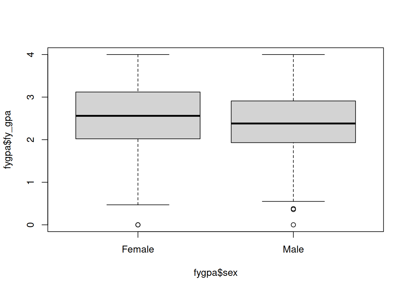
boxplot(fygpa$fy_gpa ~ fygpa$sex)
In the above figure, the box contains 50% of the data for each sex, with the bottom and top of the box given by the first and third quartiles. Then, the whiskers extend at most an additional \(1.5\) IQRs, with any points beyond 1.5IQRs being flagged as outliers. In the plot there is one outlying female and three outlying males.
3.7 Exercises
The exercises will have you deal with the wages dataset, which consists of data collected on a random sample of 935 individuals. A bit more detail on this dataset:
wage denotes the weekly earnings in dollars.
hours denotes the average number of hours worked per week.
IQ denotes the score of the individual on an IQ test (average if 100, standard deviation is 15).
educ denotes the number of years of education.
exper denotes the number of years of work experience.
tenure denotes the number of years with the current employer.
age is the age in years.
married is the marital status (Yes or No).
urban indicates whether the individual lives in an urban area (Yes or No).
sibs is the number of siblings.
birth.order is the order in which the individual was born, e.g., if the birth order is 1 then the individual is the oldest of their siblings.
mother.educ is the mother’s education in years.
father.educ is the father’s education in years.
An entry in the dataset is NA if it was not recorded; for example, respondents might not know their parents education level.
Download the wages.csv dataset from this link. You should be able to just right-click and save the file (on Chrome, click “Save Link As” and make sure to include the .csv extension). Save this to the project you made for this course in Chapter 2 and then import it into your R session as the dataset wages.
Calculate the median hours worked each week in the wages dataset and compare this to the average hours worked.
Compute the standard deviation of hours worked in the wages dataset and compare this to the IQR of the hours worked.
Make a histogram of hours worked and write down three pieces of information you can get from it.
Create a scatterplot matrix using the ggpairs() function (remember to load the GGally package first) using the variables wage, hours, educ, married, and urban. Describe one finding for
a pair of numeric variables (e.g., is there any obvious relationship between wage and hours?),
a numeric and non-numeric variable (e.g., is there any obvious relationship between wage and urban?), and
two non-numeric variables (e.g., is there any obvious relationship between marital status and urban?).