10 Influential Observations
\[ \newcommand{\bH}{\boldsymbol{H}} \newcommand{\bX}{\boldsymbol{X}} \]
10.1 The Basic Idea: Outliers and Influential Observations
In the previous chapter, we considered using model diagnostics to determine if any of our modeling assumptions were violated. This chapter will instead consider another type of diagnostics that are designed to identify influential observations and outliers.
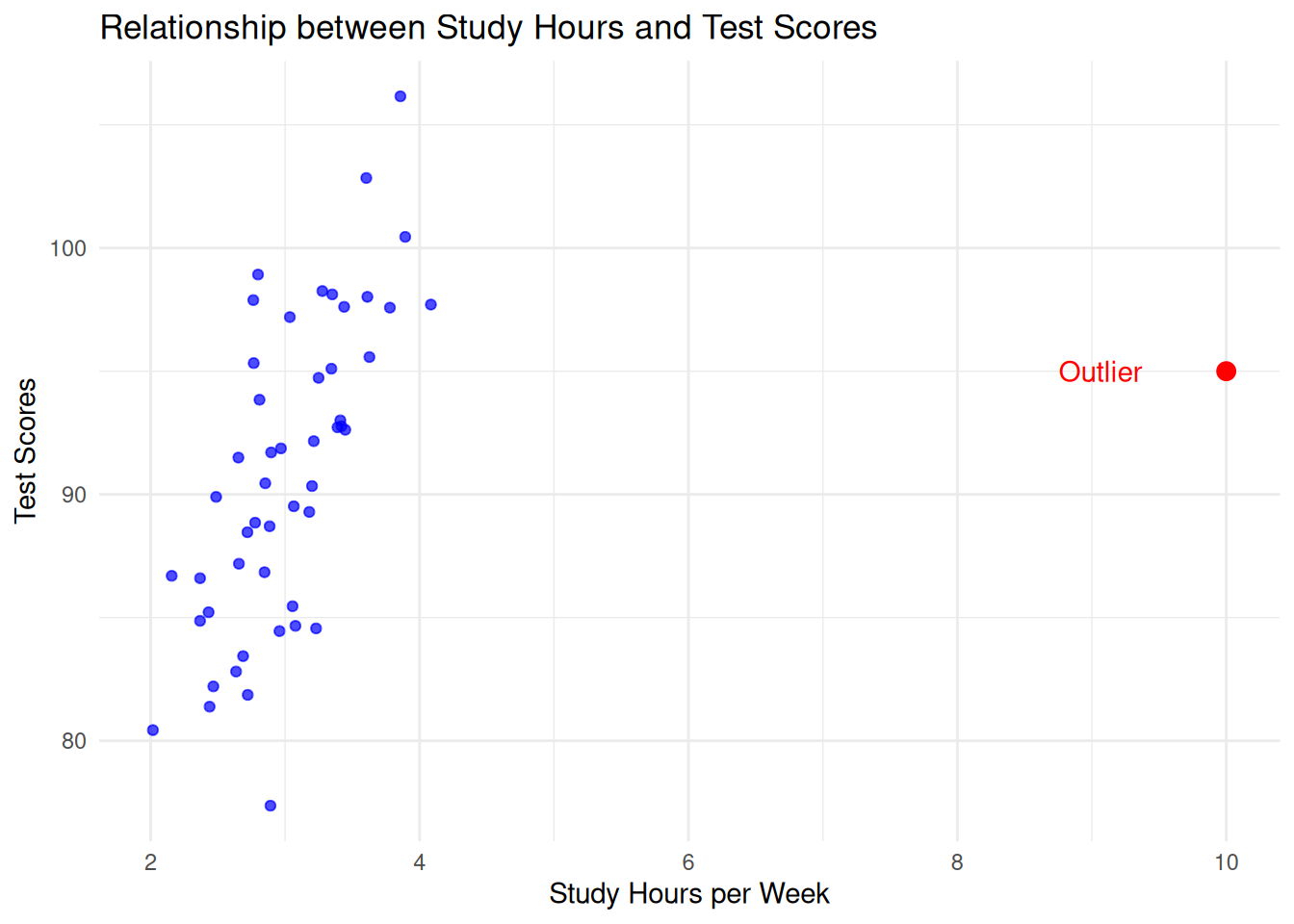
In brief, an outlier is an observation that deviates significantly from other observations in the dataset. Informally, they are “extreme” observations, and they can occur for a variety of reasons. The picture you should have in your head is something like this:
In the above figure, most students study between 2 and 4 hours, but there is one outlier that studied 10 hours. This individual has an outlying value of study hours per week, but is not an outlier with respect to test score.
We call an observation an influential observation if it not only deviates from the other observations but also has a significant impact on the regression estimator. Consider in the above example what happens when the red point is included in the analysis versus when it is removed:

Above, the red line corresponds to the regression line we get when the outlier is included, while the blue line corresponds to the line we get when the outlier is excluded. Because the outlier has a large effect on the regression line, we say that the point is influential.
10.1.1 Outlier or Influential?
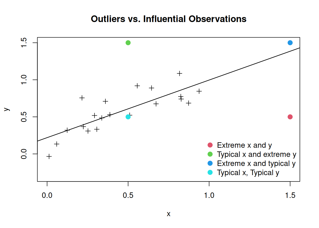
It turns out that not all outliers are influential! Some outliers in a regression may have minimal effect on the overall model, particularly if they are not “extreme” in the independent variables. In the case of a simple linear regression, there are four different possibilities: we can have an “extreme” or “typical” value of the independent variable and an “extreme” or “typical” value of the dependent variable. The following figure illustrates the possibilities:
In reality, we only really care about the impact of outliers that have a large influence on the regression line. The next figure shows the impact of deleting each of the different points on the estimated regression line:
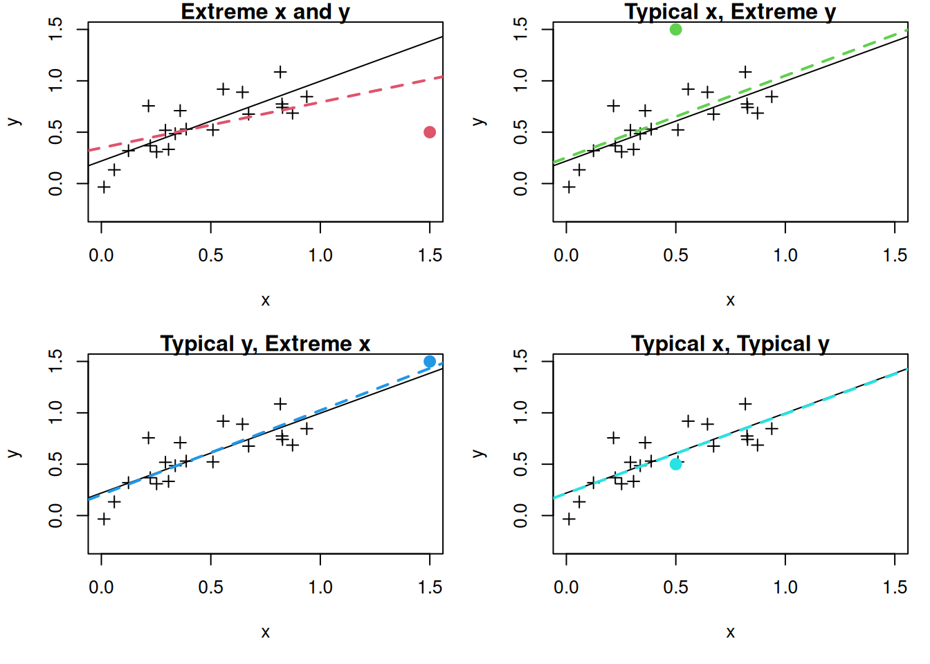
We see that the most influential observation is the one that is extreme in both the independent and dependent variables. In the other cases, deleting the observation has at most a minor impact on the regression line.
10.1.2 Case Study: Lifecycle Savings Data
We will consider the Intercountry Life-Cycle Savings Data (LifeCycleSavings), which is built into R. From the documentation:
Under the life-cycle savings hypothesis as developed by Franco Modigliani, the savings ratio (aggregate personal saving divided by disposable income) is explained by per-capita disposable income, the percentage rate of change in per-capita disposable income, and two demographic variables: the percentage of population less than 15 years old and the percentage of the population over 75 years old. The data are averaged over the decade 1960-1970 to remove the business cycle or other short-term fluctuations.
We can view the data like so:
head(LifeCycleSavings) sr pop15 pop75 dpi ddpi
Australia 11.43 29.35 2.87 2329.68 2.87
Austria 12.07 23.32 4.41 1507.99 3.93
Belgium 13.17 23.80 4.43 2108.47 3.82
Bolivia 5.75 41.89 1.67 189.13 0.22
Brazil 12.88 42.19 0.83 728.47 4.56
Canada 8.79 31.72 2.85 2982.88 2.43Our goal will be to build a model for aggregate personal savings (sr) using the other columns of the dataset (percentage of population under 15 pop15, percentage of population over 75 pop75, real per-capita disposable income dpi, and growth rate of disposable income ddpi). We first fit a multiple linear regression as follows:
lifecycle_lm <- lm(sr ~ ., data = LifeCycleSavings)
summary(lifecycle_lm)
Call:
lm(formula = sr ~ ., data = LifeCycleSavings)

Residuals:
    Min      1Q  Median      3Q     Max
-8.2422 -2.6857 -0.2488  2.4280  9.7509

Coefficients:
              Estimate Std. Error t value Pr(>|t|)
(Intercept) 28.5660865  7.3545161   3.884 0.000334 ***
pop15       -0.4611931  0.1446422  -3.189 0.002603 **
pop75       -1.6914977  1.0835989  -1.561 0.125530
dpi         -0.0003369  0.0009311  -0.362 0.719173
ddpi         0.4096949  0.1961971   2.088 0.042471 *
---
Signif. codes:  0 '***' 0.001 '**' 0.01 '*' 0.05 '.' 0.1 ' ' 1

Residual standard error: 3.803 on 45 degrees of freedom
Multiple R-squared:  0.3385,    Adjusted R-squared:  0.2797
F-statistic: 5.756 on 4 and 45 DF,  p-value: 0.0007904
10.2 Measuring the Influence of Observations
10.2.1 The Leverage
Above, we focused on simple linear regression, where it is intuitively clear what it means for an observation to have an “extreme” value of the independent variable: we can just make a plot and see visually what values look extreme, and plot the impact it has on the regression line. When there are multiple predictors it is a bit more difficult: what if an observation is outlying in one independent variable but not others?
The leverage of a point, denoted by \(h_i\), is a measure that identifies potentially influential points in your observations. It is a single-number summary of how extreme an observation is, in its predictors. Because it is a single number, looking at the leverage allows us to avoid having to think about all \(P\) independent variables at the same time.
The leverages \(h_i\) range from \(0\) to \(1\) and indicate how far away the independent variables are from their overall average. Observations with larger \(h_i\) are more extreme (in \(X\)).
(Optional) The Mathematical Definition
The leverage of observation \(i\) is given by the \((i,i)^{\text{th}}\) diagonal entry of the “hat matrix” \(\bH = \bX(\bX^\top \bX)^{-1} \bX^\top\). If you have taken linear algebra, you might recognize \(\bH\) as the projection onto the column space of \(\bX\).
As a rule of thumb, some people flag an observation as influential if \(h_i > 3 P / N\) or \(2 P / N\).
Leverage plot: The autoplot() function we have been using for diagnostics also includes a plot showing the leverage of each observation:
library(ggfortify)
autoplot(lifecycle_lm)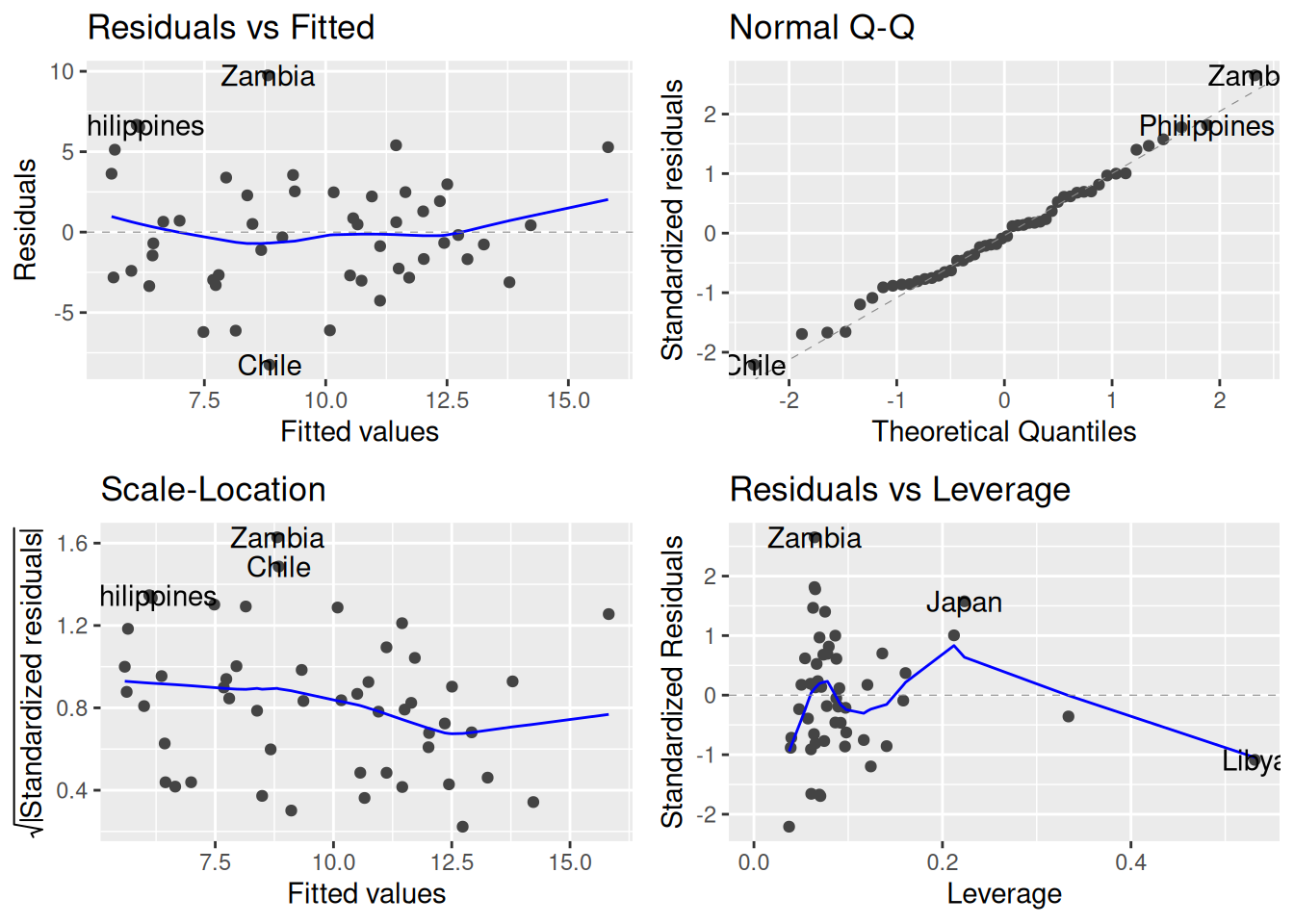
Specifically, it is this one:
autoplot(lifecycle_lm, which = c(5))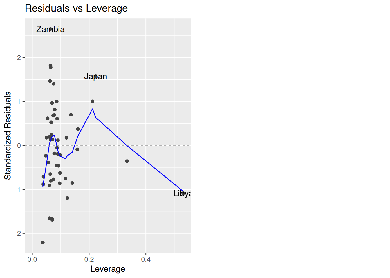
This plot gives the \(h_i\)’s on the \(x\)-axis and the standardized residuals \(r_i\) on the \(y\)-axis. Roughly speaking, observations with large \(r_i\) denote values that are outlying in the outcome while observations with large \(h_i\) are observations outlying in the predictors. The following countries are flagged as being potentially influential: Zambia, Japan, and Libya.
Next, let’s apply our rule of thumb:
N <- nrow(LifeCycleSavings)
P <- 4
3 * P / N
[1] 0.24So, values of \(h_i\) larger than 0.24 under this criterion are high-leverage. This includes Libya and another country (the United States), which has high leverage according to our rule but wasn’t flagged in the plot because it doesn’t have a large residual.
10.2.2 Influence on Predictions: dffit and dffits
A limitation of the leverage \(h_i\) is that it is a bit difficult to interpret; it measures how extreme the predictors are, but how it does so is not very transparent. A more direct way to quantify the influence of an observation is through its dffit and dffits.
dffit: The dffit metric measures the difference in the predicted response when an observation is included versus excluded from the model. It is given by
\[ \texttt{dffit}_i = \widehat Y_i - \widehat Y_{i,-i} \]
where \(\widehat Y_i\) is the fitted value using the whole data while \(\widehat Y_{i,-i}\) is the fitted value when the whole data, excluding observation \(i\) is used. Conceptually, to compute the dffit for observation \(i\) we can do the following:
- Fit a linear regression using the whole dataset and compute the prediction \(\widehat Y_i\).
- Delete the \(i^{\text{th}}\) row of the dataset.
- Refit the model on the new dataset and compute the prediction \(\widehat Y_i\).
- Subtract the new prediction from the original prediction.
(Optional) Computation
You might notice that to compute the dffit for each observation seems to require fitting \(N + 1\) linear models: we need to fit the linear model, and then fit the linear model with each of the observations deleted. This seems like it could be pretty slow, especially if we have many observations.
It turns out that it is possible to avoid actually fitting all \(N + 1\) linear models; in fact, you don’t need to compute anything beyond the original model. This is because it can be shown that
\[ \widehat Y_{i,-i} = Y_i - \frac{e_i}{1 - h_i}. \]
With a little bit of algebra, we can therefore show that \(\texttt{dffit}_i = e_i \times \frac{h_i}{1 - h_i}\). So, we do not actually need to do steps 1 – 4 to get the dffit. There are similar tricks for all of the other quantities we will be discussing in this chapter.
The dffit measures how much influence each observation has on its own predicted value. In terms of this figure:
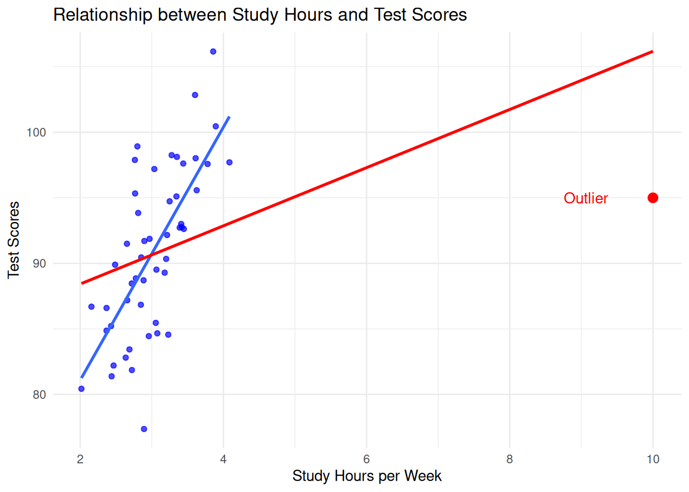
the dffit is the vertical distance between the two lines at \(x = 10\); this is quite large (the blue line extends far above the top of the graph), indicating that the outlier has a large influence.
dffits: Recall that when we looked at diagnostics for our modeling assumptions, we often worked with standardized residuals. This was important because, while the original residual had the same units as the \(Y_i\)’s, the standardized residual was unitless, and therefore could be used without needing to worry about the scale of the original data (e.g., a standardized residual of \(5\) is big, regardless of whether the data is measured in inches or in pounds).
The dffits is a standardized version of the dffit that divides by the standard error of the fitted value. It is given by
\[ \texttt{dffits}_i = \frac{\texttt{dffit}_i}{s^{(-i)} \sqrt{h_{i}}}, \]
where \(s^{(-i)}\) is the residual standard error when observation \(i\) is excluded.
Rule of thumb for dffits: A common cutoff for the dffits is
\[ |\texttt{dffits}_i| > 2 \sqrt{\frac{P + 1}{N - (P + 1)}} \qquad \text{or} \qquad |\texttt{dffits}_i| > 3 \sqrt{\frac{P + 1}{N - (P + 1)}}. \]
The justification of this cutoff is beyond the scope of this course. Alternatively, we might also look for dffits that seem “weird” when we make a plot. For example, we might plot the dffits against the standardized residuals:
lifecycle_dffits <- dffits(lifecycle_lm)
lifecycle_rstandard <- rstandard(lifecycle_lm)
plot(lifecycle_dffits, lifecycle_rstandard)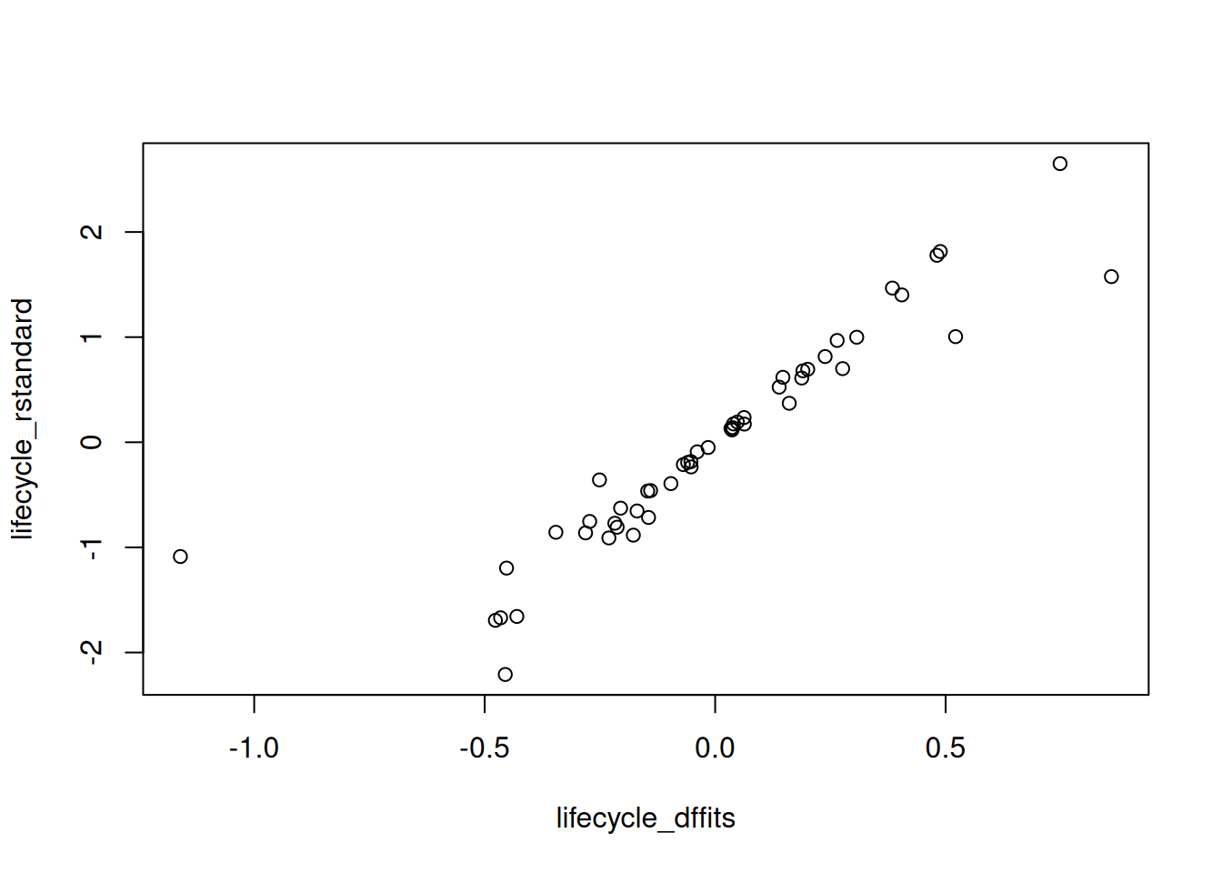
There seems to be one dffits that is weird:
subset(LifeCycleSavings, dffits(lifecycle_lm) < -1) sr pop15 pop75 dpi ddpi
Libya 8.89 43.69 2.07 123.58 16.71Again, the troublesome country seems to be Libya.
Summarizing the importance of these tools:
Leverage alone is not sufficient: A high-leverage point might not necessarily be highly influential if it aligns well with the overall trend (this is roughly what is going on with the United States, which has high leverage but a small residual). However, the same point can drastically impact predictions if it doesn’t fit the trend (the case with Libya), which dffit and dffits will reveal.
Actual Influence: dffit and dffits directly show how much an observation is altering the model’s predictions. This is crucial when evaluating model stability and reliability, making these measures practical tools for diagnostics.
10.3 Cook’s Distance
The dffit and dffits are nice because they directly quantify how much an observation impacts the fit. A limitation of these quantities is that they only describe how an observation affects its own fit. For example, in our illustration with exam grades and study time, the issue with the student that studied 10 hours is not just that the they shift the regression line at \(x = 10\), it’s that it also changes the regression line at all of the other values of \(x\) as well.
Cook’s distance provides a measure of influence of each data point on the entire regression model. It is given by
\[ D_i = \frac{\sum_k (\widehat{Y}_k - \widehat{Y}_{k,-i})^2}{(P + 1) \cdot s^2}, \]
where:
- \(\widehat{Y}_k\) is the fitted value for the \(k^{\text{th}}\) observation.
- \(\widehat{Y}_{k,-i}\) is the fitted value for the \(k^{\text{th}}\) observation when the \(i^{\text{th}}\) observation is excluded.
- \(P\) is the number of predictors.
- \(s\) is the residual standard error.
The idea here is that \(D_i\) tells us how much observation \(i\) changes all of the other fitted values; if observation \(i\) is not influential, then \(\widehat Y_k\) should be close to \(\widehat Y_{k,-i}\), and so \(D_i\) should be close to zero.
An alternate formula, which is easier to use, is
\[ D_i = \frac{e_i^2}{(P + 1) s^2} \times \frac{h_i}{(1 - h_i)^2}. \]
Rule of thumb: Larger values of Cook’s distance indicate more influential observations. There is quite a bit of variation in terms of what cutoff people recommend using
recommends a cutoff of \(D_i > 1\) or \(D_i > 0.5\) for flagging observations as influential or potentially influential.
Other sources I’ve seen recommend \(1 / N\), \(4 / N\), or other values.
Again, it can be helpful to just plot the Cook’s distances and see if there are any observations that “stick out” from the others, which we do below.
Getting Cook’s Distance: We can get a plot using Cook’s distance using autoplot as follows:
autoplot(lifecycle_lm, which = 4)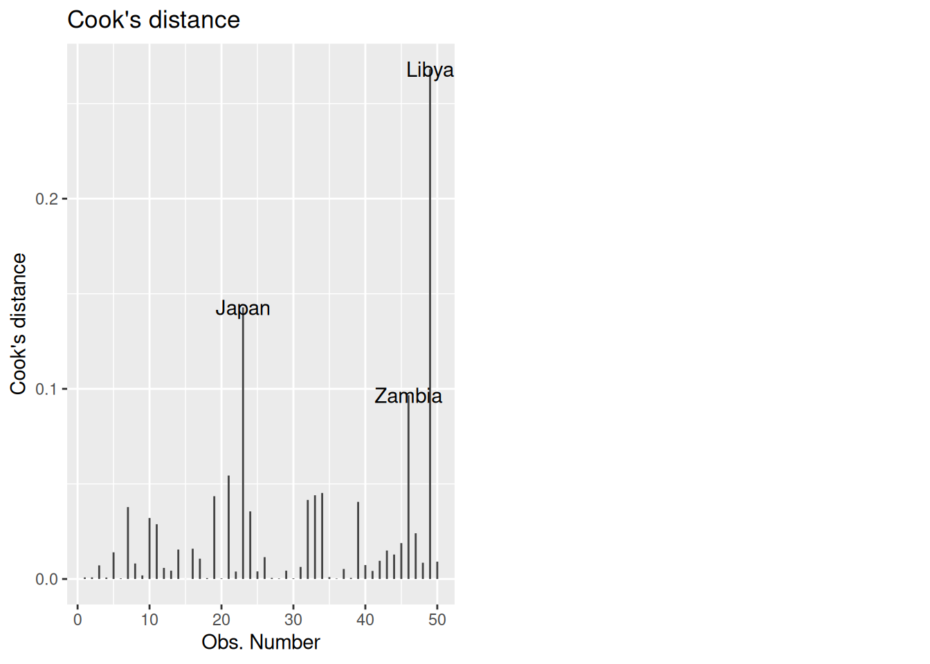
In this case, the cutoff from our rule of thumb is
4 / nrow(LifeCycleSavings)[1] 0.08So anything larger than 0.08 should be investigated. In this case, Libya, Zambia, and Japan exceed the threshold.
10.4 A Plot Showing Leverage, Studentized Residuals, and Cook’s Distance
Aside from autoplot(), a useful plot that displays the leverages \(h_i\), the studentized residuals \(t_i\), and the Cook’s distance \(D_i\) is the influencePlot() function in the package car package. It can be used as follows:
## Install car if you don't have it:
## install.packages("car")

## Load the package
library(car)

## Make the plot
influencePlot(lifecycle_lm)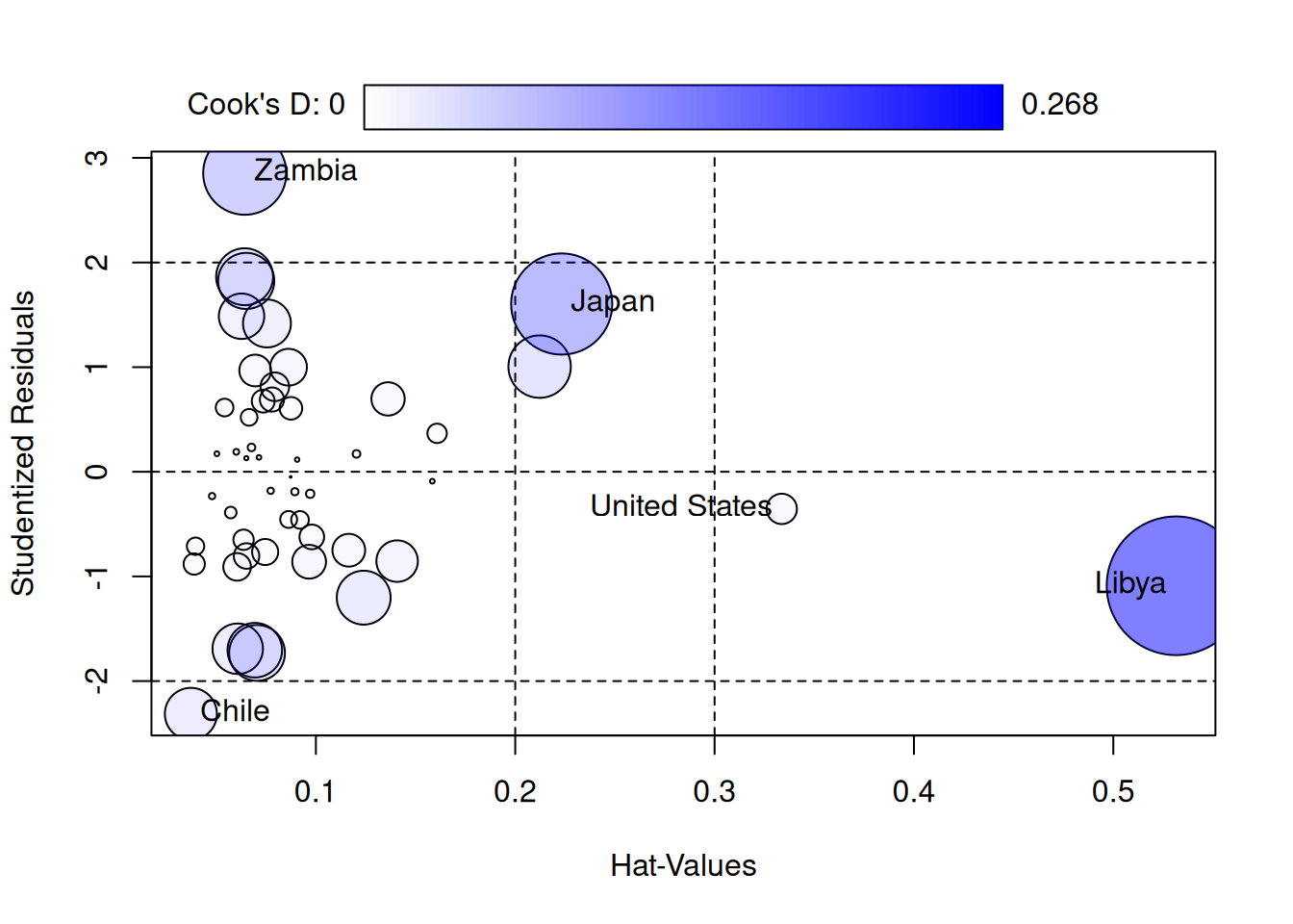
                 StudRes        Hat      CookD
Chile         -2.3134295 0.03729796 0.03781324
Japan          1.6032158 0.22330989 0.14281625
United States -0.3546151 0.33368800 0.01284481
Zambia         2.8535583 0.06433163 0.09663275
Libya         -1.0893033 0.53145676 0.26807042
This is basically the bottom-right plot of autoplot(), but it also shows the Cook’s distance as the size of the circles - on the \(x\)-axis it says “Hat Values”, which is another name for the leverage. Helpfully, it also displays some of the cutoffs for flagging outlying residuals and leverages. This combines three useful pieces of information:
- The \(h_i\)’s tell you how outlying the observation is in the independent variables.
- The \(t_i\)’s tell you how outlying the observation is in its outcome.
- The \(D_i\)’s tell you how influential the observation is on the fit of the model to the other observations.
So we see that Libya is almost the worst case scenario from an influence perspective: it is outlying in \(X\) and influences the other observations (the circle is big, indicating a big \(D_i\)). Fortunately, it isn’t outlying in \(Y\) (the \(t_i\) is around \(-1\), which is typical compared to a standard normal distribution).
10.5 Influence on Slopes: dfbeta and dfbetas
A limitation of the dffits and Cook’s distance is that they measure only the effect on the fitted values \(\widehat Y_i\), but don’t directly speak to the influence of the observations on the regression coefficients. This is important because, in many contexts, the slopes are what are of direct scientific interest rather than the predictors.
dfbeta: The dfbeta measures the change in each coefficient estimate when a specific observation is omitted. Formally, the dfbeta for observation \(i\) relative to a coefficient \(\widehat \beta_j\) is defined as
\[ \texttt{dfbeta}_{ij} = \widehat \beta_j - \widehat \beta_{j,-i} \]
where:
- \(\widehat \beta_j\) is the estimated coefficient using the full dataset.
- \(\widehat \beta_{j,-i}\) is the estimated coefficient when the \(i^{\text{th}}\) observation is excluded.
So \(\texttt{dfbeta}_{ij}\) quantifies how much the \(i^{\text{th}}\) observation influences the regression slope for predictor \(X_{ij}\). Large values of \(\texttt{dfbeta}_{ij}\) indicate that the observation \(i\) significantly changes the estimated slope.
dfbetas: As with dffit, it is a good idea to standardize the dfbeta so that we can develop a rule of thumb for whether a an observation is influential enough to be concerning. The standardized version of dfbeta is called the dfbetas, and it is defined by
\[ \texttt{dfbetas}_{ij} = \frac{\texttt{dfbeta}_{ij}}{s_{\widehat \beta_j}} \]
where \(s_{\widehat\beta_j}\) is an estimate of the standard error of \(\widehat \beta_j\).
We can interpret the dfbetas as the number of standard errors a coefficient changes when \(i^{\text{th}}\) observation is removed. A large absolute value of dfbetas indicates that the observation has a substantial influence on the estimation of that particular coefficient.
Rule of thumb for dfbetas: A common cutoff for flagging an observation as influential on \(\widehat \beta_j\) is to check if
\[ |\texttt{dfbetas}_{ij}| > 2 / \sqrt N \qquad \text{or} \qquad |\texttt{dfbetas}_{ij}| > 3 / \sqrt N. \]
We can check this using the dfbetas function:
lifecycle_dfbetas <- dfbetas(lifecycle_lm)
head(lifecycle_dfbetas)
(Intercept) pop15 pop75 dpi ddpi
Australia 0.012320146 -0.010435653 -0.02652952 0.04533888 -0.0001592338
Austria -0.010050765 0.005944185 0.04084371 -0.03671945 -0.0081822582
Belgium -0.064157019 0.051495822 0.12069946 -0.03471516 -0.0072646405
Bolivia 0.005777024 -0.012702854 -0.02252544 0.03184641 0.0406418872
Brazil 0.089730667 -0.061626457 -0.17906753 0.11996949 0.0684565105
Canada 0.005410094 -0.006750348 0.01020728 -0.03530697 -0.0026486667We can then check if any of the dfbetas exceed the threshold \(3/\sqrt N\):
N <- nrow(LifeCycleSavings)

## Subset the data to just those with a big dfbetas for pop15
## The abs() function takes the absolute value
subset(LifeCycleSavings, abs(lifecycle_dfbetas[,"pop15"]) > 3 / sqrt(N))
sr pop15 pop75 dpi ddpi
Japan 21.10 27.01 1.91 1257.28 8.21
Libya 8.89 43.69 2.07 123.58 16.71For \(\widehat \beta_{\texttt{pop15}}\) specifically, it looks like Japan and Libya are flagged as possibly concerning. We could similarly look at the other variables. For ddpi we have
subset(LifeCycleSavings, abs(lifecycle_dfbetas[,"ddpi"]) > 3 / sqrt(N)) sr pop15 pop75 dpi ddpi
Libya 8.89 43.69 2.07 123.58 16.71so just Libya.
Advantages of dfbetas:
- They provide a coefficient-specific measure of influence, allowing us to identify which observations are particularly influential for each predictor.
- They can help identify observations that might not be flagged by other influence measures but still have a substantial impact on specific coefficients of interest. We might be interested more in particular coefficients (for example,
noxin the Boston housing data) and so usingdfbetascan let us focus in on those coefficients.
10.6 What Do We Do With Influential Points?
Once we’ve identified influential observations using the methods discussed the next step is deciding how to handle them. Note that just because a point is influential does not mean that there is anything wrong! It’s perfectly reasonable to take no action, as long as you understand why the point is influential and understand its impact.
Here is a list of steps you might take after identifying an influential point:
Investigate the data point for measurement errors or errors in recording: Influential points tend to have extreme (in)dependent variables, and extreme values can occur due to measurement error. If the data point is corrupted, it should probably be removed.
Determine if removing the point changes the substantive conclusions you draw. If the influential point does not change the conclusions you want to draw, then there isn’t much of a problem with either excluding it or keeping it.
Determine if the point might be excluded for substantive reasons. Maybe, for example, you find that the observation is outlying in some predictor and, upon reflection, you aren’t substantively interested in predictors with extreme values in that predictor. For example, maybe I am interested in the number of cats that students own and its relation to happiness, but in my sample there is a cat breeder that owns 100 cats. I might identify this by looking at influence diagnostics, and decide that I don’t really care about cat breeders, and so remove the observation on those grounds.
On the other hand, the influential observation might represent a rare, but important, type of observation, and so not be excluded. In such cases, you might perform separate analysis of the “rare” cases if there are enough of them. In the specific case of Libya, a lot happened during the decade 1960 - 1970, culminating in a coup d’état that put Muammar Gaddafi in power; whether you want to include countries experiencing extreme political instability is a subject matter question that can’t be answered in general.
(Optional) Consider robust regression methods. This is beyond the scope of this course, but there are regression techniques that are better suited to handling influential observations. An example of such a method is median regression, which estimates the line that best approximates the median rather than the mean.
In all cases, it is important when performing an analysis that you document what you did with influential observations and why.
10.7 What About Libya?
For the LifeCycleSavings data, we have seen that Libya has a big influence on the coefficients. After a bit more digging around, it turns out that what makes Libya different from other countries is that it has a very large ddpi:
plot(LifeCycleSavings$ddpi,
     LifeCycleSavings$pop15,
     col = 1 + ifelse(rownames(LifeCycleSavings) == "Libya", 1, 0),
     xlab = "DDPI",
     ylab = "Percent Population Under 15",
     pch = 20)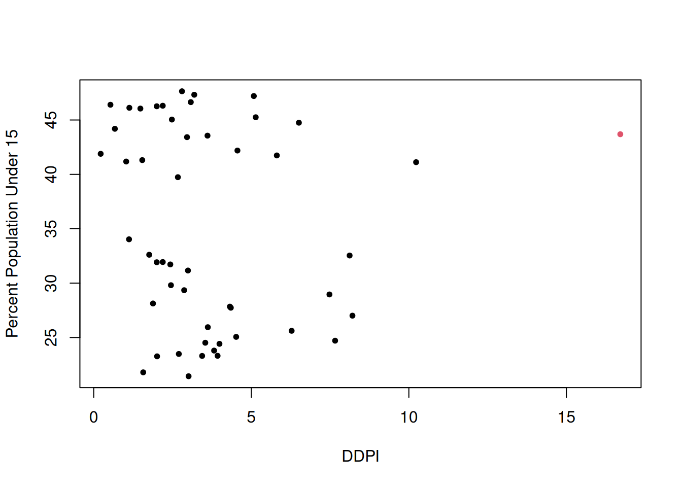
That is, at the time this data was collected, Libya was experiencing a period of very high growth in per-capita disposable income. It developed economically very quickly in the 1960s due to a growing oil industry. It was also a relatively young population, which works against savings, and usually countries with very young populations don’t have a lot of disposable income.
While Libya is influential, I don’t think on the basis of this background information that I would necessarily modify my analysis. In terms of substantive conclusions, we can compare the analysis including Libya to one excluding it:
## Subset the data to remove Libya
LifeCycleNoLibya <- subset(LifeCycleSavings,
                           rownames(LifeCycleSavings) != "Libya")

## Fit the model
lifecycle_lm_nolibya <- lm(sr ~ ., data = LifeCycleNoLibya)

## Get a summary
summary(lifecycle_lm_nolibya)
Call:
lm(formula = sr ~ ., data = LifeCycleNoLibya)

Residuals:
    Min      1Q  Median      3Q     Max
-8.0699 -2.5408 -0.1584  2.0934  9.3732

Coefficients:
              Estimate Std. Error t value Pr(>|t|)
(Intercept) 24.5240460  8.2240263   2.982  0.00465 **
pop15       -0.3914401  0.1579095  -2.479  0.01708 *
pop75       -1.2808669  1.1451821  -1.118  0.26943
dpi         -0.0003189  0.0009293  -0.343  0.73312
ddpi         0.6102790  0.2687784   2.271  0.02812 *
---
Signif. codes:  0 '***' 0.001 '**' 0.01 '*' 0.05 '.' 0.1 ' ' 1

Residual standard error: 3.795 on 44 degrees of freedom
Multiple R-squared:  0.3554,    Adjusted R-squared:  0.2968
F-statistic: 6.065 on 4 and 44 DF,  p-value: 0.0005617
And comparing this to the original fit:
summary(lifecycle_lm)
Call:
lm(formula = sr ~ ., data = LifeCycleSavings)

Residuals:
    Min      1Q  Median      3Q     Max
-8.2422 -2.6857 -0.2488  2.4280  9.7509

Coefficients:
              Estimate Std. Error t value Pr(>|t|)
(Intercept) 28.5660865  7.3545161   3.884 0.000334 ***
pop15       -0.4611931  0.1446422  -3.189 0.002603 **
pop75       -1.6914977  1.0835989  -1.561 0.125530
dpi         -0.0003369  0.0009311  -0.362 0.719173
ddpi         0.4096949  0.1961971   2.088 0.042471 *
---
Signif. codes:  0 '***' 0.001 '**' 0.01 '*' 0.05 '.' 0.1 ' ' 1

Residual standard error: 3.803 on 45 degrees of freedom
Multiple R-squared:  0.3385,    Adjusted R-squared:  0.2797
F-statistic: 5.756 on 4 and 45 DF,  p-value: 0.0007904
Including or excluding Libya leads to similar conclusions about which variables seem to be important; there is evidence supporting that having a young population leads to less savings, and having larger growth in disposable income leads to more savings. The magnitude of the evidence in favor of these conclusions varies somewhat across the two fits (i.e., the \(P\)-values are closer or further away from the usual 0.05 cutoff, depending on which model is fit).
Lacking any strong reason to exclude Libya, my own takeaways from this analysis are that pop15 seems to have moderate evidence for an effect (controlling for all other variables), that there is weak evidence supporting ddpi (controlling for all other variables), and no evidence supporting the other variables.
10.8 Exercises
10.8.1 Mobility Data
The following data is borrowed from https://www.stat.cmu.edu/~cshalizi/mreg/15/ from unknown origins. It is described below:
The data file mobility.csv has information on 729 communities. The variable we want to predict is economic mobility; the rest are predictor variables or covariates.
Mobility: The probability that a child born in 1980–1982 into the lowest quintile (20%) of household income will be in the top quintile at age 30. Individuals are assigned to the community they grew up in, not the one they were in as adults.
Commute: Fraction of workers with a commute of less than 15 minutes.
Longitude: Geographic coordinate for the center of the community
Latitude: Ditto
Name: the name of principal city or town.
State: the state of the principal city or town of the community.
An important hypothesis for the researchers who gathered this data is that short commuting times lead to higher rates of social mobility. In this assignment, we will not be concerned with their explanation of how this might work, but just with whether there really is such a connection.
We first load the data:
fn <- "https://github.com/theodds/SDS-348/raw/master/mobility.csv"
mobility <- read.csv(fn)[,-1]
head(mobility)
Name Mobility State Commute Longitude Latitude
1 Johnson City 0.06219881 TN 0.325 -82.43639 36.47037
2 Morristown 0.05365194 TN 0.276 -83.40725 36.09654
3 Middlesborough 0.07263514 TN 0.359 -83.53533 36.55154
4 Knoxville 0.05628121 TN 0.269 -84.24279 35.95226
5 Winston-Salem 0.04480079 NC 0.292 -80.50533 36.08128
6 Martinsville 0.05183585 VA 0.313 -80.29411 36.70059Fit a model using
Mobilityas the outcome andCommuteas a predictor. Then look at diagnostic plots for this usingautoplot. Which of the usual assumptions underlying a linear regression model appear to be violated?Based on the output, which observations have the highest leverage? Then, using the output of
influencePlot()(from thecarpackage) determine if these points are also influential (or not).For the most influential point, use the
dfbetasfunction to assess the impact of this point on the estimated regression coefficient. Interpret the results. (Hint: recall that thedfbetasfunction returns how much including the observation shifts the estimated coefficient, in terms of the number of standard errors it changes; that is, it is \((\widehat{\beta} - \widehat\beta_{-i}) / s_{\beta}\) where the \(-i\) notation denotes removing row \(i\) from the data set) . If you find this difficult to interpret, you may also use thedfbetafunction instead, which gives how much the regression coefficient is changed by deleting the observation.)Now, make a scatterplot of the data (
Commuteon the x-axis andMobilityon the y-axis). Then, add both the estimated regression line for the full data and the estimated regression line you get when you delete the most influential observation. What is the impact of the most influential point on the line? On a practical level, does this amount of influence seem concerning to you?