We now move onto the main topic of this course, which is using linear regression to answer scientific/forecasting/policy questions. In this chapter, we develop simple linear regression, which fits a line to the data:
\[
y = mx + b
\]
This is the version of the formula that you probably saw before college when you learned about equations for lines. In statistics, the convention is to use slightly different symbols and instead write
\[
y = \beta_0 + \beta_1 \, x
\]
where now \(\beta_0 = b\) is the y-intercept and \(\beta_1 = m\) is the slope.
Tip
Writing \(y = mx + b\) or \(y = \beta_0 + \beta_1 \, x\) doesn’t change anything, we are just using different symbols. We need to write it the second way because that is how it is always written by statisticians.
What makes this model “simple” is that it only considers two variables: an “independent” or “predictor” variable \(x\) and a “dependent” or “outcome” variable \(y\).
4.1 Estimates? Population Parameters?
In the other statistics courses you have taken, a big distinction was probably made between the population parameters and their estimates. For example, you should have seen problems where you assume that your data \(Y_1, \ldots, Y_n\) come from a normal distribution with some mean \(\mu\) and some variance \(\sigma^2\), with the goal of estimating \(\mu\); for example, the \(Y_i\)’s might consist of the observed heights in a random sample of students, and we want to estimate the average height \(\mu\) of a student selected at random from the entire population of students.
The population quantity \(\mu\) (sometimes called a population parameter) would usually be estimated with a statistic\(\bar Y = \frac{1}{n} \sum_i Y_i\), i.e., with the average in the sample that you have. Some differences between parameters and statistics are:
We never actually get to see the true values of the population quantity \(\mu\), unless we happen to have measured the entire population.
Usually, the population quantities are treated as non-random - we don’t know what they are, but they are fixed quantities. If we re-did our experiment, and collected a new sample of students to measure their heights, \(\mu\) would not change
By contrast, the statistic \(\bar Y\) is known to us: it depends only on the data that we collected.
Usually, we treat \(\bar Y\) as random - we took a random sample of the population to construct \(\bar Y\), so if we re-did our experiment we would get a different \(\bar Y\).
4.1.1 Parameters and Estimates for Linear Regression
At the moment, we will not be making any assumptions about the data or the population it is coming from. But it’s still useful to make the distinction between estimates and population quantities.
By convention, \(\beta_0\) and \(\beta_1\) refer to population quantities.
The estimates of \(\beta_0\) and \(\beta_1\) are, respectively, written \(\widehat \beta_0\) and \(\widehat \beta_1\): these are read as “beta zero hat” and “beta 1 hat”, with “hat” referring to the funny symbols that are above \(\beta_0\) and \(\beta_1\).
You can think of the line \(Y = \beta_0 + \beta_1 \, X\) as “the line you would get if you had access to the entire population” and the line \(Y = \widehat \beta_0 + \widehat \beta_1 \, X\) as “the line we get based on the sample we have taken.” In the next chapter we will be a bit more precise about what exactly this means.
4.2 A Quick Example: GPAs
Let’s revisit the GPA that we looked at in detail in Chapter 3.
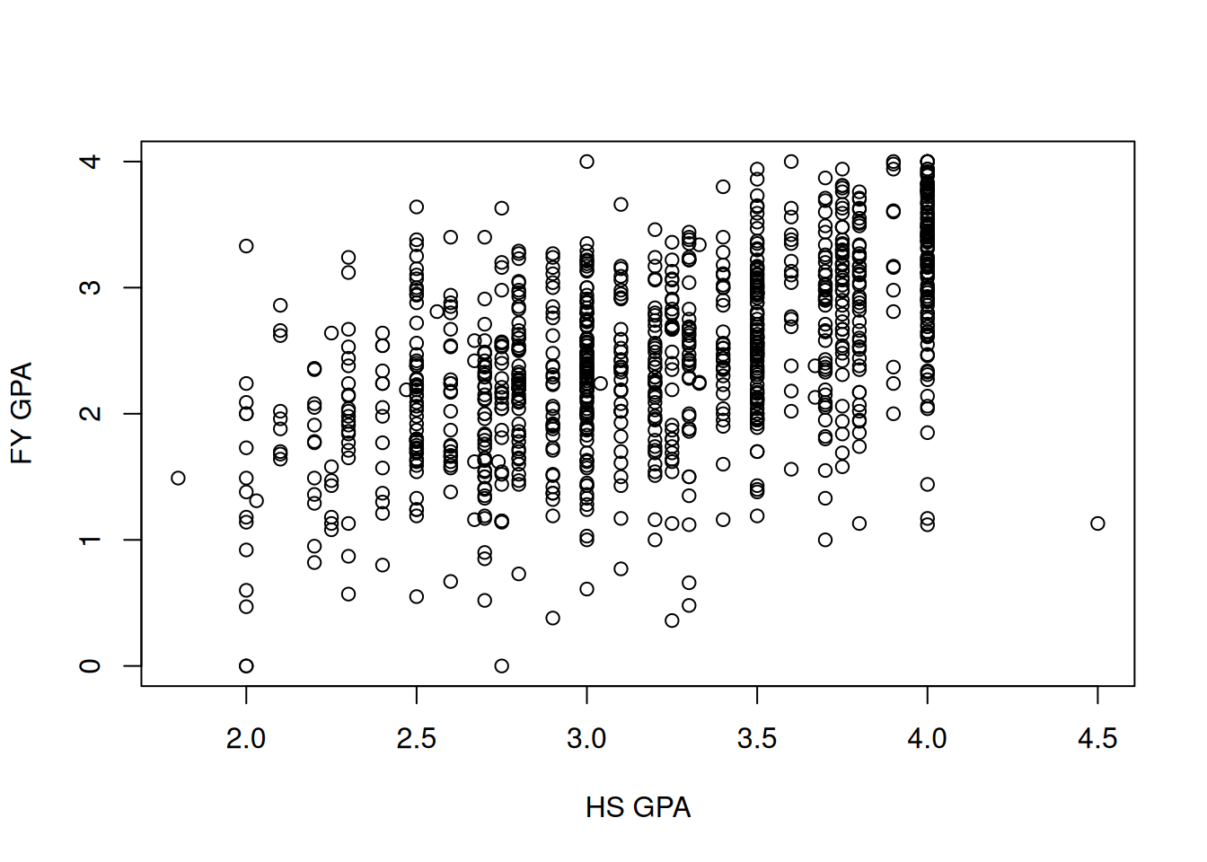
As a starting point, we might want to know the answer to the following question: “if an individual has a high-school GPA of \(x\) points, what is your best guess at their first year college GPA?” As usual, we should start with a plot:
Unsurprisingly, it looks like if you have a large high school GPA then you will tend to have a larger college GPA. But there is a lot of variability: some people with a 4.0 GPA in high school end up doing very poorly in college! Similarly, it looks like some people with a 2.0 GPA end up doing substantially better in college. This chapter will be concerned with quantifying and studying this relationship.
4.2.1 Review: Interpreting the Slope and Intercept
In the simple linear regression model \(y = \beta_0 + \beta_1 \, x\), the quantities \(\beta_0\) (the intercept) and \(\beta_1\) (the slope) have specific interpretations.
Intercept\(\beta_0\): This is the predicted value of \(y\) when \(x\) is 0. In the context of our GPA example, \(\beta_0\) would represent the predicted first year college GPA for a student who had a high school GPA of 0. While this value might not be practically meaningful, it is a necessary part of the regression equation.
Slope\(\beta_1\): This represents the change in the predicted value of \(y\) for a one-unit increase in \(x\). In our example, \(\beta_1\) would indicate how much we expect the first year college GPA to increase for each one-point increase in high school GPA.
4.2.2 Preview: What Happens with GPA?
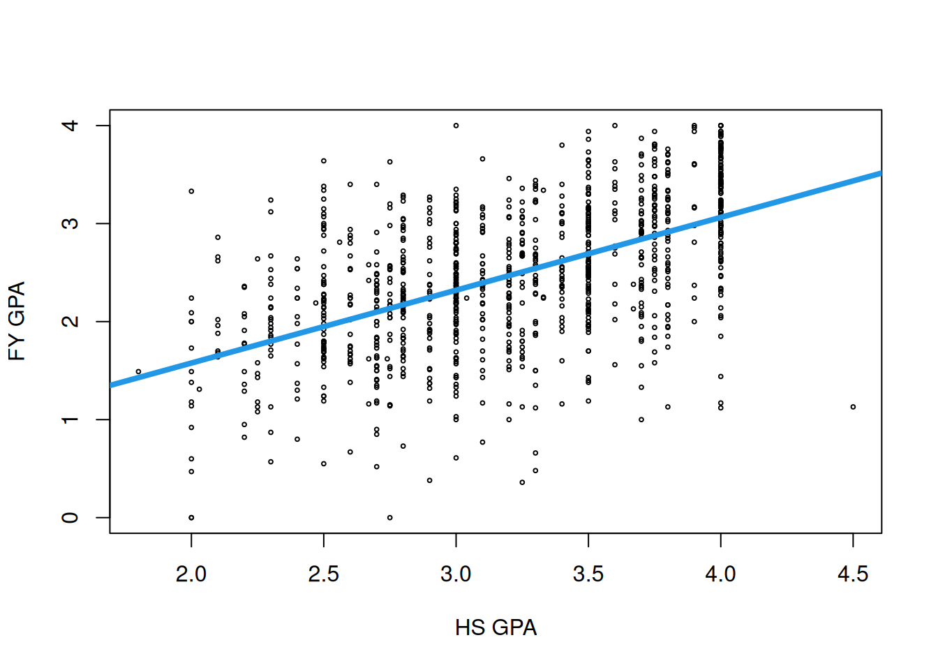
After going through this chapter, you will be able to fit a line to any dataset with a single independent variable (or predictor) \(x\) and a single numeric outcome \(y\). In the case of the GPA data, the relationship we get looks like this:
To get a handle on what information this is communicating, let’s look at some specific values:
This line predicts that someone with a high school GPA of 4.0 will have a first-year GPA of \(0.0913 + 0.743 \times 4.0 = 3.06\).
Similarly, a student with a high school GPA of 3.0 is predicted to have a first-year GPA of \(0.0913 + 0.743 \times 3.0 = 2.32\).
Finally, a student with a high school GPA of 2.0 is predicted to have a first-year GPA of \(1.58\).
Interpreting the intercept: The intercept of the line is 0.0913, which is the predicted first-year GPA of a student with a GPA of 0 points in high school. Note that there are no students in the sample who had a high school GPA this low, so we should treat this prediction skeptically!
Interpreting the slope: The slope of the line is 0.743. What this means is that if we take two students, one of whom has a high school GPA that is one point higher than the other, then the model predicts that the student with the higher high school GPA will have a first-year GPA that is 0.74 points higher than the other student.
4.3 Covariance
One way of trying to be more quantitative about whether two variables \(X\) and \(Y\) as associated with each other is to look at the covariance between them. The sample covariance between \(X\) and \(Y\) is given by
Admittedly, this expression is not very intuitive in terms of what it is communicating to us. Roughly speaking, the idea is the following:
Suppose that when \(X\) is “big” then \(Y\) also tends to be “big.” We might say that \(X\) is positively associated with \(Y\) if this is the case, whereas if the opposite is true (big \(X\) means small \(Y\)) then we say the variables are negatively associated.
“Big” is a bit vague; let’s say “big” means “bigger than the average.” In math, this would mean \(X_i > \bar X\). So, if both variables are “big” we would have \((X_i - \bar X)\) and \((Y_i - \bar Y)\) both positive; similarly, if both variables are “small” we would have \((X_i - \bar X)\) and \((Y_i - \bar Y)\) negative.
So, if \(X\) and \(Y\) are positively associated, we should expect \((X_i - \bar X)(Y_i - \bar Y)\) to be a positive number. On the other hand, if they are negatively associated, we should expect \((X_i - \bar X)(Y_i - \bar Y)\) to be negative.
This is the motivation for looking at the expression \((X_i - \bar X)(Y_i - \bar
Y)\); after doing this, we are just taking the average.
Tip
Summarizing the above discussion: if \(X\) and \(Y\) are positively associated (as in the GPA data example), then the covariance should be positive; if they are negatively associated then the covariance should be negative.
For the most part we will not directly be looking at the covariance, so do not worry too much if you find it unintuitive! It is an important mathematical quantity, but most of the time we look at covariances we won’t worry about interpreting them directly.
4.3.1 Computing Covariance in R
The sample covariance can be computed using the cov function in R:
cov(fygpa$hs_gpa, fygpa$fy_gpa)
[1] 0.2180234
The covariance is positive, so we can conclude that high school GPA and first year GPA are positively associated (big high school GPA predicts big first year GPA).
4.3.2 Sums of Squares
Like the variance, the covariance is often written in terms of sums-of-squares. Recall that we defined the sum of squares
\[
SS_{XX} = \sum_{i = 1}^N (X_i - \bar X)^2.
\]
This sum of squares is a special case of a more general definition:
so that the covariance can be compactly written as \(s_{XY} = SS_{XY} / (N-1)\).
4.4 The Correlation Coefficient
Rather than thinking in terms of the covariance, it is more typical to think in terms of the correlation between \(X\) and \(Y\). The sample correlation (also called the Pearson correlation) between \(X\) and \(Y\) is given by
The sample correlation has several properties that make it useful as a measure of how strongly associated \(X\) and \(Y\) are:
\(r\) does not have any units, so it has the same meaning regardless of what two variables you are working with (i.e., a correlation of \(r = 0.5\) means the same thing whether you are talking about grade point averages or heights/weights, etc). It also does not matter what units you use to measure the variables: if you decide to measure a distance \(X\) and volume \(Y\) then it will not matter if you measure in miles/cups or kilometers/liters, as you will get the same answer.
\(r\) always lies between \(-1\) and \(1\), with negative \(r\) corresponding to negative associations, positive \(r\) corresponding to positive associations, and \(r = 0\) corresponding to no (linear) association.
An \(r\) of either \(-1\) or \(1\) corresponds to a perfect linear association: if \(r = 1\) then you can write \(Y = mX + b\)exactly so that all \((X_i, Y_i)\)’s lie exactly on a straight line.
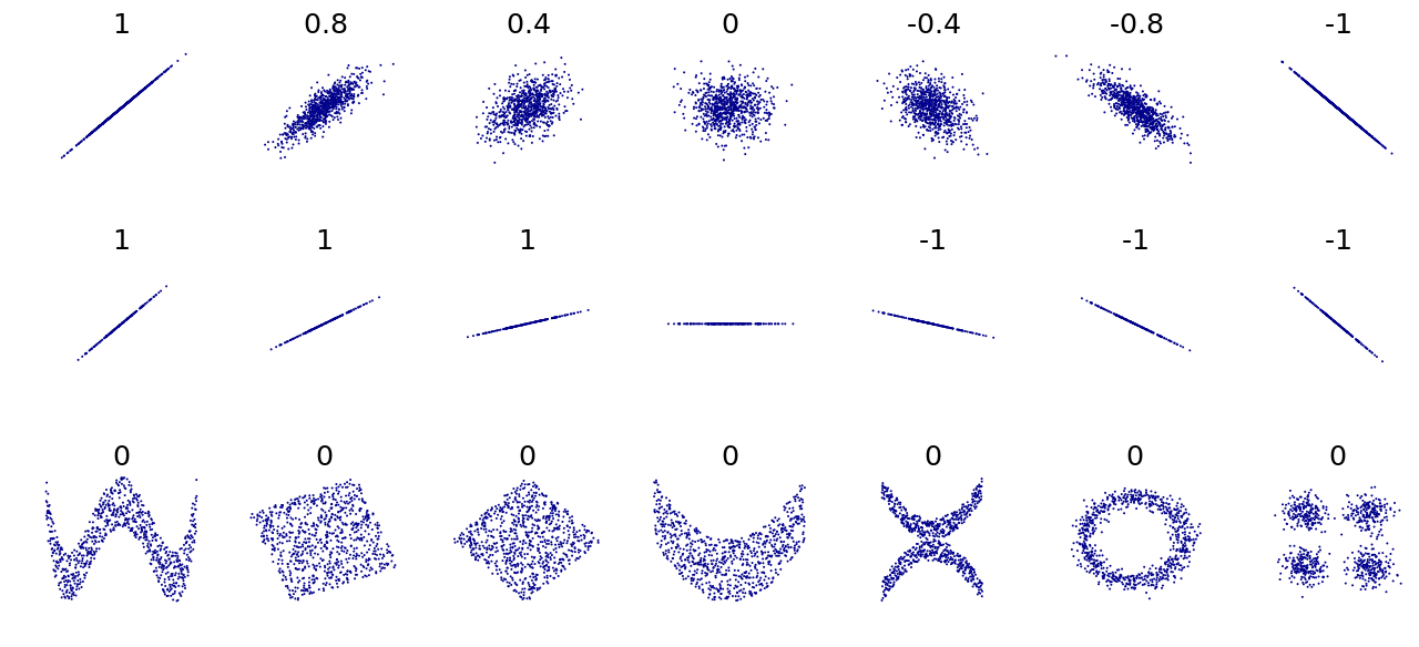
To get an intuitive sense of what \(r\) is telling us, the following figure gives a plot of different scatterplots corresponding to different values of \(r\):
Image taken from wikimedia commons, https://commons.wikimedia.org/wiki/File:Correlation_examples.png
We can see from the above figure that \(r\) does a good job of capturing what we intuitively think of as positive and negative association when the data looks like one of the point clouds we have been looking at. On the other hand, \(r\) only seems to work well when there is a linear relationship between the variables, i.e., there seems to be a straight line that captures how one variable changes with the other.
The bottom row shows some scatterplots where we have \(r = 0\), but where there is a clear non-linear relationship between the variables. In view of these examples, you should keep the following points in mind:
Just because \(r = 0\) does not mean that there is no relationship between the variables; it might just be that the relationship is non-linear.
Conversely, just because \(r\) is close to \(1\) or \(-1\), this does not mean that the relationship between \(X\) and \(Y\) is entirely linear; there still might be a large non-linear component.
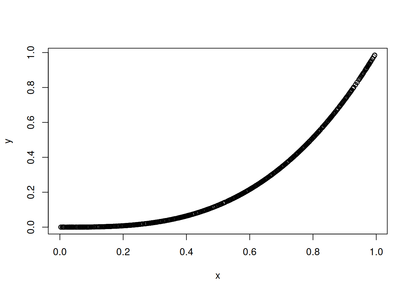
An example of the second point is given below:
x <-runif(1000) ## 1000 random numbers between 0 and 1y <- x^3## y is exactly x^3plot(x, y) ## Picture of the relationship
cor(x, y) ## The correlation is very high!
[1] 0.9158692
For the GPA dataset we have:
cor(fygpa$fy_gpa, fygpa$hs_gpa)
[1] 0.5433535
This indicates a reasonably strong positive association between first year GPA and high school GPA; relative to the correlations one typically sees in social sciences, a correlation of 0.5 is quite large.
4.5 Simple Linear Regression: Which Line is Best?
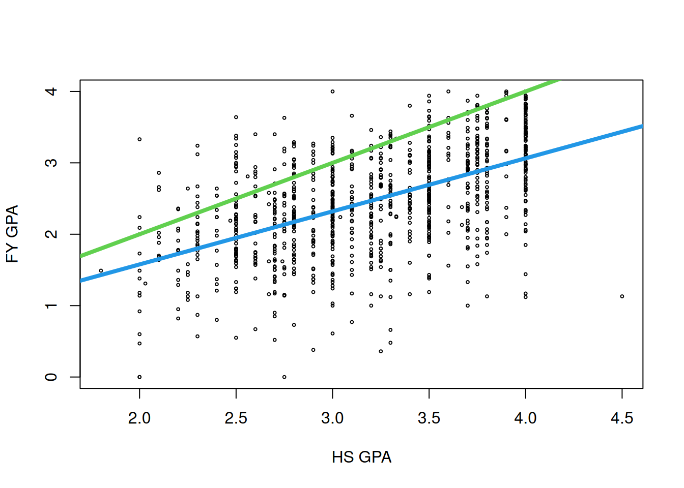
We are now ready to talk about where the “best” line passing through the data comes from. How do we decide which line is the best fitting one? Some lines are clearly better than others: for example, for the GPA data, we can tell visually that the blue line below is better than the green line:
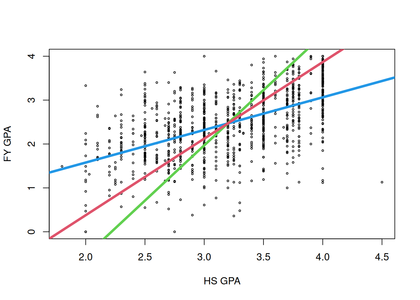
But what about the following three lines?
I think that you probably will feel like the blue line is still the best, but they actually all “pass through the data” in some sense, and it turns out that all of them are actually useful depending on the context:
The blue line is built to make it so that the vertical distances to the fitted line are small. This is the line associated with linear regression.
The green line is built to make it so that the horizontal distances to the fitted line are small. This is the line you would want to use if you wanted to predict high school GPA rather than first year GPA rather than the other way around.
The red line is built to make it so that the Euclidean distances to the line are small. That is, it minimizes the sum of the shortest squared distances to the line, where the distances to the line are allowed to be diagonal rather than just horizontal or vertical. This line is associated with a technique called principal component analysis, which you can learn about is SDS 322E.
In the following section, we discuss why the first option is the one we will use in this course.
4.5.1 Least Squares: We Should Make the Predictions Accurate
To determine how good a given line \(y = \beta_0 + \beta_1 \, x\) is at summarizing a relationship between \(X\) and \(Y\) we can look at how accurate the predictions we get are. If we are predicting \(Y\) using the line \(\beta_0 + \beta_1 \, x\) then we can define the predicted value of \(Y\) as
\[
\widehat Y = \beta_0 + \beta_1 \, x
\]
and the residual (or prediction error) as
\[
e_i = Y_i - \widehat Y_i.
\]
Tip
Remember that
the predicted value \(\widehat Y_i\) is the value that the line predicts that \(Y_i\) will be when plugging in \(X_i\) for \(x\); and
the residual is how far off that prediction was.
Given \(\widehat Y_i\) (the prediction) and the residual \(e_i\) (how far off the prediction was), we know that \(Y_i = \widehat Y_i + e_i\).
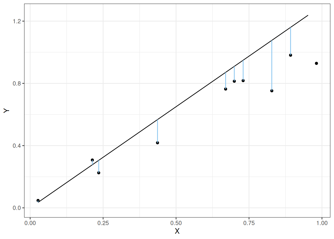
Intuitively, we want the size of the \(e_i\)’s to be as small as possible so that our predictions are as accurate as possible. That is, we would like the length of the lines in the following figure to be small:
Note
In the above figure, the residuals \(e_i\) are given by the signed lengths of the line segments. If the point is below the line, the residual is negative while if the point is above the line then the residual is positive.
Note that we care about the length of the lines; we do not care about whether the \(e_i\)’s is positive or negative. The least squares approach to regression minimizes the sum of the squared residuals so that
\[
\sum_{i = 1}^n e_i^2 \qquad \text{is as small as possible.}
\]
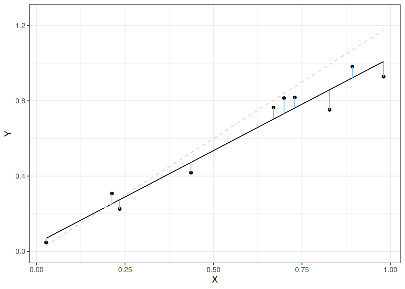
The reason we square the errors in the above expression is to make it so that positive and negative residuals do not cancel each other out. The least squares fit is given in the following figure (the line we started with is given by the dashed gray line):
The lengths of the lines in the above picture are much smaller than they were for the line we started with!
Note
A natural follow up question some students have is “why not look at the absolute value \(|e_i|\), which gives the actual length of the lines? Isn’t this what we should do if we want the lengths of the lines to be as small as possible?”
It is possible to do this, but it turns out that the mathematical properties of the resulting fit \(y = \widehat \beta_0 + \widehat \beta_1 \, x\) are quite different: rather than estimating the average of \(Y_i\) for each \(X_i\), for reasons we will not get into it turns out to estimate the median of \(Y_i\).
4.5.2 Formulas for \(\widehat \beta_0\) and \(\widehat \beta_1\)
Having decided that we want to minimize the sum of squared residuals \(\sum_i e_i^2\), the question now arises: “well, what values of \(\widehat \beta_0\) and \(\widehat \beta_1\) actually do this?” It turns out that they are given by the following equations:
We will now use these formulas to compute the \(\widehat\beta_0\) and \(\widehat\beta_1\) on for the GPA data. In practice, you would never do this on your own, but it is worth seeing that it works at least once in your life!
## Define some new variables to make it easier to see what is going onY <- fygpa$fy_gpaX <- fygpa$hs_gpa## Compute the relevant quantitiesSSXY <-sum((Y -mean(Y)) * (X -mean(X)))SSXX <-sum((X -mean(X))^2)## Compute the slope and interceptbeta_1_hat <- SSXY / SSXXbeta_0_hat <-mean(Y) - beta_1_hat *mean(X)## Print the resultsprint(c(beta_0_hat = beta_0_hat, beta_1_hat = beta_1_hat))
beta_0_hat beta_1_hat
0.09131887 0.74313847
So the least squares line for this dataset is given by
This agrees with what we already saw in Section 4.2.
Optional Exercise
If you have taken a course in multivariable calculus, you can actually derive these formulas for yourself. It’s not too hard! It would be a reasonable question to put on an exam covering maximization of functions by setting their gradient to zero. To get you started, what you want to do is minimize
by setting the partial derivatives equal to zero. Do \(\beta_1\) first and notice that, as you simplify, use the fact that \(\sum_i (X_i - \bar X) = 0\).
4.6 Fitting Linear Regression in R with the GPA Data
4.6.1 Using lm() and Formulas
Let’s now use R to get the least squares fit for the relationship between first year GPA and high school GPA. This can be done by using the lm() function in R as follows:
fygpa_lm <-lm(fy_gpa ~ hs_gpa, data = fygpa)
The reason the function is called lm() is because it fits a linear model. Let’s break this expression down:
fygpa_lm <-: This part assigns the output of the lm() function to a variable named fygpa_lm. Recall that the <- operator in R is used to assign values to a variable. The lm() function creates a special type of object in R called an lm.
lm(fy_gpa ~ hs_gpa, data = fygpa): The lm() function is used to fit linear models. Inside the parentheses, the function takes a formula and a dataset as arguments.
fy_gpa ~ hs_gpa: This is the formula specifying the relationship you want to model. The ~ symbol separates the dependent variable (fy_gpa) from the independent variable (hs_gpa). It tells R to model fy_gpa as a function of hs_gpa.
data = fygpa: This argument specifies the dataset to be used in the model. Here, fygpa is the name of the dataset that contains the variables fy_gpa and hs_gpa. The data argument tells the lm() function where to find these variables.
Running this code will create a new object called fygpa_lm (or whatever name you choose for the fit), but it will not directly produce any output for you to look at. To get the actual information stored in the fit, we will need to use other R functions.
4.6.2 Using summary()
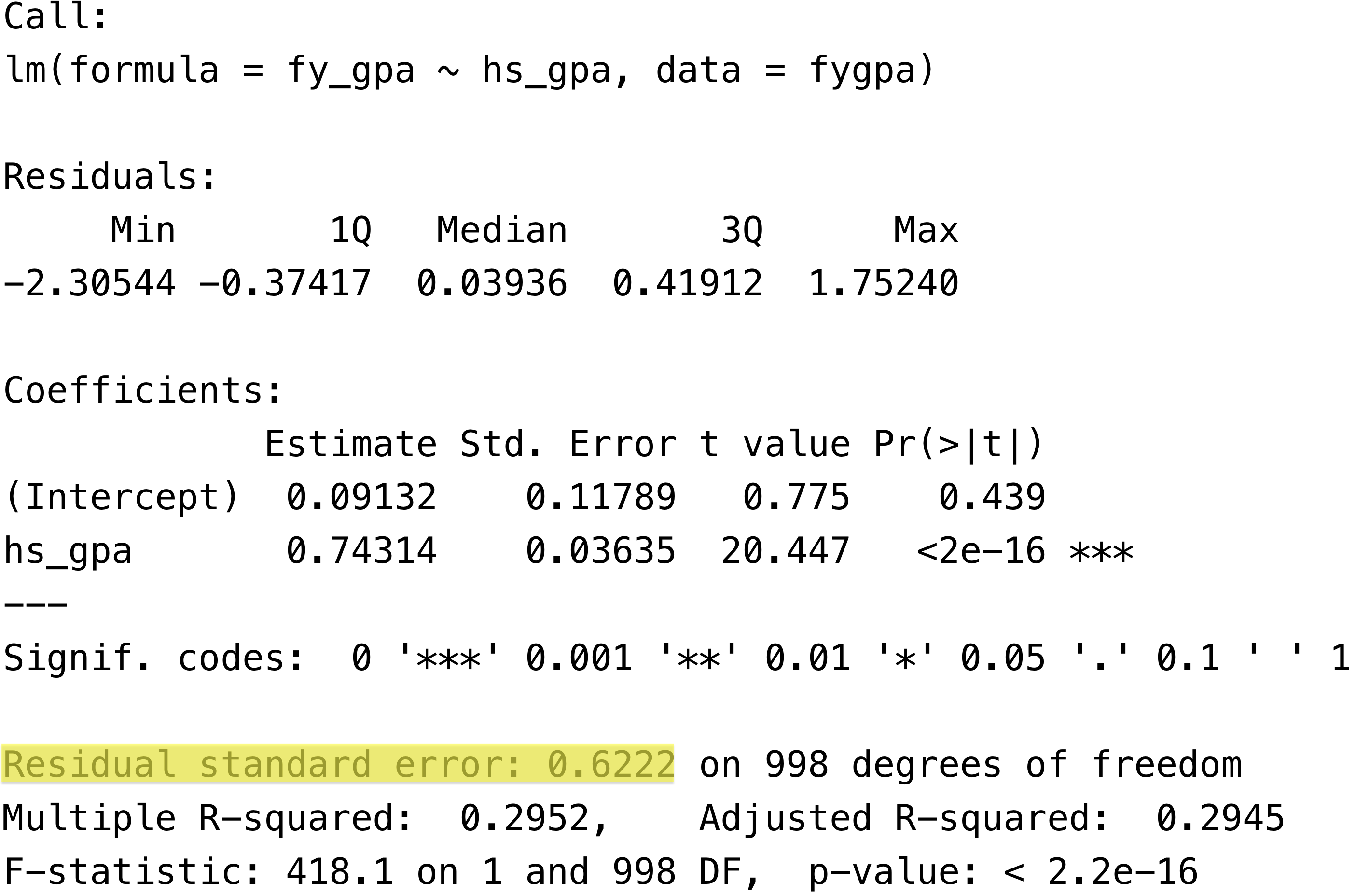
The standard way to access information in an lm object is to use the summary() function:
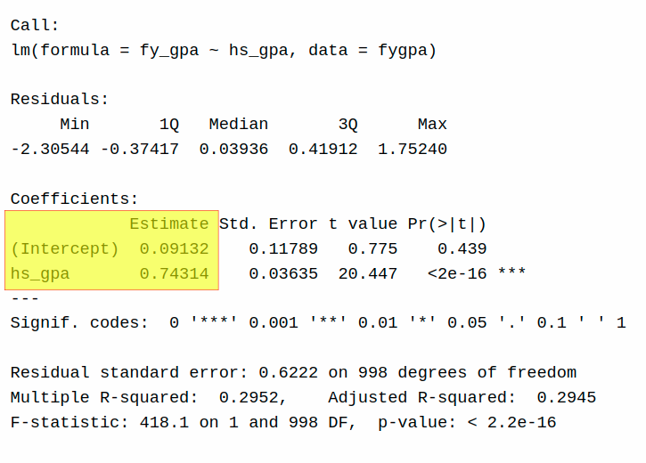
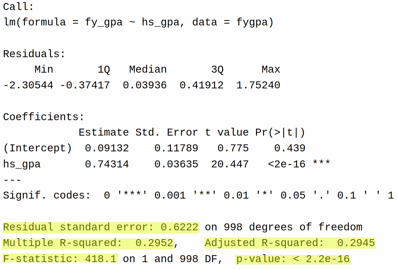
summary(fygpa_lm)
Call:
lm(formula = fy_gpa ~ hs_gpa, data = fygpa)
Residuals:
Min 1Q Median 3Q Max
-2.30544 -0.37417 0.03936 0.41912 1.75240
Coefficients:
Estimate Std. Error t value Pr(>|t|)
(Intercept) 0.09132 0.11789 0.775 0.439
hs_gpa 0.74314 0.03635 20.447 <2e-16 ***
---
Signif. codes: 0 '***' 0.001 '**' 0.01 '*' 0.05 '.' 0.1 ' ' 1
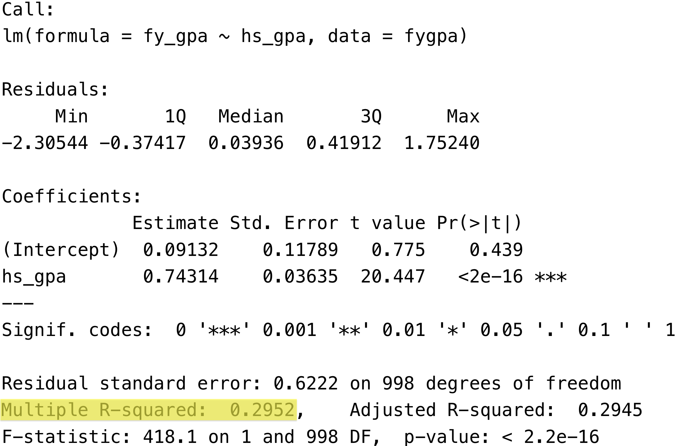
Residual standard error: 0.6222 on 998 degrees of freedom
Multiple R-squared: 0.2952, Adjusted R-squared: 0.2945
F-statistic: 418.1 on 1 and 998 DF, p-value: < 2.2e-16
This prints out a bunch of information, and we will spend a lot of time in this course talking about what each of the different numbers in the output mean. We can read of the slope \(\widehat \beta_1 = 0.743\) and the intercept \(\widehat
\beta_0 = 0.09132\) from the Coefficients table:
The y-intercept is given by the Estimate of (Intercept) while the slope is Estimate of hs_gpa
Instead, we can also use functions in the broom package to clean up the information in this table to make it more accessible to beginners.
Warning
At the moment, I do not expect you to be able to explain everything that is going on in this table. By the end of the course you should know what all of the different parts of summary() are showing you, but you do not need to understand all of it at the moment.
4.6.3 Simplifying the Output: tidy(), glance(), and augment()
The broom package in R was made to help “tidy up” the output of the lm() function (as well as some other functions in R). We will learn about three functions in this package to look at the output of a linear regression: tidy(), glance(), and augment().
First, we load the package:
library(broom)
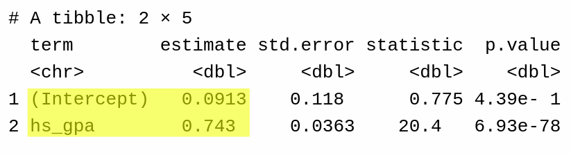
Next, the tidy() function can be used to get the estimated slope and intercept as in
Once again, for the time being we will only be concerned with the estimates:
Similar to the output of summary, but only information on the slope and intercept are given rather than additional information.
We will learn about the other parts of this table later.
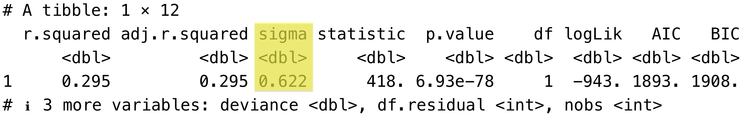
The glance() function provides some other parts of the summary() output, and again we will learn about the individual components later. Think of glance() as providing an overall summary of the model fit, which will be more important when we start using more than one independent variable.
For comparison, this highlights the parts of the summary() output that correspond to the entries in the glance().
Parts of summary relevant to glance
Note that not all quantities given by glance() appear in summary().
Lastly, the augment() function augments the original dataset with additional information, including the fitted values \(\widehat Y_i\) and the residuals \(e_i\):
This produces a new data frame (which I have named augmented_fygpa) with the following columns:
The dependent (fy_gpa) and independent (hs_gpa) variables from the model fit.
.fitted is the fitted value \(\widehat Y_i\) for each row; so, for example, the model predicts a first year GPA of 2.618 for a student with a high school GPA of 3.40.
.resid is the residual, \(e_i = Y_i - \widehat Y_i\).
We will discuss the remaining columns (.hat, .sigma, .cooksd, .std.resid) as they become relevant in this course.
4.7 Measuring the Prediction Error with the Residual Standard Error
After fitting a line \(\widehat Y = \widehat \beta_0 + \widehat \beta_1 \, X\), a natural follow up question is how well does this line do at actually predicting the outcome? A simple measure of predictive accuracy that we can use is the residual standard error (also sometimes called the root mean squared error, or RMSE)
Interpreting\(\widehat\sigma\): The residual standard error measures the “typical” amount by which the predictions are off from the observed values. More precisely, \(\widehat \sigma\) is the square root of the average squared distance of each observation from its predicted value. Visually, \(\widehat \sigma\) is the square root of the average squared length of each of the vertical lines we saw in Section 4.5.1.
Smaller values of \(\widehat \sigma\) indicate that the observations are more tightly clustered around the regression line; conversely larger values of \(\widehat \sigma\) indicate that observations tend to be far away from the regression line.
Note
Again, we have a slightly different denominator than you might expect when computing \(\widehat \sigma\): we use \(N - 2\) rather than \(N\), and we refer to \(N - 2\) as the degrees of freedom of the residuals. It turns out that the reason we subtract \(2\) has to do with the fact that we are estimating two quantities (\(\beta_0\) and \(\beta_1\)), and we will discuss why we do this a bit more when we start performing statistical inference with this model.
Note
You can again think of \(\widehat \sigma\) as the “average distance that the observed values fall from the regression line” as an intuitive anchor, even though it isn’t quite correct, similar to how we might think of the standard deviation as the “average distance of an observation from its mean.” In reality it is the “square-root-of-the-average-squared-distance”, which is harder to think about but almost the same thing.
Computing\(\widehat\sigma\)in R: To get \(\widehat\sigma\) from a fitted linear model, we can plug the fitted model into the sigma() function:
sigma(fygpa_lm)
[1] 0.6222204
Alternatively, it is available in the output of glance() here:
or in the output of summary() here:
4.7.1 Example: Interpreting \(\widehat\sigma\) for the GPA Data
For the GPA data, we computed as residual standard error of 0.6222204. This means, roughly, that on average, student GPAs tended to be about 0.6222 points away from their predicted value! That is, if a student is predicted to have a GPA of 2.8 based on their high school GPA, we really should expect it to lie between roughly a 3.4 and a 2.2 GPA, and being off by somewhat more than 0.6 grade points would not be strange either. In this way \(\widehat \sigma\) is a measure of how precisely our model can make predictions.Whether you can tolerate your model being off by about 0.6 grade points on average is of course dependent on what questions you are trying to answer with the model!
Warning
One limitation of the residual standard error is that it depends on the units of the outcome, which can make it difficult to compare \(\widehat\sigma\)’s across different models/applications. So, for example, if we are modeling the heights of students, then the residual standard error will change depending on whether we measure the students in heights or in centimeters. If you want a unitless measure of accuracy, you can use the proportion of variance explained (\(R^2\)), which is introduced in the following section.
4.8 The Proportion of Variance Explained: \(R^2\)
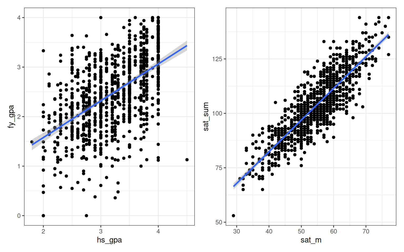
Another natural question to ask after fitting a linear regression is overall, how well does the fitted line do at summarizing the information in the data? For example, we can compare the fit of the actual GPA data (left) to the use of the SAT math score to predict the total SAT score (right):
Even though the units in the two problems are completely different from one another, you can see visually that in some sense the line on the right is “better” than the line on the left at describing the data. This can be partially explained by the fact that the \(R^2\) (which we will learn about below) for the plot on the right is higher than the \(R^2\) for the plot on the left; specifically, the left plot has an \(R^2\) of 29.5% while the right one an \(R^2\) of 74.0%.
4.8.1 Motivating \(R^2\): Sums of Squares
Suppose we have a regression with independent variable \(X\) and dependent variable \(Y\). We can define the total amount of variability in\(Y\) as
\[\text{SST} = \sum_i (Y_i - \bar Y)^2.\]
This measures how close the \(Y_i\)’s tend to be to their overall average ignoring the\(X_i\)’s! By analogy we can interpret the sum of squared errors
as the amount of variability in the\(Y_i\)’s that cannot be accounted for by the line. The amount of variability that is explained by the line is called the regression sum of squares and is given by
Our choice of names for these different quantities suggests that
\[
\text{Total Variability} = \text{Variability Explained by Line} +
\text{Variability Unexplained by Line}
\]
so we might guess that
\[
\text{SST} = \text{SSR} + \text{SSE}.
\]
This turns out to be true!
4.8.2 Defining \(R^2\)
Having defined the total, regression, and error sums of squares, we can now ask: what proportion of the total variability is explained? Since SST is the total amount of variability and SSR is the amount of variability that is explained, we define
\[
R^2 = \frac{\text{SSR}}{\text{SST}}
\]
to be the proportion of the variance explained; that is, the percentage of the variance explained by the fitted line is \(100 \times R^2\). Notice that because \(\text{SST} = \text{SSR} + \text{SSE}\) we know that \(0 \le R^2 \le 1\).
Important
Note that \(R^2\) makes a statement about variability in the data. It does not make a statement about variability in the population! This distinction will turn out to matter a great deal once we start building models with more than one independent variable.
4.8.3 Where is \(R^2\) In The Output?
In the output of summary: The \(R^2\) of the model is available in the summary() output here:
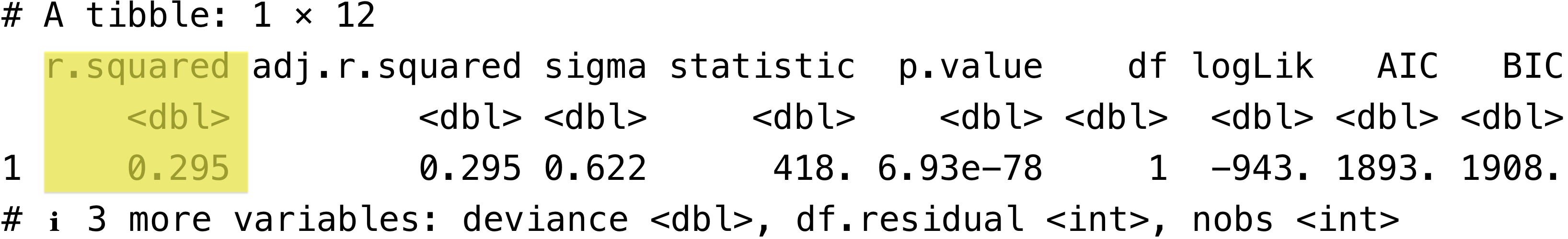
In the output of glance: It is also available in the output of glance() here:
4.8.4 Interpreting \(R^2\) for the GPA Data
For the GPA data, we found an \(R^2\) of 0.295233. We can interpret this as
Roughly 29.5% of the variability of first year GPA in the data can be accounted for by high school GPA.
Note
Question: Do you think this amount is a lot? Or not very much? Do you think we could improve the performance of the model by including other things? If so, what?
4.8.5\(R^2\) Happens to be a Squared Correlation
Even though it is not at all obvious that this is the case, it turns out that \(R^2\) can also be defined as the square of the correlation between the observed and predicted values. For example:
I personally find this to be a useful alternate motivation for looking at \(R^2\). Yet another way to understand \(R^2\) is as the squared correlation between the independent and dependent variables:
cor(fygpa$fy_gpa, fygpa$hs_gpa)^2
[1] 0.295233
Note
In case you forgot, the object augmented_fygpa was built with the augment() function; if you do not remember what this function does, see Section 4.6.3.
What’s the Point?
It seems a little bit repetitive to introduce a new concept, \(R^2\), and then reveal that it is actually just the correlation with a hat on 🧢. The main reason for looking at\(R^2\) is that it will be useful even when we look at settings with multiple independent variables! If I were controlling for both high school GPA and SAT scores, for example, it is no longer true that \(R^2\) is the squared correlation between first year GPA and any of the other variables, but it remains true that it is the squared correlation of first year GPA with its predicted value.
(Optional) A Note on Regression Through the Origin
Technically speaking, the facts given in this section are only correct when the least squares regression model \(y = \beta_0 + \beta_1 \, x\) includes an intercept \(\beta_0\). It is possible to instead perform regression through the origin, which uses the relationship \(y = \beta_1 \, x\) (with no intercept), and the \(R^2\) for this model will not correspond to the square of a correlation.
4.8.6 (Optional) Some Limitations of \(R^2\)
I find \(R^2\) to be somewhat useful to look at, and I usually do look at it when I use linear regression in practice. Nevertheless, there are some well-known critics of \(R^2\) who argue that it can be misleading. Below I list some reasons that are given by Cosma Shalizi for not liking \(R^2\); some other reasons he gives are available at this link.
Just because \(R^2\) is small, it does not mean that there is anything “wrong” with the model; it can be arbitrarily small even if the relationship between \(X\) and \(Y\) is well-described by a line.
Just because \(R^2\) is large, it does not mean that the model is “good”; we can get a high \(R^2\) sometimes even if the model is highly flawed and (for example) the relationship between \(X\) and \(Y\) is extremely non-linear.
\(R^2\) says nothing about how well the model will do at predicting future data. If you want a measure of how well the model will do at predicting future data, the residual standard error would be a better descriptor.
The interpretation of \(R^2\) as the proportion of variability in \(Y\) “explained” by \(X\) is misleading, and in the case of simple linear regression we could just as easily say that it is the proportion of variability in \(X\) “explained” by \(Y\). I tend to use the term “accounted for” rather than “explained by” because I think “explained by” suggests a statement about causation (which \(R^2\) cannot give you).
4.9 Using lm() for Prediction of New Outcomes
A common application of linear regression is to use it to predict new outcomes. For example:
Problem Statement for GPA
Suppose you work on an admissions committee for a university. You might want to forecast, for each applicant, how well they would be expected to perform in college based on their high school GPA, and other statistics. Some reasons you might want to do this include:
To decide whether to admit a student, as you generally would prefer to admit students that you believe would be successful in your courses. (Note: it’s not as simple as this, as you can imagine that basing admissions decisions only on expected performance would lead to all sorts of complicated equity issues. None of the admissions committees I’ve ever been on has included a predicted GPA for students.)
To decide whether to allocate additional resources to students that are at risk of performing poorly.
So our goal is to provide for each student in a new dataset, a prediction of their first year GPA using the model.
Notice that, for this problem, the predictions will be on new data, for whom the outcome has not been observed.
4.9.1 Making a New Dataset to Predict On
Since we do not have any new students to predict on, we will create some hypothetical students to illustrate how to perform predictions. We will do this by creating a new data frame called new_gpa that contains the high school GPAs we want to predict from. First, we create a vector of (evenly spaced) GPAs we want to predict from.
new_hsgpas <-seq(from =0, to =4, length =20)print(new_hsgpas)
This uses the seq() function to create 20 evenly-spaced numbers between the lowest possible GPA (0) and the highest (?) possible unweighted GPA (4.0). Next, we store the results in a new data frame that is constructed using the data.frame() command:
To get predictions from a linear model fit with the lm() function, we just need the new data set to have columns for the independent variables(s) we used; it does not need to include all of the variables. In this case, because we have only one independent variable (hs_gpa), this is the only column we need.
Warning
When you make your new data, make sure that the names of the columns of the independent variables match your original data!. Otherwise you will get the wrong answer, and R will not give you any warning!
4.9.2 Interpolation versus Extrapolation
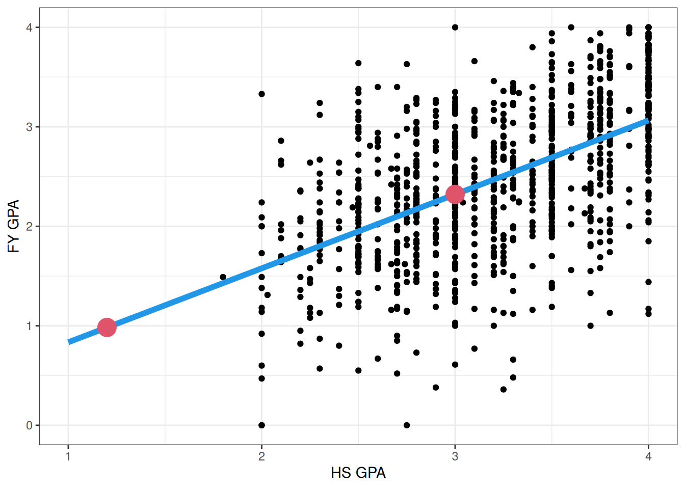
It is important to be mindful when forming predictions (or forecasts) of future data whether you are interpolating from a model or extrapolating from the linear regression. For example, consider the following two possible predictions we might make based on the fit to the GPA data:
The leftmost big/red point corresponds to the prediction that we would make for a student with a high school GPA of 1.2, while rightmost big/red point corresponds to the prediction we would make for a student with a high- school GPA of 3.0. We call the rightmost point an interpolation and the leftmost point an extrapolation.
Interpolation involves predicting a value that lies in the range of the observations we already have. In the above figure, we see that there are many students that have high school GPAs around 3, and we can see that the linear regression does a passable job for such students. We generally expect that interpolations of our data will be reasonably accurate, provided that our linear regression works well; we are confident that the model works around GPAs of 3, because we have lots of similar data.
Extrapolation, on the other hand, involves predicting values outside the range of the data. In the above figure, we simply do not have any students in our sample with GPAs around 1.2. The problem with making extrapolations is that we need to assume that the relationship really is linear, and that it extends beyond the data that we have actually seen! What if, for example, the relationship is actually curved?
Typically, the further you extrapolate from the data that you have seen the less reliable the predictions will be. If we extrapolate only a little bit (as is common in settings where we are trying to predict what will happen in the future based on past data) then things might OK, but we should be suspicious of any predictions that require extrapolating very far beyond our data. Sometimes extrapolating is unavoidable, but it’s important to use extrapolation cautiously and be aware of its potential for increased error.
4.9.3 The predict() Function
The easiest way to get predictions on a new dataset is to use predict().
This function takes as its first argument the linear model object (in this case, fygpa_lm) as well as a number of optional arguments. The important ones for us (taking descriptions from help(lm)) are:
newdata: An optional data frame in which to look for variables with which to predict. If it is omitted, predict() just returns the predictions on the original dataset.
se.fit: Indicates if the standard errors of the predictions should also be returned. We will use this in the next chapter when we build prediction intervals for the predictions. By default, standard errors will not be returned.
interval: Indicates what type of intervals we want to return (interval = "confidence" for a confidence interval orinterval = “prediction”` for a prediction interval). These will be described in the next chapter. By default, no intervals are returned.
level: The confidence level for the prediction/confidence intervals (defaults to 95%).
So, a more advanced usage of this function that we will see next chapter would look something like this:
which returns not just the predictions (fit), but the lower (lwr) and upper (upr) endpoints of a 90% prediction interval.
Warning
Again, we have not covered confidence or prediction intervals yet, so do not spend much time trying to figure out exactly what these intervals mean at the moment. At a high-level, however, what this result says is that we are roughly 90% confident that a given individual with (say) a 4.0 high school GPA will have a first year college GPA somewhere between a 2.03 and 4.08. So the prediction is not very precise!
4.10 Exercises
4.10.1 Exercise 1: Advertising Data
Use the following code to load the advertising dataset, created by these people:
The advertising data set consists of sales of that product in 200 different markets. It also includes advertising budgets for the product in each of those markets for three different media: TV, radio, and newspapers.
The variables in this dataset correspond to:
TV: a numeric vector indicating the advertising budget on TV, in thousands of dollars.
radio: a numeric vector indicating the advertising budget on radio, in thousands of dollars.
newspaper: a numeric vector indicating the advertising budget on newspaper, in thousands of dollars.
sales: a numeric vector indicating the sales of the interest product, in thousands of units.
Create a scatterplot of sales against TV advertising. Does the relationship appear to be well-described by a line?
Fit a simple linear regression model with sales as the dependent variable and TV advertising as the independent variable. Interpret the slope of this fitted regression in terms of the relationship between TV budget and sales.
Interpret the intercept of the fitted regression in terms of the relationship between TV budget and sales.
What is the \(R^2\) for this model? What is its interpretation?
What is the residual standard error for this model? Interpret this value in the context of the problem.
Use your model to predict the sales for a TV advertising budget of $400,000.
Is this prediction an interpolation or an extrapolation? Explain your reasoning.
4.10.2 Exercise 2: Boston Housing Data
The Boston housing dataset contains information on housing prices in various census tracts in Boston from the 1970s. The data can be loaded by running the following commands:
Boston <- MASS::Boston
Learn more about the dataset by running the command ?MASS::Boston. What do each of the columns in the dataset represent?
This data was initially looked at by economists to understand the relationship between nitric oxide concentration in census tracts (nox) and the median home value in that tract (medv). Create a scatterplot with nox on the x-axis and medv on the y-axis. Does the relationship appear to be linear? Explain.
Create a simple linear regression model using nox to predict medv. What is the \(R^2\) of this model?
Create a different simple linear regression model using rm to predict medv. Does this model seem to predict medv better than the one that used nox?
Use the augment() function from the broom package to add fitted values and residuals to your dataset. For the first three tracts listed, interpret the fitted value (using statements like “for a tract with nitric oxide concentration equal to AAA the model predicts a median home value of BBB.”).
4.10.3 Exercise 3: Studying
A researcher is studying the relationship between study time and exam scores for a group of college students. They fit a simple linear regression model where:
\(Y\) (dependent variable) is the exam score (0-100 points)
\(X\) (independent variable) is the number of hours spent studying
After fitting the model, they obtain the following results:
Intercept (\(\widehat\beta_0\)) = 60
Slope (\(\widehat\beta_1\)) = 2
\(R^2 = 0.36\)
Residual Standard Error (\(s\)) = 8
Answer the following questions:
Interpret the intercept in the context of this scenario. What does it represent, and is this interpretation meaningful?
Interpret the slope. What does a one-unit change in X correspond to in terms of Y?
A student studies for 5 hours. What exam score would the model predict for this student?
The \(R^2\) value is 0.36. Explain what this means in the context of the study. Is this a “good” R² value? Why or why not?
What does the Residual Standard Error of 8 tell us about the model’s predictions? How might you use this information?
Suppose a student who didn’t study at all (0 hours) scored 65 on the exam. What would be the residual for this student? Is this student performing better or worse than the model predicts?
The researcher wants to use this model to predict the exam score for a student who studied for 30 hours. Explain whether this would be interpolation or extrapolation. What concerns might you have about this prediction?
The researcher claims that based on this model, studying causes higher exam scores. Is this a valid conclusion? Why or why not?
4.10.4 Exercise 4: Affairs
Using the Affairs dataset from the AER package in R, we’ll explore the relationship between marriage rating and the frequency of extramarital affairs. The data can be loaded by running the following commands:
# Load the datalibrary(AER)data("Affairs")head(Affairs)
   affairs gender age yearsmarried children religiousness education occupation
4        0   male  37        10.00       no             3        18          7
5        0 female  27         4.00       no             4        14          6
11       0 female  32        15.00      yes             1        12          1
16       0   male  57        15.00      yes             5        18          6
23       0   male  22         0.75       no             2        17          6
29       0 female  32         1.50       no             2        17          5
   rating
4       4
5       4
11      4
16      5
23      3
29      5
Details on the individual columns of this dataset can be obtained by running ?Affairs. Use simple linear regression to answer the following questions.
Do individuals with higher ratings for their marriage seem to have more affairs, or less affairs?
What is the relationship between education and the number of affairs?
Which of the following variables accounts for the highest proportion of variability in the number of affairs: age, years married, rating of their marriage, or religiousness?
Predict the frequency of affairs for someone with a marriage rating of (i) very unhappy and (ii) very happy.